How to make Text Responsive in Bootstrap ?
Last Updated :
26 Apr, 2024
In Bootstrap, Making text responsive involves ensuring that text scales appropriately across different screen sizes. This is achieved by using relative units for font sizes and leveraging Bootstrap’s responsive typography classes or utility classes to adjust text appearance based on the viewport width.
Below are the approaches to making text responsive in Bootstrap:
Using fs class
Bootstrap’s fs classes, like fs-1 and fs-2, enable responsive text sizing. These classes adjust font sizes based on screen breakpoints, providing a quick way to make text adapt to different device sizes without custom CSS.
Example: This example describes the implementation of making the text responsive using display fs of Bootstrap.
HTML
<!DOCTYPE html>
<html>

<head>
    <title>Responsive Text</title>
    <link href=
"https://cdn.jsdelivr.net/npm/bootstrap@5.3.0/dist/css/bootstrap.min.css"
          rel="stylesheet" />
</head>

<body>
    <div class="container">
        <h1 class="text-center text-success">
            GeeksforGeeks
        </h1>
        <div class="container">
            <p>Small text</p>
            <p class="fs-5">Medium text</p>
            <p class="fs-4">Medium text</p>
            <p class="fs-3">Large text</p>
            <p class="fs-2">Large text</p>
            <p class="fs-1">Very Large text</p>
        </div>
    </div>
</body>

</html>
Output:

Using display class
Bootstrap’s display class is used when you need a responsive heading. These display classes offer a quick way to style headings making them useful for creating visually appealing and hierarchy-aware responsive typography in a Bootstrap-based project.
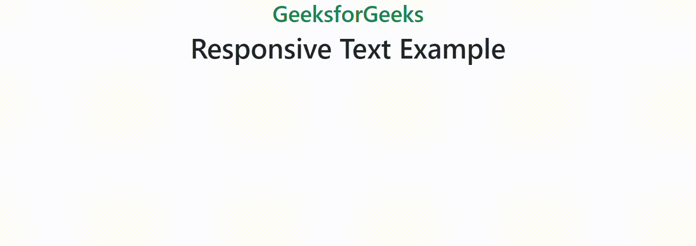
Example: This example describes the implementation of making the text responsive using display class of Bootstrap.
HTML
<!DOCTYPE html>
<html>

<head>
    <title>Responsive Text</title>
    <link href=
"https://cdn.jsdelivr.net/npm/bootstrap@5.3.0/dist/css/bootstrap.min.css"
          rel="stylesheet" />
</head>

<body>
    <div class="container">
        <h1 class="text-center text-success">
            GeeksforGeeks
        </h1>
        <div class="container">
            <h1 class="display-6 text-center">
                Responsive Text Example
            </h1>
        </div>
    </div>
</body>

</html>
Output:
Using text-wrap class
Bootstrap provides utility classes that we can use to make text responsive. These classes include text-wrap for preventing text wrapping, text-truncate for truncating long text, and text-break for breaking long words.
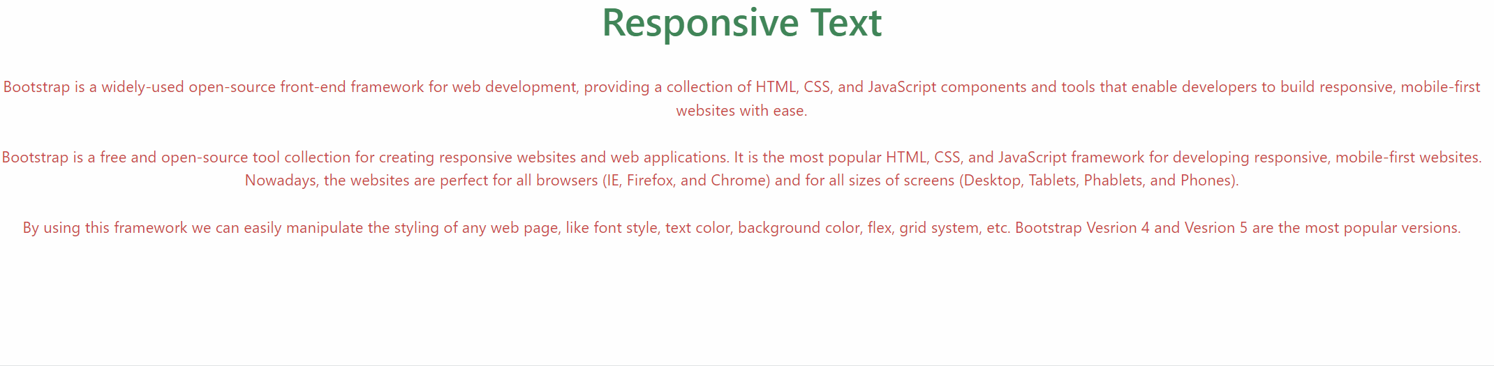
Example: This example describes the implementation of making the text responsive using text-wrap class of Bootstrap.
HTML
<!DOCTYPE html>
<html>

<head>
    <title>Responsive Text</title>
    <link href=
"https://cdn.jsdelivr.net/npm/bootstrap@5.3.0/dist/css/bootstrap.min.css"
          rel="stylesheet" />
</head>

<body>
    <h1 class="text-center text-success">
        Responsive Text
    </h1>
    <br />
    <div class="text-center">
        <p class="text-wrap text-danger">
            Bootstrap is a widely-used open-source front-end framework
            for web development, providing a collection of HTML, CSS, and
            JavaScript components and tools that enable developers to build
            responsive, mobile-first websites with ease.
            <br />
            <br />
            Bootstrap is a free and open-source tool collection for
            creating responsive websites and web applications. It is the
            most popular HTML, CSS, and JavaScript framework for developing
            responsive, mobile-first websites. Nowadays, the websites are
            perfect for all browsers (IE, Firefox, and Chrome) and for
            all sizes of screens (Desktop, Tablets, Phablets, and Phones).
            <br />
            <br />
            By using this framework we can easily manipulate the styling
            of any web page, like font style, text color, background color,
            flex, grid system, etc. Bootstrap Vesrion 4 and Vesrion 5 are
            the most popular versions.
        </p>
    </div>
</body>

</html>
Output:
Share your thoughts in the comments
Please Login to comment...