How to make the Responsive Slider using Media Query in CSS ?
Last Updated :
04 Apr, 2024
Making a slider responsive using media queries in CSS involves adjusting the slider’s layout, dimensions, and behavior based on the screen size or device. Media queries allow you to apply different CSS styles depending on screen width, height, and orientation. This ensures the slider adapts and looks good across various devices and screen sizes.
Approach
- The HTML file sets up the structure of a web page with a navbar, a title, and a container for a responsive slider.
- CSS styles are defined inline within the <style> tags to handle the layout, design, and animations of the slider and other page elements.
- Media queries make the slider responsive by adjusting the size of the carousel items based on the viewport width.
- The JavaScript functions ‘nextSlide()’ and ‘prevSlide()’ are defined to handle the animation of sliding to the next and previous images in the carousel.
- These functions temporarily disable the animation, update the animation style, and then re-enable the animation to achieve smooth transitions between slides.
Example: Creating the slider responsive using media query in CSS.
HTML
<!DOCTYPE html>
<html lang="en">
<head>
<meta charset="UTF-8">
<meta name="viewport"
content="width=device-width, initial-scale=1.0">
<title>How to Make the Slider Responsive
Using Media Query in CSS
</title>
<style>
* {
margin: 0;
padding: 0;
box-sizing: border-box;
}
/* Global styles */
body {
font-family: Arial, sans-serif;
}
.navbar {
background-color: #333;
padding: 10px 0;
}
.logo-container {
display: flex;
justify-content: center;
align-items: center;
}
.logo {
width: 80px;
height: auto;
}
h2 {
text-align: center;
margin: 20px;
}
.container {
max-width: 1200px;
margin: 0 auto;
position: relative;
}
.carousel {
display: flex;
overflow: hidden;
width: 100%;
position: relative;
}
.carousel-inner {
display: flex;
animation: slide 7s infinite;
}
@keyframes slide {
0% {
transform: translateX(0);
}
20% {
transform: translateX(-100%);
}
40% {
transform: translateX(-200%);
}
100% {
transform: translateX(0);
}
}
.carousel-item {
flex: 0 0 33.33%;
text-align: center;
}
.carousel-item img {
max-width: 100%;
height: auto;
}
/* Media query for responsiveness */
@media (max-width: 768px) {
.carousel-item {
flex: 0 0 50%;
}
}
@media (max-width: 576px) {
.carousel-item {
flex: 0 0 100%;
}
}
/* Manual slide buttons */
.carousel-controls {
position: absolute;
top: 50%;
transform: translateY(-50%);
width: 100%;
}
.carousel-control {
background: transparent;
color: #0b0b0b;
padding: 10px 15px;
cursor: pointer;
border: none;
outline: none;
font-size: 20px;
position: absolute;
top: 0;
bottom: 0;
margin: auto;
}
.carousel-control.left {
left: 0;
}
.carousel-control.right {
right: 0;
}
</style>
</head>
<body>
<nav class="navbar">
<div class="logo-container">
<img alt="Logo" class="logo" src=
"https://media.geeksforgeeks.org/gfg-gg-logo.svg"/>
</div>
</nav>
<h2>Responsive Slider using Media Query in CSS</h2>
<div class="container mt-5">
<div class="carousel">
<div class="carousel-inner">
<div class="carousel-item">
<img src=
"https://media.geeksforgeeks.org/wp-content/uploads/20240328172027/img10.png"
alt="Image 1">
</div>
<div class="carousel-item">
<img src=
"https://media.geeksforgeeks.org/wp-content/uploads/20240328172142/img101.jpg"
alt="Image 2">
</div>
<div class="carousel-item">
<img src=
"https://media.geeksforgeeks.org/wp-content/uploads/20240328172217/img102.jpg"
alt="Image 3">
</div>
<div class="carousel-item">
<img src=
"https://media.geeksforgeeks.org/wp-content/uploads/20240328172027/img10.png"
alt="Image 4">
</div>
<div class="carousel-item">
<img src=
"https://media.geeksforgeeks.org/wp-content/uploads/20240328172142/img101.jpg"
alt="Image 5">
</div>
<div class="carousel-item">
<img src=
"https://media.geeksforgeeks.org/wp-content/uploads/20240328172217/img102.jpg"
alt="Image 6">
</div>
<div class="carousel-item">
<img src=
"https://media.geeksforgeeks.org/wp-content/uploads/20240328172027/img10.png"
alt="Image 4">
</div>
<div class="carousel-item">
<img src=
"https://media.geeksforgeeks.org/wp-content/uploads/20240328172142/img101.jpg"
alt="Image 5">
</div>
<div class="carousel-item">
<img src=
"https://media.geeksforgeeks.org/wp-content/uploads/20240328172217/img102.jpg"
alt="Image 6">
</div>
</div>
<div class="carousel-controls">
<button class="carousel-control left"
onclick="prevSlide()">
❮
</button>
<button class="carousel-control right"
onclick="nextSlide()">
❯
</button>
</div>
</div>
</div>
<script>
function nextSlide() {
// Disable animation temporarily
document.querySelector('.carousel-inner')
.style.animation = 'none';
setTimeout(() => {
// Re-enable animation
document.querySelector('.carousel-inner')
.style.animation = 'slide 5s infinite';
// Delay to reset animation
}, 10);
}
function prevSlide() {
document.querySelector('.carousel-inner')
.style.animation = 'none';
setTimeout(() => {
document.querySelector('.carousel-inner')
.style.animation = 'slide-reverse 5s infinite';
}, 10);
}
</script>
</body>
</html>
Output:
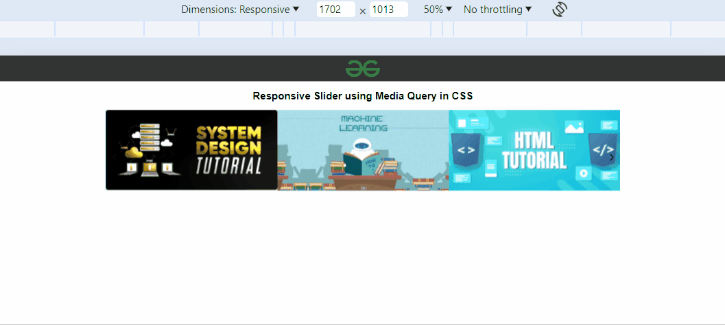
Output
Share your thoughts in the comments
Please Login to comment...