How to make CSS Font Size Fit Container Effectively ?
Last Updated :
18 Mar, 2024
Making CSS font size fit a container effectively involves ensuring that the text scales appropriately based on the dimensions of the container. This is crucial for maintaining readability and a consistent user experience regardless of the device being used.
Using Viewport
We can use viewport units to set font sizes relative to the viewport size. This ensures that font sizes adjust according to the size of the viewport, making them responsive.
Syntax:
.class_name {
font-size: 4vw;
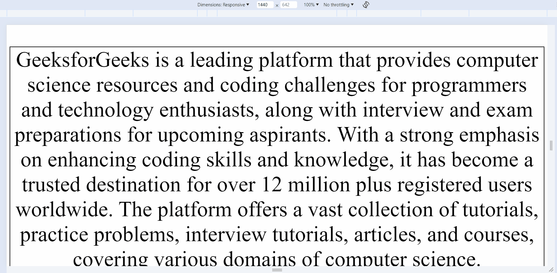
}Example: The below code will explain the use of the viewport units to make CSS font size fit container effectively.
HTML
<!DOCTYPE html>
<html>

<head>
    <title>GFG</title>
    <meta name="viewport" content=
"width=device-width, initial-scale=1.0" />
    <style>
        .responsive-text {
            font-size: 4vw;
            text-align: center;
            border: 2px solid black;
        }
    </style>
</head>

<body>
    <div class="container">
        <p class="responsive-text">
            GeeksforGeeks is a leading platform that provides
            computer science resources and coding challenges
            for programmers and technology enthusiasts, along
            with interview and exam preparations for upcoming
            aspirants. With a strong emphasis on enhancing coding
            skills and knowledge, it has become a trusted destination
            for over 12 million plus registered users worldwide. The
            platform offers a vast collection of tutorials, practice
            problems, interview tutorials, articles, and courses, covering
            various domains of computer science.
        </p>
        <p class="responsive-text">
            Our exceptional mentors hailing from top
              colleges & organizations have the ability
              to guide you on a journey from the humble beginnings
            of coding to the pinnacle of expertise.
              Under their guidance watch your skills flourish
              as we lay the foundation and help you conquer the
            world of coding.
        </p>
        <p class="responsive-text">
            Our brand is built on the pillars of expertise,
              accessibility, and community. We strive to
              empower individuals to enhance their programming
            skills, to bridge the gap between academia and
              industry, and provide a supportive community to
              the learners. GeeksforGeeks is committed to promoting
            technological advancement and providing opportunities
              for growth in the ever-evolving field of computer science.
        </p>
    </div>
</body>

</html>
Output:
We can implement media queries to define specific font sizes for different screen sizes. This allows us to adjust font sizes based on the screen size of the device.
Syntax:
@media (max-width: screen_size_here) {
     // CSS for defined screen size
}
Example: The below code will explain the use of the media query to make font size responsive according to the screen size.
HTML
<!DOCTYPE html>
<html>

<head>
    <title>GFG</title>
    <meta charset="UTF-8" />
    <meta name="viewport" content=
"width=device-width, initial-scale=1.0" />
    <style>
        .responsive-text {
            text-align: center;
            border: 2px solid black;
        }

        /* Media query for screens smaller than 768px */
        @media (max-width: 768px) {
            p {
                font-size: 14px;
            }
        }

        /* Media query for screens between 768px and 992px */
        @media (min-width: 768px) and (max-width: 992px) {
            p {
                font-size: 18px;
            }
        }

        /* Media query for screens larger than 992px */
        @media (min-width: 992px) {
            p {
                font-size: 30px;
            }
        }
    </style>
</head>

<body>
    <div class="container">
        <p class="responsive-text">
            GeeksforGeeks is a leading platform that provides
            computer science resources and coding challenges
            for programmers and technology enthusiasts, along
            with interview and exam preparations for upcoming
            aspirants. With a strong emphasis on enhancing coding
            skills and knowledge, it has become a trusted destination
            for over 12 million plus registered users worldwide. The
            platform offers a vast collection of tutorials, practice
            problems, interview tutorials, articles, and courses, covering
            various domains of computer science.
        </p>
        <p class="responsive-text">
            Our exceptional mentors hailing from top
              colleges & organizations have the ability
              to guide you on a journey from the humble
              beginnings of coding to the pinnacle of
              expertise. Under their guidance watch
            your skills flourish as we lay the
              foundation and help you conquer the
            world of coding.
        </p>
        <p class="responsive-text">
            Our brand is built on the pillars of expertise,
              accessibility, and community. We strive to
              empower individuals to enhance their programming
            skills, to bridge the gap between academia and
              industry, and provide a supportive community to
              the learners. GeeksforGeeks is committed to promoting
            technological advancement and providing
              opportunities for growth in the
            ever-evolving field of computer science.
        </p>
    </div>
</body>

</html>
Output:
Using CSS Clamp
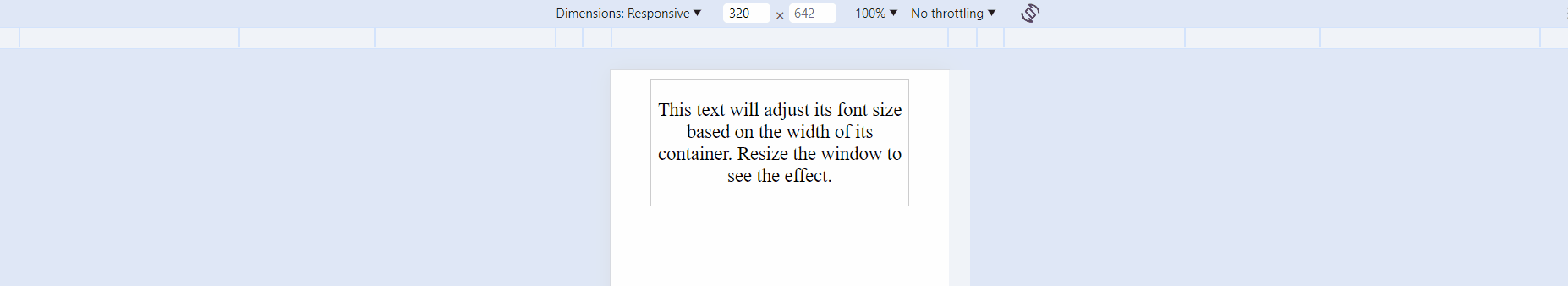
We can utilize CSS Clamp to make text content flexible within containers. It takes three parameters: value1, value2, and value3. value1 represents the minimum allowed value, value2 is the preferred value, and value3 is the maximum allowed value.
Syntax:
clamp(value1, value2, value3)
Example: The below code will explain the use of clamp to make font size responsive according to the screen size within container.
HTML
<!DOCTYPE html>
<html lang="en">

<head>
    <meta charset="UTF-8" />
    <meta name="viewport" content=
"width=device-width, initial-scale=1.0" />
    <title>Font Size with Clamp</title>
    <style>
        body {
            display: flex;
            justify-content: center;
        }

        .container {
            width: 80%;
            border: 1px solid #ccc;
            text-align: center;
        }

        /* Using clamp to adjust font size */
        .text {
            font-size: clamp(18px, 3vw, 26px);
        }
    </style>
</head>

<body>
    <div class="container">
        <p class="text">
            This text will adjust its font size based
            on the width of its container. Resize the
            window to see the effect.
        </p>
    </div>
</body>

</html>
Output:
Share your thoughts in the comments
Please Login to comment...