How to make a Row with 7 Equal Columns in Bootstrap ?
Last Updated :
03 Apr, 2024
Bootstrap is the styling framework to make the web application more attractive. To create a row with 7 equal columns in Bootstrap, you can use the grid system by dividing the row into 12 columns and assigning each column a class such as col-1 for each of the 7 columns. This way, each column will occupy an equal portion of the row, ensuring a balanced layout across different screen sizes.
Using Bootstrap Grid
In this approach, we are using Bootstrap’s grid system to divide the row into 7 equal columns. This can be achieved by using the .col- classes with appropriate column widths to ensure equal distribution within the row.
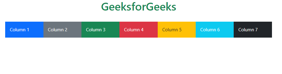
Example: The below example uses Bootstrap Grid to make a row with 7 equal columns in Bootstrap.
HTML
<!DOCTYPE html>
<html lang="en">

<head>
    <title>Row with 7 equal columns</title>
    <link href=
"https://cdn.jsdelivr.net/npm/bootstrap@5.3.0/dist/css/bootstrap.min.css"
          rel="stylesheet">
</head>

<body>
    <div class="container mt-5">
        <h1 class="text-success">GeeksforGeeks</h1>
        <h3>Using Bootstrap Grid</h3> <br>
        <div class="row">
            <div class="col-1">
                <div class="bg-primary p-3 text-center text-white">
                      Column 1
                  </div>
            </div>
            <div class="col-1">
                <div class="bg-secondary p-3 text-center text-white">
                      Column 2
                  </div>
            </div>
            <div class="col-1">
                <div class="bg-success p-3 text-center text-white">
                      Column 3
                  </div>
            </div>
            <div class="col-1">
                <div class="bg-danger p-3 text-center text-white">
                      Column 4
                  </div>
            </div>
            <div class="col-1">
                <div class="bg-warning p-3 text-center text-white">
                      Column 5
                  </div>
            </div>
            <div class="col-1">
                <div class="bg-info p-3 text-center text-white">
                      Column 6
                  </div>
            </div>
            <div class="col-1">
                <div class="bg-dark p-3 text-center text-white">
                      Column 7
                  </div>
            </div>
        </div>
    </div>
</body>

</html>
Output:

Using Flexbox
To create a row with 7 equal columns in Bootstrap using the Flexbox approach, you can apply the ‘d-flex‘ class to the parent container and ‘flex-grow-1‘ class to each column. This ensures that all columns expand equally to fill the available space, resulting in a row with 7 equally sized columns.
Example: The below example uses flexbox to make a row with 7 equal columns in Bootstrap.
HTML
<!DOCTYPE html>
<html>

<head>
    <title>Using Flexbox Approach</title>
    <link href=
"https://cdn.jsdelivr.net/npm/bootstrap@5.3.0/dist/css/bootstrap.min.css"
          rel="stylesheet">
</head>

<body>
    <h1 class="text-center text-success">
          GeeksforGeeks
      </h1> <br>
    <div class="container">
        <div class="d-flex flex-wrap equal-cols">
            <div class="flex-grow-1
                        p-3 bg-primary text-white">
                  Column 1
              </div>
            <div class="flex-grow-1 p-3
                        bg-secondary text-white">
                  Column 2
              </div>
            <div class="flex-grow-1 p-3
                        bg-success text-white">
                  Column 3
              </div>
            <div class="flex-grow-1 p-3
                        bg-danger text-white">
                  Column 4
              </div>
            <div class="flex-grow-1 p-3
                        bg-warning text-dark">
                  Column 5
              </div>
            <div class="flex-grow-1 p-3
                        bg-info text-white">
                  Column 6
              </div>
            <div class="flex-grow-1 p-3
                        bg-dark text-white">
                  Column 7
              </div>
        </div>
    </div>

</body>

</html>
Output:
Share your thoughts in the comments
Please Login to comment...