How to Format the Labels of the Y Axis in a Chart ?
Last Updated :
04 Mar, 2024
The y-axis in a chart is a basic aspect of data visualization that indicates the significance of data points and contributes to the overall visual appeal of the chat. Draw the chart using the chart.js JavaScript library. Formatting the y-axis also aids in conveying the meaning of data points.
Below are the approaches to set the Chart.js Y-axis title:
Using a callback function
- In the HTML design, we used the main tag <canvas> to show the line graph. The element serves as the container for the pie chart visualization.
- Using the callback function within the tick configuration of the Y-axis.
- This approach defines a callback function within the ticks configuration of the Y-axis options. This callback function allows you to dynamically format the Y-axis labels based on your requirements.
Syntax:
options: {
  scales: {
    yAxes: [{
      ticks: {
        callback: function(value, index, values) {
          // formating code
        }
      }
    }]
  }
}
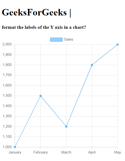
Example: The below code uses a callback function to format the labels of Y-axis.
HTML
<!DOCTYPE html>
<html lang="en">
<head>
<meta charset="UTF-8">
<meta name="viewport" content=
"width=device-width, initial-scale=1.0">
<title>Formatted Y-axis Labels</title>
<script src=
</script>
</head>
<style>
div {
height: 400px;
width: 400px;
}
</style>
<body>
<h1>
GeeksForGeeks |
</h1>
<p>
<b>
format the labels of the Y
axis in a chart?
</b>
</p>
<div>
<canvas id="myChart" width="400"
height="400">
</canvas>
</div>
<script>
const ctx =
document.getElementById('myChart').
getContext('2d');
const myChart = new Chart(ctx, {
type: 'line',
data: {
labels:
['January', 'February',
'March', 'April', 'May'],
datasets: [{
label: 'Sales',
data:
[1000, 1500, 1200,
1800, 2000],
backgroundColor:
'rgba(54, 162, 235, 0.5)',
borderColor:
'rgba(54, 162, 235, 1)',
borderWidth: 1
}]
},
options: {
scales: {
yAxes: [{
ticks: {
callback:
function (value, index, values) {
return '$' +
value.toLocaleString();
}
}
}]
}
}
});
</script>
</body>
</html>
|
Output:
You can use the Intl.NumberFormat object for number formatting. Here’s how you can integrate it:
- In the HTML design, we used the main tag <canvas> to show the line graph. The element serves as the container for the pie chart visualization.
- It includes the Chart.js library through a CDN.
Syntax:
const formatter = new Intl.NumberFormat('en-US', {
  style: 'currency',
  currency: 'USD'
});
Example: The below code uses intl.NumberFormat() method to format the labels of Y-axis.
HTML
<!DOCTYPE html>
<html lang="en">
<head>
<meta charset="UTF-8">
<meta name="viewport" content=
"width=device-width, initial-scale=1.0">
<title>
Formatted Y-axis Labels
</title>
<script src=
</script>
</head>
<style>
div {
height: 400px;
width: 400px;
}
</style>
<body>
<h1>
GeeksForGeeks |
</h1>
<p>
<b>
format the labels of the Y
axis in a chart?
</b>
</p>
<div>
<canvas id="myChart" width="400"
height="400">
</canvas>
</div>
<script>
const ctx =
document.getElementById('myChart').
getContext('2d');
const formatter =
new Intl.NumberFormat('en-US', {
style: 'currency',
currency: 'USD'
});
var myChart = new Chart(ctx, {
type: 'line',
data: {
labels:
['January', 'February',
'March', 'April', 'May'],
datasets: [{
label: 'Sales',
data:
[1000, 1500, 1200, 1800, 2000],
backgroundColor:
'rgba(54, 162, 235, 0.5)',
borderColor:
'rgba(54, 162, 235, 1)',
borderWidth: 1
}]
},
options: {
scales: {
yAxes: [{
ticks: {
callback:
function (value, index, values) {
return formatter.format(value);
}
}
}]
}
}
});
</script>
</body>
</html>
|
Output:

Using a Custom Plugin
- This code draw the 2d drawing context of the canvas element with the ID ‘mychart’.
- You can create a custom plugin to handle label formatting.
- This Code sets a line chart using chart.js and ensures that the Y-axis labels are formatted as currency values.
Syntax:
Chart.plugins.register({
  beforeRender: function(chart) {
    const yAxis = chart.scales['y-axis-0'];
    yAxis.options.ticks.callback = function(value, index, values) {
      return '$' + value.toLocaleString(); // Format as currency
    };
  }
});
Example: The below code explains the use of custom plugin to format the labels of Y-axis.
HTML
<!DOCTYPE html>
<html lang="en">
<head>
<meta charset="UTF-8">
<meta name="viewport" content=
"width=device-width, initial-scale=1.0">
<title>
Formatted Y-axis Labels
</title>
<script src=
</script>
</head>
<style>
div {
height: 400px;
width: 400px;
}
</style>
<body>
<h1>
GeeksForGeeks |
</h1>
<p>
<b>
format the labels of the Y
axis in a chart?
</b>
</p>
<div>
<canvas id="myChart" width="400"
height="400">
</canvas>
</div>
<script>
const ctx =
document.getElementById('myChart').
getContext('2d');
Chart.plugins.register({
beforeRender: function (chart) {
var yAxis = chart.scales['y-axis-0'];
yAxis.options.ticks.callback =
function (value, index, values) {
return '$' + value.toLocaleString();
};
}
});
var myChart = new Chart(ctx, {
type: 'line',
data: {
labels:
['January', 'February',
'March', 'April', 'May'],
datasets: [{
label: 'Sales',
data:
[1000, 1500, 1200, 1800, 2000],
backgroundColor:
'rgba(54, 162, 235, 0.5)',
borderColor:
'rgba(54, 162, 235, 1)',
borderWidth: 1
}]
}
});
</script>
</body>
</html>
|
Output:
Share your thoughts in the comments
Please Login to comment...