How to fix “Tailwind CSS responsive breakpoint overrides not working” issue ?
Last Updated :
21 Nov, 2023
In this article, we will see how to fix an issue with Tailwind CSS where responsive breakpoint overrides do not function and then will understand their basic implementation to resolve the issue with different approaches.
Tailwind CSS is a popular utility-first CSS framework that simplifies the styling of web applications. One of its powerful features is responsive breakpoints, allowing you to adjust styles based on the screen size. However, there are some cases when Tailwind CSS responsive breakpoint overrides may not work as expected. We will understand this issue with the help of the following example.
Below are the 2 approaches through which the Tailwind CSS can be utilized in the Project:
Through npm:
- Basically, Tailwind is available on npm and you can install it using the following command:
npm install tailwindcss
- After that create an add Tailwind configuration file using the following command:
npm tailwind init {name of file}
Tailwind CSS CDN Link:
<link href=
”https://cdn.jsdelivr.net/npm/tailwindcss@2.2.7/dist/tailwind.min.css”
         rel=”stylesheet”>
Cause of Error:
The issue arises due to the conflicting usage of responsive width classes in the Tailwind CSS framework. For example, the class lg:w-1/2 sets the width to half on large screens, and sm:w-full sets it to full width on small screens. However, the subsequent !lg:w-1/4 attempts to override the large screen width, creating a conflict. This conflicting combination of responsive width classes can lead to unexpected behavior and layout issues in the design.
Example: This example illustrates the override of the responsive breakpoint issue in Tailwind CSS.
HTML
<!DOCTYPE html>
<html lang="en">
<head>
<meta charset="UTF-8">
<meta name="viewport"
content="width=device-width,
initial-scale=1.0">
<title>
Tailwind CSS Breakpoint Error Example
</title>
<link href=
rel="stylesheet">
</head>
<body>
<div class="lg:w-1/2 sm:w-full !lg:w-1/4 bg-blue-200 p-4">
<p>
This is a div with a conflicting
custom breakpoint.
</p>
</div>
</body>
</html>
|
Output:

Tailwind CSS offers a straightforward syntax for responsive design using breakpoints. The syntax typically involves adding responsive classes to HTML elements, like sm:, md:, lg:, and xl:, followed by the desired utility class.
Syntax
<div class="lg:w-1/2">
    This element is
    half-width on large screens
</div>
Solution
The below approaches will utilized to resolve the override of the responsive breakpoint issue in Tailwind CSS.
Check Configuration
Tailwind CSS allows you to customize breakpoints by configuring them. This ensures that the breakpoints are correctly configured, and there are no typos or inconsistencies in your custom breakpoint values.
Approach
- Create an HTML document with meta tags and a viewport for responsiveness.
- Use Tailwind CSS (v2.2.19) from a CDN, linking it in the head section.
- Structure a centered, responsive layout with a white container and shadow.
- Design a gradient heading with varying colors based on screen size.
Example 1: This example illustrates the fixing of override of the responsive breakpoint issue in Tailwind CSS. Here, we need to ensure that the Tailwind CSS configuration includes responsive breakpoints.
HTML
<!DOCTYPE html>
<html lang="en">
<head>
<meta charset="UTF-8">
<meta name="viewport"
content="width=device-width,
initial-scale=1.0">
<title>Enhanced UI</title>
<link rel="stylesheet"
href=
</head>
<body class="bg-gray-100 flex items-center
justify-center h-screen">
<div class="bg-white rounded-lg
shadow-lg p-8">
<p class="text-blue-500
sm:text-red-500
md:text-green-500
lg:text-yellow-500 xl:text-purple-500
text-center text-3xl font-bold pb-4">
Geeks For Geeks
</p>
<p class="text-gray-700 text-center">
Explore the world of coding and technology
with our expert articles and tutorials.
</p>
</div>
</body>
</html>
|
Output: In this corrected code, the background color of the div should now change at different breakpoints (sm, md, lg, and xl) based on the updated configuration.
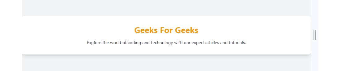
Output
CSS Order
Tailwind CSS relies on the order of classes. The last class applied takes precedence. Check the order of your classes to ensure that responsive classes are not overridden by subsequent classes.
Approach
- Design an HTML document with appropriate meta tags and Tailwind CSS linked from a CDN.
- Create a centered, responsive layout with a gray background and flex properties.
- Implement a text container with a default gray color, overriding it with blue on medium screens and green on large screens using Tailwind’s responsive classes.
- Ensure that the order of classes is correct, placing responsive classes after non-responsive ones to avoid unintended overrides in your Tailwind CSS.
Example: This is another example that illustrates fixing the issue for override of the responsive breakpoint in Tailwind CSS by ensuring that responsive classes come after non-responsive classes in the HTML.
HTML
<!DOCTYPE html>
<html lang="en">
<head>
<meta charset="UTF-8">
<meta name="viewport"
content="width=device-width,
initial-scale=1.0">
<title>Improved Responsive Text Color</title>
<link rel="stylesheet"
href=
</head>
<body class="bg-gray-100 flex items-center
justify-center h-screen">
<div class="text-center text-gray-600
md:text-blue-500 lg:text-green-500">
<p class="text-2xl font-bold p-4">
Geeks For Geeks
</p>
</div>
</body>
</html>
|
Output: In this corrected example, the text color should change at different breakpoints (md and lg) as specified, and it works because responsive classes come after non-responsive classes.
.gif)
Share your thoughts in the comments
Please Login to comment...