How to Get Tailwind CSS Active Breakpoint in JavaScript ?
Last Updated :
04 Oct, 2023
In JavaScript, a Tailwind CSS active breakpoint refers to a specific breakpoint configuration in the Tailwind CSS framework that is currently active, which allows web designers to target specific screen sizes and also consider their styles and functionalities efficiently. In this article, we will see how we can get Tailwinds active breakpoints in JavaScript.
There are two common methods that can be used to get tailwinds active breakpoint in JavaScript, which are listed below:
We will explore all the above methods along with their basic implementation with the help of examples.
Approach 1: Using Tailwind CSS Utility Classes
In this approach, the Tailwind CSS framework and JavaScript dynamically display the active breakpoint and screen size by listening to window resize events and applying specific styles based on the viewport width.
Syntax:
<div id="app" class="bg-red-200
            sm:bg-blue-200
            md:bg-green-200
            lg:bg-yellow-200
            xl:bg-pink-200
            p-4">
</div>
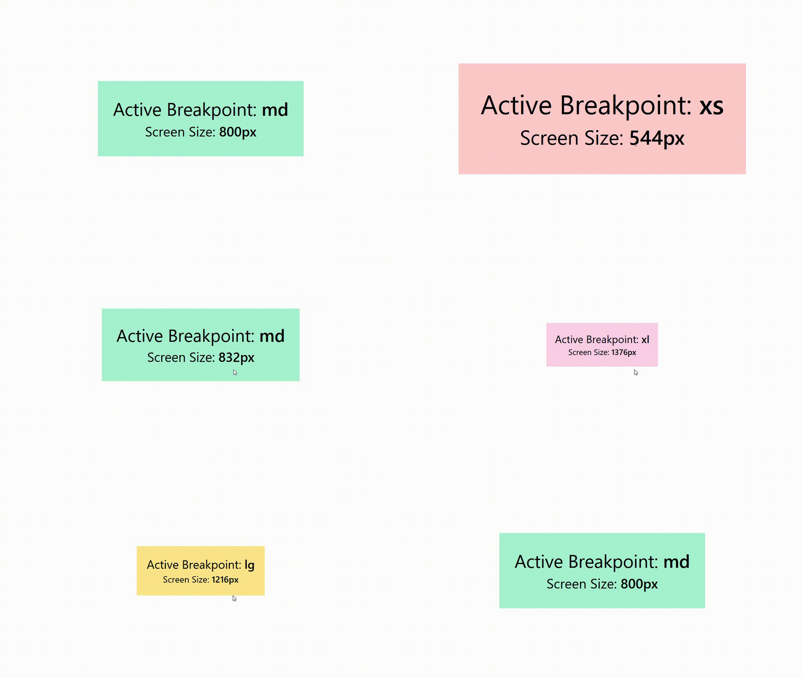
Example: In this example, we are using the Tailwind CSS utility classes for screen sizes or breakpoints. Using the JavaScript, we are dynamically updating and displaying the active breakpoint and screen size. JavaScript listens for window resize events and also updates the displayed breakpoint and screen which is based on media query breakpoints.
HTML
<!DOCTYPE html>
<html lang="en">
<head>
<meta charset="UTF-8">
<meta name="viewport" content=
"width=device-width, initial-scale=1.0">
<link href=
rel="stylesheet">
<title>Tailwind CSS Breakpoint</title>
</head>
<body class="flex justify-center
items-center
min-h-screen
m-0">
<div id="app" class="bg-red-200
sm:bg-blue-200
md:bg-green-200
lg:bg-yellow-200
xl:bg-pink-200
p-4">
<p class="text-2xl">
Active Breakpoint:
<span id="breakpoint"
class="font-semibold">
</span>
</p>
<p class="text-lg">
Screen Size:
<span id="screenSize"
class="font-semibold">
</span>
</p>
</div>
<script>
function updatingActiveBreakpoint() {
const breakpoints = {
'xs': '(max-width: 639px)',
'sm': '(min-width: 640px) and (max-width: 767px)',
'md': '(min-width: 768px) and (max-width: 1023px)',
'lg': '(min-width: 1024px) and (max-width: 1279px)',
'xl': '(min-width: 1280px)',
};
let appElement = document.getElementById("app");
for (const breakpoint in breakpoints) {
if (window.matchMedia(breakpoints[breakpoint])
.matches) {
document.getElementById("breakpoint"
).textContent = breakpoint;
break;
}
}
let screenSize = window.innerWidth + "px";
document.getElementById("screenSize"
).textContent = screenSize;
}
window.addEventListener('resize',
updatingActiveBreakpoint);
updatingActiveBreakpoint();
</script>
</body>
</html>
|
Output: 
In this apporcah, we are using the JS and Media Queries to dynamically track the active Tailwind CSS breakpoint. JS checks dor the widow’s width against the predefined breakpoints using media queries.
Syntax:
function getActiveBreakpoint() {
    if (window.matchMedia('(min-width: 1280px)').matches) {
        return 'xl';
    } else if (window.matchMedia('(min-width: 1024px)').matches) {
        return 'lg';
    } else if (window.matchMedia('(min-width: 768px)').matches) {
        return 'md';
    } else if (window.matchMedia('(min-width: 640px)').matches) {
        return 'sm';
    } else {
        return 'default';
    }
};
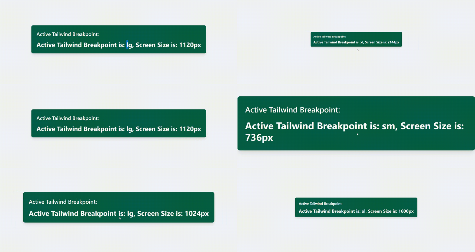
Example: In this example, we have used ‘window.matchMedia’ to check the current window width against the predefined breakpoints.
HTML
<!DOCTYPE html>
<html lang="en">
<head>
<meta charset="UTF-8">
<meta name="viewport" content=
"width=device-width, initial-scale=1.0">
<title>Tailwind Active Breakpoint</title>
<link href=
rel="stylesheet">
</head>
<body class="bg-gray-100">
<div class="flex justify-center
items-center
h-screen">
<div class="bg-green-800
text-white
p-6
rounded-lg
shadow-lg">
<h1 class="text-2xl
font-semibold
mb-4">
Active Tailwind Breakpoint:
</h1>
<div id="break-info"
class="text-3xl font-bold">
</div>
</div>
</div>
<script>
function getActiveBreakpoint() {
if (window.matchMedia(
'(min-width: 1280px)').matches) {
return 'xl';
} else if (window.matchMedia(
'(min-width: 1024px)').matches) {
return 'lg';
} else if (window.matchMedia(
'(min-width: 768px)').matches) {
return 'md';
} else if (window.matchMedia(
'(min-width: 640px)').matches) {
return 'sm';
} else {
return 'default';
}
}
function updatingBreakInfo() {
const breakInfo =
document.getElementById('break-info');
const activeBreakpoint = getActiveBreakpoint();
if (activeBreakpoint) {
breakInfo.textContent = activeBreakpoint;
}
}
window.addEventListener('resize', updatingBreakInfo);
updatingBreakInfo();
</script>
</body>
</html>
|
Output:

Share your thoughts in the comments
Please Login to comment...