How to create text-reveal effect using HTML and CSS ?
Last Updated :
30 Jan, 2024
Text-reveal is a type of effect in which all the alphabets of the text are revealed one by one in some animated way. There are uncountable ways to animate text for this effect. It is up to your creativity how you want the text to reveal. We will look at a basic and easy way to get started.
In this, we will create a text-reveal effect by wrapping your text in a `<div>` inside a container. Apply CSS with keyframes to the container for a gradual reveal, creating a visually appealing effect. The approach is to animate frames to slowly reveal the text frame-wise.
Note: You can change the value of height and width used in each frame to reveal text differently.
Example: In this example, we will see how to create text-reveal effects using HTML and CSS.
html
< !DOCTYPE html>
<html lang="en">
<head>
<meta charset="UTF-8">
<meta name="viewport"
content="width=device-width, initial-scale=1.0">
<title>Text Reveal Animation</title>
<style>
body {
background: green;
}
.geeks {
width: 20%;
top: 50%;
position: absolute;
left: 40%;
border-bottom: 5px solid white;
overflow: hidden;
animation: animate 2s linear forwards;
}
.geeks h1 {
color: white;
}
@keyframes animate {
0% {
width: 0px;
height: 0px;
}
30% {
width: 50px;
height: 0px;
}
60% {
width: 50px;
height: 80px;
}
}
</style>
</head>
<body>
<div class="geeks">
<h1>GeeksforGeeks</h1>
</div>
</body>
</html>
|
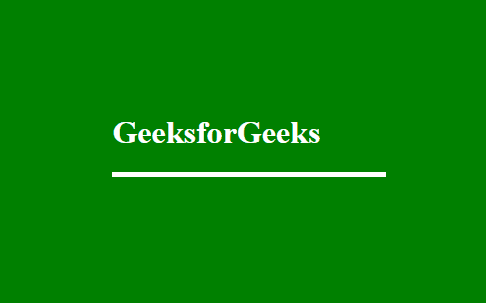
Output:
Using Clip-path
In this we will achieve a text-reveal effect using clip-path in HTML and CSS by applying the clip-path’ property to the text element with a polygon shape, creating a gradual reveal as defined in the animation.
Example: In this example, we will see how to create text-reveal effects using HTML and CSS.
HTML
<!DOCTYPE html>
<html lang="en">
<head>
<meta charset="UTF-8">
<title>Collecting Data</title>
<link rel="stylesheet" href=
integrity=
"sha384-TX8t27EcRE3e/ihU7zmQxVncDAy5uIKz4rEkgIXeMed4M0jlfIDPvg6uqKI2xXr2"
crossorigin="anonymous">
<style>
body {
margin: 0px;
height: 100vh;
display: flex;
align-items: center;
justify-content: center;
background: #ddd;
}
.container {
margin-top: 50px;
width: 50%;
height: auto;
}
.text-typing {
padding: 20px 30px;
background: #f5f5f5;
font-size: 35px;
font-family: monospace;
border-radius: 50px;
overflow: hidden;
position: relative;
}
.text-typing p {
margin: 0px;
white-space: nowrap;
clip-path: polygon(0 0, 0 100%, 100% 100%, 100% 0);
animation:
typing 4s steps(22, end) forwards, blink 1s infinite;
}
@keyframes typing {
0% {
width: 0%
}
100% {
width: 100%
}
}
@keyframes blink {
0%,
100% {
border-right: 2px solid transparent;
}
50% {
border-right: 2px solid #222;
}
}
</style>
</head>
<body class="container">
<div class="text-typing">
<p>Geeks For Geeks</p>
</div>
</body>
</html>
|
Output:

Share your thoughts in the comments
Please Login to comment...