How to Create Responsive Divs in Bootstrap ?
Last Updated :
19 Mar, 2024
In Bootstrap, it’s important to make sure your website looks good and works well on all sorts of devices. Responsive design is the way to make this happen, and Bootstrap gives you tools to do it easily.
Below are the approaches to create responsive div in Bootstrap:
Using Bootstrap’s Grid System
The grid system in Bootstrap provides a flexible and easy-to-use layout system for organizing content into rows and columns. By dividing your content into these grid-based structures, you can create responsive designs that adapt to various screen sizes.
- container: Defines a container element to hold the content.
- row: Creates a row to contain the columns.
- col-sm-6: Defines a column that spans half the width of its container on small devices and larger.
Example: The below mentioned approach shows the implementation of responsive divs in Bootstrap.
HTML
<!DOCTYPE html>
<html>

<head>
    <title>Responsive divs using Bootstrap</title>
    <meta name="viewport"
          content="width=device-width, initial-scale=1">
    <link rel="stylesheet"
          href=
"https://maxcdn.bootstrapcdn.com/bootstrap/3.4.1/css/bootstrap.min.css">
    <script src=
"https://ajax.googleapis.com/ajax/libs/jquery/3.6.0/jquery.min.js">
      </script>
    <script src=
"https://maxcdn.bootstrapcdn.com/bootstrap/3.4.1/js/bootstrap.min.js">
      </script>
</head>

<body>
    <div class="container">
        <div class="row">
            <div class="col-sm-6 bg-primary">
                  Half Width Content 1
              </div>
            <div class="col-sm-6 bg-danger">
                  Half Width Content 2
              </div>
        </div>
    </div>
</body>

</html>
Output:
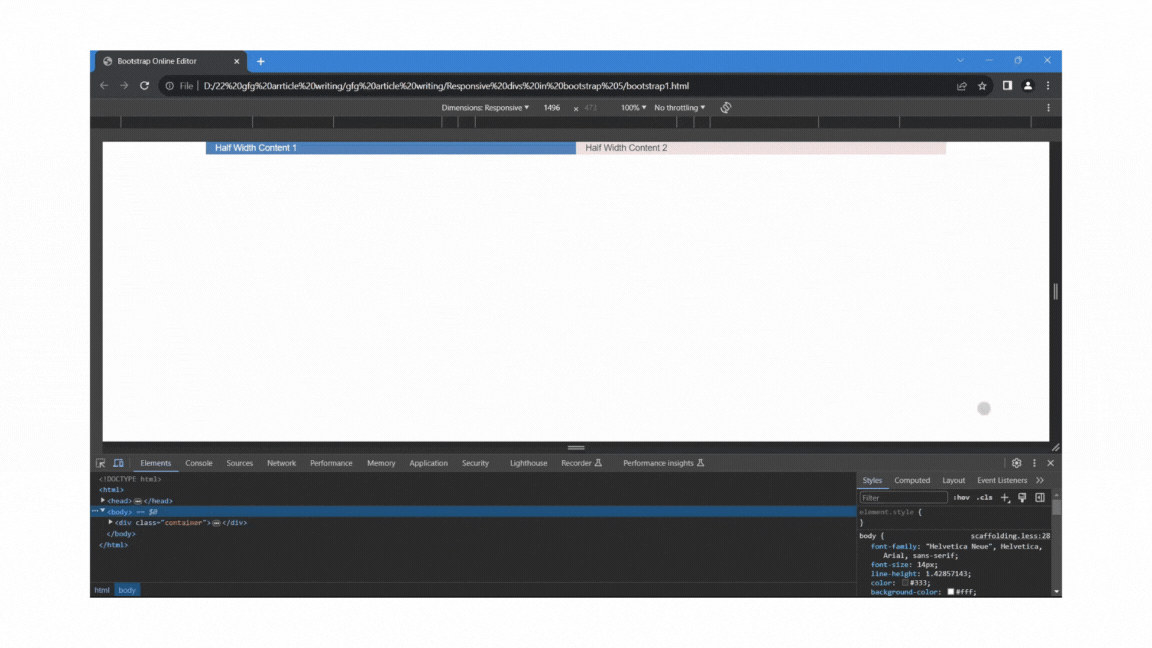
Bootstrp Responsive divs Using Bootstrap’s Grid System
Using Bootstrap’s Responsive Utility classes
In addition to the grid system, Bootstrap provides a set of responsive utility classes that allow you to control the visibility and alignment of content based on the screen size.
- d-none: Hides the element.
- d-md-block: Shows the element on medium and larger devices.
- d-sm-block: Shows the element on small devices.
- d-md-none: Hides the element on medium and larger devices.
- d-sm-none: Hides the element on small devices.
Example: The below mentioned approach shows the implementation of responsive divs in Bootstrap.
HTML
<!DOCTYPE html>
<html>

<head>
    <title>Responsive divs using Bootstrap </title>
    <meta name="viewport" content="width=device-width, initial-scale=1">
    <link href=
"https://cdn.jsdelivr.net/npm/bootstrap@5.3.3/dist/css/bootstrap.min.css"
          rel="stylesheet"
          integrity=
"sha384-QWTKZyjpPEjISv5WaRU9OFeRpok6YctnYmDr5pNlyT2bRjXh0JMhjY6hW+ALEwIH"
          crossorigin="anonymous">
    <script src=
"https://cdn.jsdelivr.net/npm/bootstrap@5.3.3/dist/js/bootstrap.bundle.min.js"
        integrity=
"sha384-YvpcrYf0tY3lHB60NNkmXc5s9fDVZLESaAA55NDzOxhy9GkcIdslK1eN7N6jIeHz"
        crossorigin="anonymous">
      </script>
</head>

<body>
    <div class="d-block d-sm-none bg-danger">
          Visible on Extra Small devices
      </div>
    <div class="d-none d-sm-block d-md-none bg-info">
          Visible on Small devices
      </div>
    <div class="d-none d-md-block bg-success ">
          Visible on Medium and larger devices
      </div>
</body>

</html>
Output:
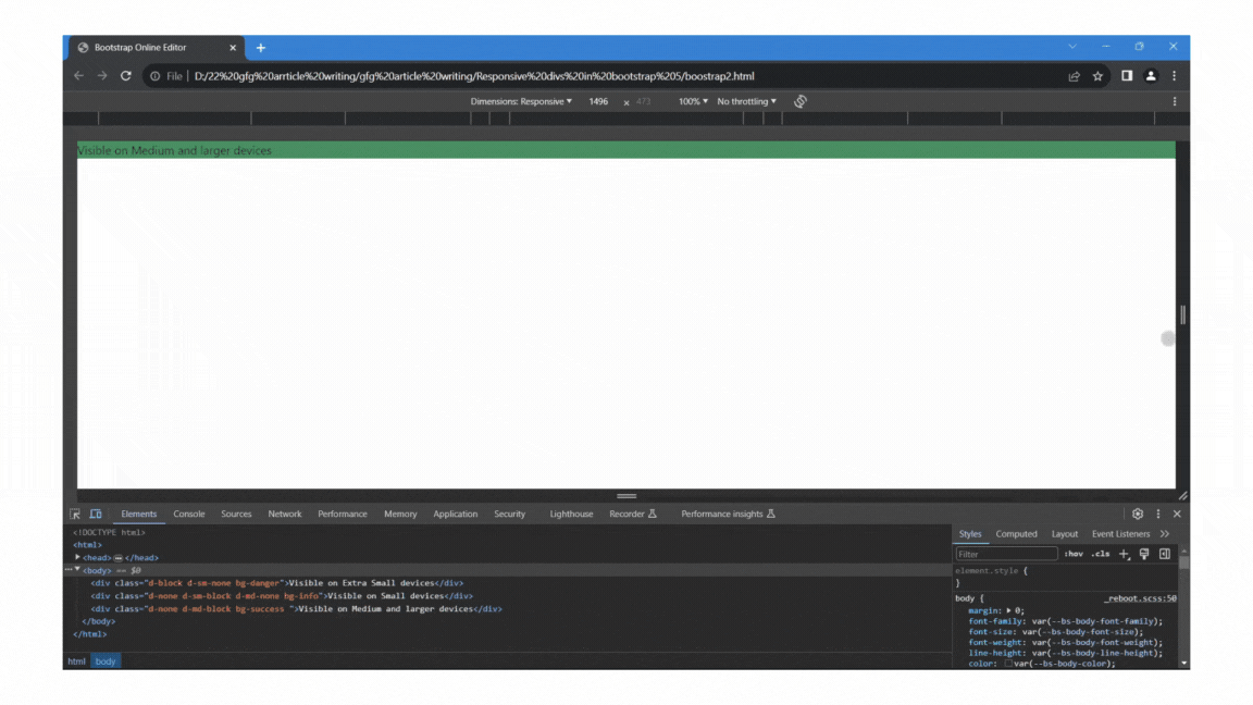
Bootstrp Responsive divs Using Bootstrap’s utility classes
Share your thoughts in the comments
Please Login to comment...