How to Create Dark/Light Theme in Bootstrap with React?
Last Updated :
07 May, 2024
Creating dark/light themes and integrating them into a React application enhances user experience by providing visual customization options, improving readability, and allowing users to switch between themes based on their preferences. In this article, we will learn to create dark/light theme in Bootstrap 5 with React.
Steps to Create the React Application
Step 1: Create React Project
npx create-react-app theme
Step 2: Navigate to the project directory
cd theme
Step 3: Installing required modules
npm install react-bootstrap bootstrap
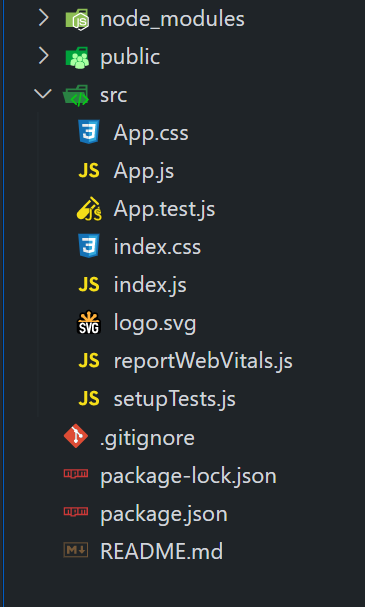
Project Structure:
The updated dependencies in package.json file will look like:
"dependencies": {
    "@testing-library/jest-dom": "^5.17.0",
    "@testing-library/react": "^13.4.0",
    "@testing-library/user-event": "^13.5.0",
    "bootstrap": "^5.3.3",
    "react": "^18.2.0",
    "react-dom": "^18.2.0",
    "react-bootstrap": "^2.10.2",
    "react-scripts": "5.0.1",
    "web-vitals": "^2.1.4"
}
Using Bootstrap’s built-in dark mode
- In this approach, we are using Bootstrap’s built-in dark mode by toggling a state (isDarkMode) to switch between light and dark themes.
- The container’s background and text color classes (bg-dark, text-light for dark mode, and bg-light for light mode) are dynamically applied based on the state.
- The toggleDarkMode function switches the theme when the toggle button is clicked.
Example: Implementation of the above approach.
JavaScript
// Filename - App.js

import React, { useState } from 'react';
import 'bootstrap/dist/css/bootstrap.min.css';
import { Container, Button } from 'react-bootstrap';

function App() {
  const [isDarkMode, setIsDarkMode] = useState(false);

  const toggleDarkMode = () => {
    setIsDarkMode((prevMode) => !prevMode);
  };

  return (
    <>
      <h1 className="text-center mb-5">
          Using Bootstrap's built-in dark mode
       </h1>
      <Container
        className={`d-flex flex-column justify-content-center
        align-items-center ${isDarkMode ?
        'bg-dark text-light' : 'bg-light'}`}
        style={{ minHeight: '70vh' }}
      >
        <h1>{isDarkMode ? 'Dark Theme' : 'Light Theme'}</h1>
        <Button variant="primary" onClick={toggleDarkMode}>
          Toggle Theme
        </Button>
      </Container>
    </>
  );
}

export default App;
Output:

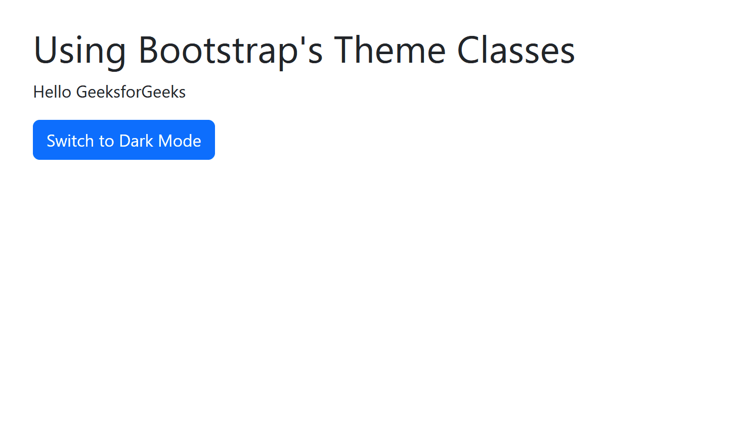
Using Bootstrap’s Theme Classes
- In this approach, we are using Bootstrap’s theme classes to toggle between dark and light themes in React.
- By dynamically adding the “theme-dark” or “theme-light” class to the main container, we control the overall theme appearance.
- Additionally, we utilize the data-bs-theme attribute on the HTML element to apply Bootstrap’s built-in dark mode feature for a consistent styling experience.
Example: Implementation of the above approach.
JavaScript
// Filename - App.js

import React, { useState } from 'react';
import 'bootstrap/dist/css/bootstrap.min.css';
import { Container, Button } from 'react-bootstrap';
const App = () => {
  const [darkMode, setDarkMode] = useState(false);
  const toggleTheme = () => {
    setDarkMode(!darkMode);
    const htmlElement = document.querySelector('html');
    htmlElement.setAttribute('data-bs-theme',
    darkMode ? 'dark' : 'light');
  };
  return (
    <div className={`App ${darkMode ? 'theme-dark' : 'theme-light'}`}>
      <Container className="py-4">
        <h1>Using Bootstrap's Theme Classes</h1>
        <p>Hello GeeksforGeeks</p>
        <Button variant="primary" onClick={toggleTheme}>
          {darkMode ? 'Switch to Light Mode' : 'Switch to Dark Mode'}
        </Button>
      </Container>
    </div>
  );
};
export default App;
Output:
Share your thoughts in the comments
Please Login to comment...