How to Create a Bootstrap Dark Theme without Duplicating CSS ?
Last Updated :
24 Nov, 2023
In this article, we will create a bootstrap dark theme without duplicating CSS. Creating a Bootstrap dark theme without duplicating CSS can help you maintain a more organized and efficient codebase for your web projects. In this article, we will explore different approaches to achieving a dark theme for Bootstrap. A dark theme is not only aesthetically pleasing but can also reduce eye strain, especially in low-light conditions. To create a Bootstrap dark theme without duplicating CSS, we’ll explore a few different methods.
Using CSS Customization
In this method, creating a Bootstrap dark theme involves customizing the default Bootstrap styles using CSS. By selectively overriding specific classes and variables, developers can tweak the appearance without duplicating the entire CSS. This approach offers fine-grained control, allowing modifications to match the desired dark theme aesthetics while minimizing redundancy in the stylesheet.
Syntax
selector {
    property: value;
}
Using the Sass/SCSS Variables Override Method
Sass/SCSS variables override is a more modular and maintainable approach to creating a dark theme for Bootstrap. It involves using Sass/SCSS, which is a CSS pre-processor, to override Bootstrap’s default variables and create a consistent and easily updatable dark theme. Instead of directly changing CSS styles, you modify variables that Bootstrap uses for its core styling. This approach allows you to make changes globally by redefining these variables.
Syntax
/* Syntax for Sass/SCSS Variables Override */
$variable-name: value;
Using Custom Stylesheet
In this approach, a custom stylesheet is created to make all the necessary style modifications for the Bootstrap dark theme. By maintaining a separate stylesheet, we can neatly organize and isolate theme-related styles without directly altering Bootstrap’s core files. This method provides flexibility, and ease of maintenance, and avoids cluttering the main stylesheet.
Syntax
<!-- Linking a Custom Stylesheet in HTML -->
<link rel="stylesheet" href="custom-styles.css">
Bootstrap Themes
Bootstrap itself provides themes that you can use as a foundation for customization. This involves selecting a Bootstrap theme and then customizing it further to achieve a dark theme. This method provides a good balance between customization and maintainability.
Example 1: In this example, we will implement code to demonstrate a simple dark theme.
HTML
<!DOCTYPE html>
<html lang="en">
<head>
<meta charset="UTF-8">
<meta name="viewport"
content="width=device-width,
initial-scale=1,
shrink-to-fit=no">
<title>GeeksforGeeks Dark Theme</title>
<link rel="stylesheet"
href=
<link rel="stylesheet"
href="style.css">
</head>
<body>
<nav class="navbar navbar-expand-lg
navbar-dark bg-dark">
<a class="navbar-brand text-success"
href="#">
GeeksforGeeks
</a>
<button class="navbar-toggler"
type="button"
data-toggle="collapse"
data-target="#navbarNav"
aria-controls="navbarNav"
aria-expanded="false"
aria-label="Toggle navigation">
<span class="navbar-toggler-icon"></span>
</button>
<div class="collapse navbar-collapse" id="navbarNav">
<ul class="navbar-nav ml-auto">
<li class="nav-item active">
<a class="nav-link"
href="#">
Home
<span class="sr-only">
(current)
</span>
</a>
</li>
<li class="nav-item">
<a class="nav-link"
href="#">
About
</a>
</li>
<li class="nav-item">
<a class="nav-link"
href="#">
Services
</a>
</li>
</ul>
</div>
</nav>
<div class="container">
<div class="custom-section">
<h2>Welcome to GeeksforGeeks Dark Theme</h2>
<p>
This is a sample section
demonstrating the dark theme
with GeeksforGeeks branding.
</p>
</div>
</div>
</body>
</html>
|
CSS
body {
background-color: #1e1e1e;
color: #fff;
}
.navbar-dark .navbar-nav .nav-link {
color: #fff;
}
.navbar-dark .navbar-brand {
color: #fff;
font-weight: bold;
}
.gfg-logo {
max-width: 50px;
}
.custom-section {
padding: 20px;
margin: 20px 0;
border-radius: 8px;
background-color: #333;
}
|
Output:
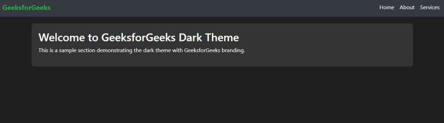
Dark Theme
Example 2: In this example, we will implement code to demonstrate a toggle between a dark theme and a light theme.
HTML
<!DOCTYPE html>
<html lang="en">
<head>
<meta charset="UTF-8">
<meta name="viewport"
content="width=device-width,
initial-scale=1,
shrink-to-fit=no">
<title>GeeksforGeeks Theme Toggle</title>
<link rel="stylesheet"
href=
<link id="theme-link"
rel="stylesheet"
href="styles-light.css">
<link rel="stylesheet"
href="styles.css">
</head>
<body>
<nav class="navbar navbar-expand-lg
navbar-dark bg-dark">
<a class="navbar-brand text-success"
href="#">
GeeksforGeeks
</a>
<button class="navbar-toggler"
type="button"
data-toggle="collapse"
data-target="#navbarNav"
aria-controls="navbarNav"
aria-expanded="false"
aria-label="Toggle navigation">
<span class="navbar-toggler-icon"></span>
</button>
<div class="collapse navbar-collapse"
id="navbarNav">
</div>
</nav>
<div class="text-center mt-3">
<label class="switch">
<input type="checkbox"
id="theme-toggle">
<span class="slider round"></span>
</label>
<span class="ml-2">
Toggle Theme
</span>
</div>
<div class="container">
<div class="custom-section">
<h2>Welcome to GeeksforGeeks Theme Toggle</h2>
<p>
This is a sample section
demonstrating the theme toggle
with GeeksforGeeks branding.
</p>
</div>
</div>
<script src="script.js"></script>
</body>
</html>
|
CSS
.gfg-logo {
max-width: 50px;
}
.custom-section {
padding: 20px;
margin: 20px 0;
border-radius: 8px;
}
|
CSS
body {
background-color: #fff;
color: #000;
}
|
CSS
body {
background-color: #1e1e1e;
color: #fff;
}
|
Javascript
document.addEventListener('DOMContentLoaded', function () {
const themeToggle =
document.getElementById('theme-toggle');
const themeLink =
document.getElementById('theme-link');
themeToggle.addEventListener('change', function () {
if (themeToggle.checked) {
themeLink.href = 'styles-dark.css';
} else {
themeLink.href = 'styles-light.css';
}
});
});
|
Output:
Share your thoughts in the comments
Please Login to comment...