How to create card animation using React Transition Group ?
Last Updated :
06 Nov, 2023
Creating card animation using React Transition Group simply refers to displaying animations in the card when any DOM event occurs. React transition group provide simple and easy-to-use components to display animation in the React components.
Prerequisites:
Approach
To create card animation using the React Transition Group, we will use the SwitchTransition component of the React Transition Group. The SwitchTransition component has two modes: in-out and out-in. The next card will appear first before the previous card disappears and replaces its position. The card will disappear first then the position will be replaced by the next card.
Steps to create React Application
Step 1: Create a React application using the following command:
npx create-react-app demo
Step 2: After creating your project folder i.e. demo, move to it using the following command.
cd demo
Step 3: Install the React Transition Group from the npm.
npm i react-transition-group
Project Structure:
The updated dependencies in package.json file will look like.
"dependencies": {
        "@testing-library/jest-dom": "^5.17.0",
        "@testing-library/react": "^13.4.0",
        "@testing-library/user-event": "^13.5.0",
        "react": "^18.2.0",
        "react-dom": "^18.2.0",
        "react-scripts": "5.0.1",
        "react-transition-group": "^4.4.5",
        "web-vitals": "^2.1.4"
}
Example: This example use React-transition-group to display in-out and out-in card animations.
Javascript
import React, { useState } from "react";
import {
CSSTransition,
SwitchTransition,
} from "react-transition-group";
import "./App.css";
export default function App() {
const [state, setState] = useState(false);
const [mode, setMode] = useState("in-out");
return (
<div className="App">
<div>
<button
className="btn-mode"
onClick={() =>
setMode(
mode === "in-out"
? "out-in"
: "in-out"
)
}
>
Change Mode
</button>
<p className="p-mode">
Current Mode: {mode}
</p>
</div>
<SwitchTransition mode={mode}>
<CSSTransition
key={
state
? "Goodbye, world!"
: "Hello, world!"
}
addEndListener={(node, done) =>
node.addEventListener(
"transitionend",
done,
false
)
}
classNames="fade"
>
<div className="a">
<p>
{state
? "A computer Science Portal"
: "GeeksforGeeks also known as GFG"}
</p>
<button
onClick={() =>
setState((state) => !state)
}
>
{state
? "Go back"
: "Know more"}
</button>
</div>
</CSSTransition>
</SwitchTransition>
</div>
);
}
|
Javascript
.fade-enter {
opacity: 0;
}
.fade-exit {
opacity: 1;
}
.fade-enter-active {
opacity: 1;
}
.fade-exit-active {
opacity: 0;
}
.fade-enter-active,
.fade-exit-active {
transition: opacity 300ms;
}
.a {
width: 300px;
height: 200px;
border: 4px solid green;
border-radius: 10px;
box-shadow: 2px 2px 2px 2px rgb(93, 94, 93, 0.4);
text-align: center;
margin: 20px;
background: rgb(156, 232, 156);
}
p {
font-size: 30px;
color: green;
}
button {
width: 100px;
height: 30px;
border-radius: 4px;
padding: 4px;
color: rgb(38, 47, 96);
font-weight: bold;
background: rgb(195, 246, 197);
}
.btn-mode {
width: 300px;
margin: 20px;
background: rgb(207, 215, 207);
}
button:hover {
border: 4px solid green;
}
.p-mode {
margin: 20px;
color: rgb(43, 111, 52);
}
|
Step to Run Application: Run the application using the following command from the root directory of the project:
npm start
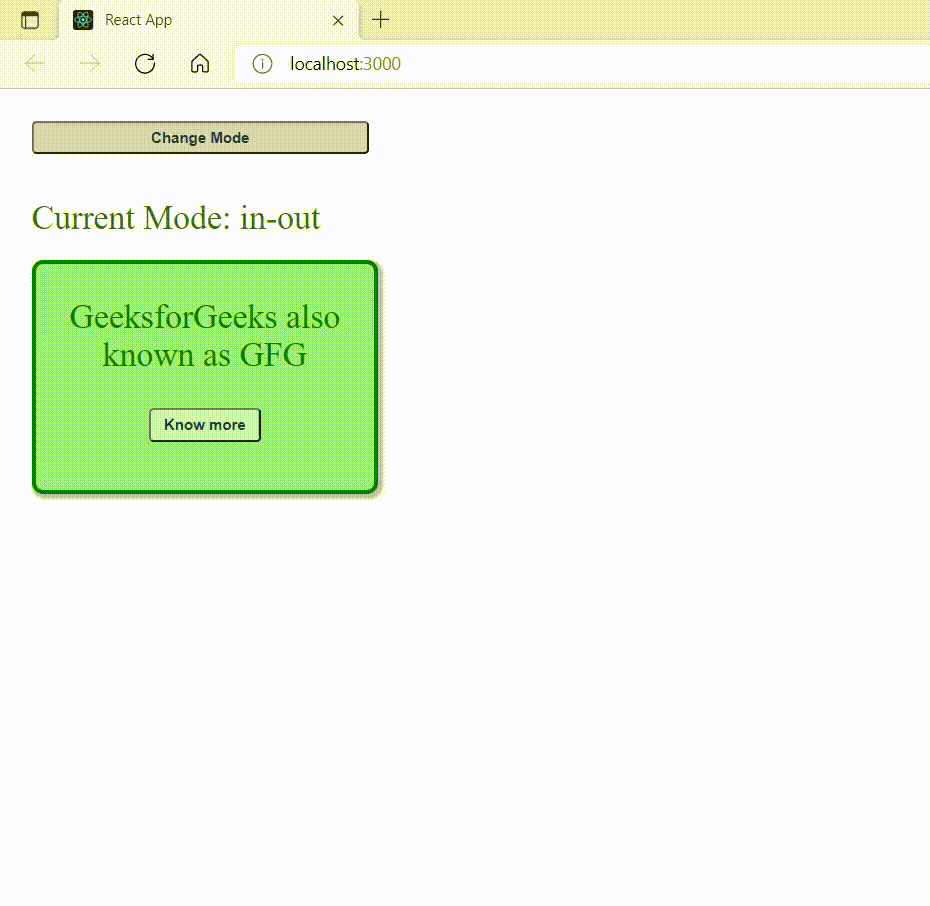
Output: Now open your browser and go to http://localhost:3000/, you will see the following output:
Share your thoughts in the comments
Please Login to comment...