How to Create an Ogive Graph in Python?
Last Updated :
01 Nov, 2022
In this article, we will create an Ogive Graph. An ogive graph can also be called as cumulative histograms, this graph is used to determine the number of values that lie above or below a particular value in a data set. The class interval is plotted on the x-axis whereas the cumulative frequency is plotted on the y-axis. These points are plotted on the graph and joined by lines.
NumPy has a function named a histogram() that represents the frequency of data in a particular set range graphically. The histogram function returns two values first one is the frequency and which is stored in values and the second one is the bin values or the interval between which the numbers from the dataset lie, it is stored in the base variable.
After this we will calculate the cumulative sum which can be done easily with the cumsum() function, it returns the cumulative sum along a particular axis. At last, we will plot the graph using plot() function and passing base as x-axis value and cumsum as y-axis value. We can format the graph using markers, color, and linestyle attributes.
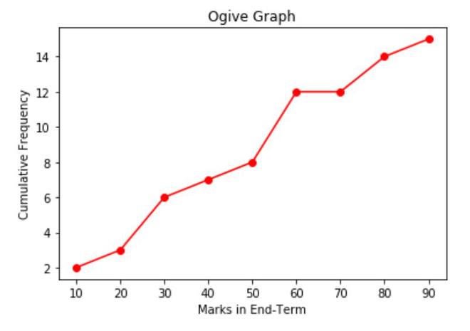
Example 1: (More than Ogive graph)
The more than ogive graph shows the number of values greater than the class intervals. The resultant graph shows the number of values in between the class interval. Eg- 0-10,10-20 and so on. Let us take a dataset, and we will now plot it’s more than ogive graph- [22,87,5,43,56,73, 55,54,11,20,51,5,79,31,27].
Table representing intervals, frequency and cumulative frequency(less than)-
| Class Interval |
Frequency |
Cumulative Frequency |
| 0-10 |
2 |
2 |
| 10-20 |
1 |
3 |
| 20-30 |
3 |
6 |
| 30-40 |
1 |
7 |
| 40-50 |
1 |
8 |
| 50-60 |
4 |
12 |
| 60-70 |
0 |
12 |
| 70-80 |
2 |
14 |
| 80-90 |
1 |
15 |
Approach:
- Import the modules (matplotlib and numpy).
- Calculate the frequency and cumulative frequency of the data.
- Plot it using the plot() function.
Python3
import numpy as np
import matplotlib.pyplot as plt
data = [22, 87, 5, 43, 56, 73, 55, 54, 11, 20, 51, 5, 79, 31, 27]
classInterval = [0, 10, 20, 30, 40, 50, 60, 70, 80, 90]
values, base = np.histogram(data, bins=classInterval)
cumsum = np.cumsum(values)
plt.plot(base[1:], cumsum, color='red', marker='o', linestyle='-')
plt.title('Ogive Graph')
plt.xlabel('Marks in End-Term')
plt.ylabel('Cumulative Frequency')
|
Output:
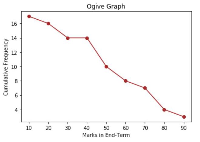
Example 2: (Less than Ogive Graph)
In this example, we will plot less than Ogive graph which will show the less than values of class intervals. Dataset:[44,27,5,2,43,56,77,53,89,54,11,23, 51,5,79,25,39]
Table representing intervals, frequency and cumulative frequency(more than)-
| Class Interval |
Frequency |
Cumulative Frequency |
| 0-10 |
3 |
17 |
| 10-20 |
1 |
16 |
| 20-30 |
3 |
14 |
| 30-40 |
1 |
14 |
| 40-50 |
2 |
10 |
| 50-60 |
4 |
8 |
| 60-70 |
0 |
7 |
| 70-80 |
2 |
4 |
| 80-90 |
1 |
3 |
Approach is same as above only the cumulative sum that we will calculate will be reversed using flipud() function present in the numpy library.
Python3
import numpy as np
import matplotlib.pyplot as plt
data = [44, 27, 5, 2, 43, 56, 77, 53, 89, 54, 11, 23, 51, 5, 79, 25, 39]
classInterval = [0, 10, 20, 30, 40, 50, 60, 70, 80, 90]
values, base = np.histogram(data, bins=classInterval)
cumsum = np.cumsum(values)
res = np.flipud(cumsum)
plt.plot(base[1:], res, color='brown', marker='o', linestyle='-')
plt.title('Ogive Graph')
plt.xlabel('Marks in End-Term')
plt.ylabel('Cumulative Frequency')
|
Output:
Share your thoughts in the comments
Please Login to comment...