The Chart is a pictorial or graphical representation of the data visualization, based on certain conditions There are various types of charts available such as Bar Charts, Line Charts, Pie Charts, etc, that are used to represent important data. In this article, we will see how to create the Line chart using HTML & CSS.
A Line Chart is a chart that is used to display data in the form of points connected by straight lines. It is usually used to display those data that changes from time to time in a continuous manner.
Steps to create a Line chart: Here, we will see the steps to make the Line Chart by applying a little bit of knowledge of mathematics. There are some points that will be plotted on the coordinate axes, X-axis & Y-axis. So suppose we have 5 points ie., (40,80) , (80,120) , (120,80) , (160,120) , (200,80) and take x-axis and y-axis of 250 Units. Now, we will plot these points on the XY plane using the following steps:
Step 1: Create XY Plane: We will use a div tag and put an id selector with the name “chart”. After that, we will apply CSS using that id sector on this div to make it like XY Plane.
<div id="chart"></div>
CSS:
#chart {
    border-bottom: 2px solid black;
    border-left: 2px solid black;
    margin-left:500px;
    margin-top: 100px;
    padding: 0;
    height: 250px;
    width:250px;
    position: relative;
  }
On implementing the above style, we will see the below output:
Step 2: Mark which axis is the x-axis and which axis is the y-axis:
We will use two <p> tags inside that div that contains the x-axis and y-axis and after that position it accordingly using CSS.
<div id="chart">
    <p id="x1">x-axis</p>
    <p id="y1">y-axis</p>
</div>
CSS:
#x1, #y1 {
    position: absolute;
    font-size: larger;
    }
#x1 {
    bottom: -50px;
    left: 100px;
}
#y1{
    left: -60px;
    bottom: 110px;
    }
Here in CSS, we have made the position absolute, so that it can be positioned relative to its parent and then uses left and bottom to do so.
Step 3: Create Points and line segments joining those points:
We will make 4 sets of point and line segments. In those sets, the line segment will be starting from the point present in that set and goes to the nearer point. We will also make a point which will be our 5th point. This point will not be in any set with line segments because we only need 4 lines. So, no lines will be originating from this 5th point. Only one line will come and connect with this point. After that, our task is to position those points and line them according to their given coordinates.
Now, we will make 5 <div> inside that main <div> which was representing coordinate-axes. Then from that 5 div, we will take 4 div and make two div inside each of them. Where 1st div will be representing a point and the other will be representing a line. In the 5th div, we will only make a single div that will be representing the 5th point. Here, We haven’t created any div for the line because we only need 4 lines. There is no need for 5th line.
Now, we will use some Mathematics by taking the two nearest points and those are (40,80) and (80,120). So the length of the line between these two points will be the hypotenuse of the right-angled triangle made by the difference between their x-coordinate and y-coordinate. See below Fig. 1. Now for inclination, we will use the following trigonometric formula:
tan(angle) = Perpendicular / Base
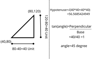
Fig. 1
So, we will calculate the length of the line and its inclination for every other line segment. We will use this information while styling every line segment. This is what our generalized HTML code will look like:
<div id="chart">
    <p id="x1">x-axis</p>
    <p id="y1">y-axis</p>
    <div>
        <div id="point..."></div>
        <div id="line..."></div>
    </div>
    ...
</div>
Step 4: Applying the CSS properties to those points & Lines:
Now, we have to use CSS to make those points and lines visible. We can see in the above HTML code that we have given “id” to every div that are representing a line and point. We will use these id selectors to style lines and points. Let’s see the CSS for one point and similarly, will be done for other points:
 #point1 {
    background-color: violet;
    border-radius: 50%;
    bottom: 76px;
    left: 36px;
    position: absolute;
    height: 12px;
    width: 12px;
    z-index: 1;
  }
Now, let’s see the CSS for one line, and similarly, will be done for other lines:
#line1 {
    background-color: black;
    bottom: 80px ;
    height: 3px;
    left: 40px;
    position: absolute;
    transform: rotate(-45deg);
    transform-origin: left bottom;
    width: 56.57px;
  }
Note: You must note that rotate() will by default rotate the line in a clockwise direction if the angle is passed without any sign. If you will pass the angle with the -ve sign then it will rotate in an anticlockwise direction. For instance, if we pass 45 degrees then it will rotate 45 degrees in the Clockwise direction and if we will pass -45 degrees then it will pass 45 degrees in Anticlockwise Direction.
Example: This example describes the creation of the Line Chart with the help of HTML & CSS.
HTML
<!DOCTYPE html>
<html>
<head>
<title>Line Chart</title>
<style>
#x1,
#y1 {
position: absolute;
font-size: larger;
}
#x1 {
bottom: -50px;
left: 100px;
}
#y1 {
left: -60px;
bottom: 110px;
}
#h1,
#h3 {
text-align: center;
color: green;
}
#chart {
border-bottom: 2px solid black;
border-left: 2px solid black;
margin-left: 600px;
margin-top: 45x;
height: 250px;
width: 250px;
position: relative;
}
#point1,
#point2,
#point3,
#point4,
#point5 {
border-radius: 50%;
position: absolute;
height: 12px;
width: 12px;
z-index: 1;
}
#point1 {
background-color: violet;
bottom: 76px;
left: 36px;
}
#point2 {
background-color: pink;
bottom: 116px;
left: 76px;
}
#point3 {
background-color: orange;
bottom: 76px;
left: 116px;
}
#point4 {
background-color: greenyellow;
bottom: 116px;
left: 156px;
}
#point5 {
background-color: green;
bottom: 76px;
left: 196px;
}
#line1,
#line2,
#line3,
#line4 {
height: 3px;
position: absolute;
transform-origin: left bottom;
width: 56.57px;
}
#line1 {
background-color: black;
bottom: 80px;
left: 40px;
transform: rotate(-45deg);
}
#line2 {
background-color: black;
bottom: 120px;
left: 80px;
transform: rotate(45deg);
}
#line3 {
background-color: black;
bottom: 80px;
left: 120px;
transform: rotate(-45deg);
}
#line4 {
background-color: black;
bottom: 120px;
left: 160px;
transform: rotate(45deg);
}
</style>
</head>
<body>
<h1 id="h1">GeeksforGeeks</h1>
<h3 id="h3">Line Chart using HTML & CSS</h3>
<div id="chart">
<p id="x1">x-axis</p>
<p id="y1">y-axis</p>
<div>
<div id="point1"></div>
<div id="line1"></div>
</div>
<div>
<div id="point2"></div>
<div id="line2"></div>
</div>
<div>
<div id="point3"></div>
<div id="line3"></div>
</div>
<div>
<div id="point4"></div>
<div id="line4"></div>
</div>
<div>
<div id="point5"></div>
</div>
</div>
</body>
</html>
|
Output:
Share your thoughts in the comments
Please Login to comment...