How to add an Alert in Bootstrap 5?
Last Updated :
07 Feb, 2024
Bootstrap 5 alerts provide a flexible and visually appealing way to communicate important information to users. By utilizing various alert classes, we can easily create dynamic notifications, warnings, or messages within their web applications.
Preview:
Syntax:
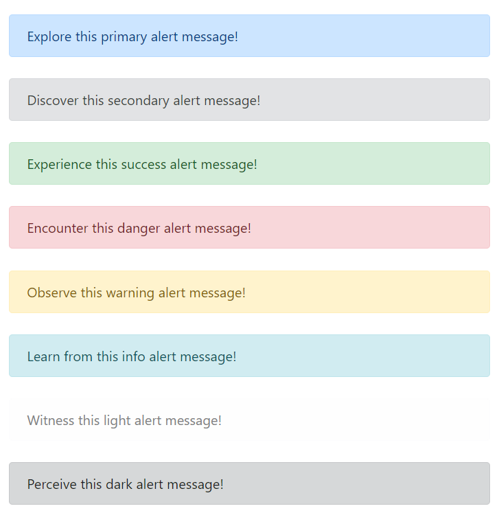
<div class="alert alert-primary" role="alert">
  Explore this primary alert message!
</div>
<div class="alert alert-secondary" role="alert">
  Discover this secondary alert message!
</div>
<div class="alert alert-success" role="alert">
  Experience this success alert message!
</div>
<div class="alert alert-danger" role="alert">
  Encounter this danger alert message!
</div>
<div class="alert alert-warning" role="alert">
  Observe this warning alert message!
</div>
<div class="alert alert-info" role="alert">
  Learn from this info alert message!
</div>
<div class="alert alert-light" role="alert">
  Witness this light alert message!
</div>
<div class="alert alert-dark" role="alert">
  Perceive this dark alert message!
</div>
The below table illustrates the alert classes in Bootstrap 5 alongside their corresponding descriptions.
| Classes |
Description |
| alert-primary |
A blue-colored alert box indicating informative messages. |
| alert-secondary |
A light gray-colored alert box conveying less important information. |
| alert-success |
A green-colored alert box indicating success messages. |
| alert-danger |
A red-colored alert box indicating error messages. |
| alert-warning |
A yellow-colored alert box highlighting warnings. |
| alert-info |
A light blue-colored alert box conveying general information. |
| alert-light |
A light-colored alert box indicating non-urgent messages. |
| alert-dark |
A dark-colored alert box ideal for displaying important information. |
Share your thoughts in the comments
Please Login to comment...