Gauge Chart in pygal
Last Updated :
03 Jul, 2020
Pygal is a Python module that is mainly used to build SVG (Scalar Vector Graphics) graphs and charts. SVG is a vector-based graphics in the XML format that can be edited in any editor. Pygal can create graphs with minimal lines of code that can be easy to understand and write.
Gauge Charts
Gauge charts are also known as dial charts or speedometer charts. This type of chart is often used in executive dashboard reports to show key business indicators. Gauge charts are much useful for comparing the values between a small number of variables either by using multiple needles on the same gauge or by using multiple gauges. It shows the maximum, the minimum, and the present value of data being analyzed. It can be created using the Gauge() method.
Syntax:
gauge_chart = pygal.Gauge()
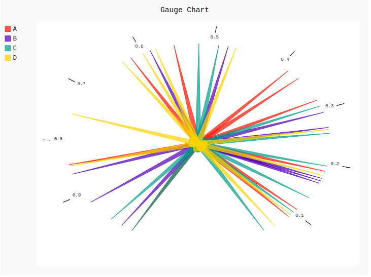
Example 1:
import pygal
import numpy
gauge = pygal.Gauge()
gauge.title = 'Gauge Chart'
gauge.add('A', numpy.random.rand(10))
gauge.add('B', numpy.random.rand(10))
gauge.add('C', numpy.random.rand(10))
gauge.add('D', numpy.random.rand(10))
gauge
|
Output:
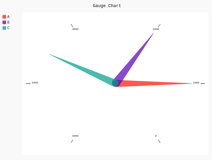
Example 2:
import pygal
gauge = pygal.Gauge()
gauge.title = 'Gauge Chart'
gauge.range = [0, 5000]
gauge.add('A', 1000)
gauge.add('B', 2000)
gauge.add('C', 3500)
gauge
|
Output:
Share your thoughts in the comments
Please Login to comment...