Flutter – Working with Animations
Last Updated :
08 Feb, 2021
Whenever building an app animation plays a vital role in designing the experience of the user. People tend to like an app that has a smooth flow and a slick design. The Flutter Package provides a variety of methods to create and use animation in our app. We will be discussing the inbuilt Flutter widgets to handle animation.
Animation in Flutter
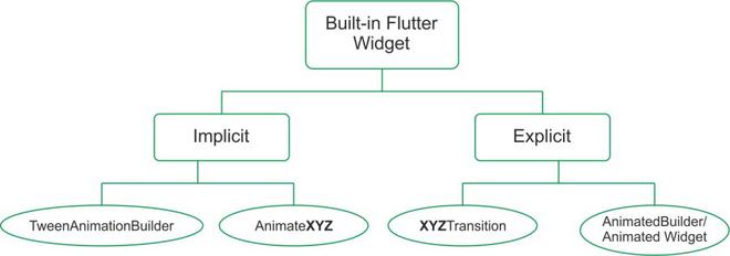
As the flow chart shows to handle animation in Flutter the framework provides widgets of different capacity and implementation. The basic property that is present in all the animation widget is the Duration and Curve. The Duration is the time for which the widget animates and the Curve defines the way the object animates and from beginning to end (The flow of the animation from start to end). The built-in animation widgets in flutter can be divided into two main categories.
Implicit Widgets
These are the simplest widget provided by flutter. These widgets can be implemented without much work from the developer. These are very basic animation techniques, so they don’t have many options available to be changed. They have one-way animation which is not continuous. The implicit widgets can in turn be categorized into two as
- AnimatedXYZ: Here XYZ is a specific widget available to be animated. These are animated versions of the basic widgets available in Flutter. Here are some of the Implicit AnimatedXYZ of existing XYZ widgets.
- Align → AnimatedAlign
- Container → AnimatedContainer
- DefaultTextStyle → AnimatedDefaultTextStyle
- Padding → AnimatedPadding
- Positioned → AnimatedPositioned
- TweenAnimationBuilder: These widgets animate a given widget from an initial value (Tween.begin) to a final value (Tween.end). This widget can be used to animate a custom widget for a simple animation. It takes in a builder property that builds the Animation based on the value provided in its parameter. We can also provide what needs to be done when the animation completes with the help of onEnd callback.
Explicit Widget
These widgets provide a more granular control on the animated widget. They have the properties to control the repetition and movement of the widget. These widgets require an AnimationController for the granular control they provide. This controller can be defined in the initState and the dispose of states for better usage. The explicit widget can be categorized as
- XYZTransition: Here XYZ is a specific widget available as Transition. These are built-in transition which provides more control over the implicit animation. They can be thought of as an extension of the AnimatedXYZ widget. Some explicit XYZTransition available are:
- SizeTransition
- FadeTransition
- AlignTransition
- RotationTransition
- PositionedTransition
- DecoratedBoxTransition
- AnimatedBuilder/ AnimatedWidget: When there are no widgets available from the predefined XYZTransition which already define a variety of Animation then we can use the AnimatedBuilder/ AnimatedWidget. They apply to a custom widget that we want to explicitly animate. If we can define the animation in the same widget then we can use the AnimatedBuilder otherwise if we define a while new widget we can extend the defined widget with the Animated Widget.
Now that we have covered the basic definition for the in-built animation widget. We are going to see an example of each of them one by one.
We are going to set up the app. First, we will be creating the images directory in the root and add the two images as bird.png and hypno.png provided below

hypno.png
bird.png
After this in the pubspec.yaml add the following lines under assets and click on Pub get to use the images
assets:
    - images/ #Add
Now that the resources have been added we will be defining the content of the lib directory. We are going to create four new dart files as animated_xyz.dart, tween_animation.dart, xyz_transition.dart, and builder_animation.dart apart from main.dart.
The main.dart has the following code
Dart
import 'package:flutter/material.dart';
import 'builder_animation.dart';
import 'xyz_transition.dart';
import 'tween_animation.dart';
import 'animated_xyz.dart';
void main() {
runApp(MyApp());
}
class MyApp extends StatelessWidget {
@override
Widget build(BuildContext context) {
return MaterialApp(
debugShowCheckedModeBanner: false,
title: 'Animation Demo',
theme: ThemeData(
primarySwatch: Colors.green,
),
home: Home(),
);
}
}
class Home extends StatelessWidget {
@override
Widget build(BuildContext context) {
return DefaultTabController(
length: 4,
child: Scaffold(
appBar: AppBar(
bottom: TabBar(
tabs: [
Tab(text: 'Ani..XYZ'),
Tab(text: 'Tween'),
Tab(text: 'XYZTra..'),
Tab(text: 'Builder'),
],
),
title: Text('GeeksforGeeks'),
),
body: TabBarView(
children: [
AnimatedXYZ(),
TweenAnimation(),
XYZTransition(),
BuilderAnimation(),
],
),
),
);
}
}
|
Here we have made a Scaffold that contains an app bar and apart from this the app bar has a Tabbar which shows the different screens for different animation types.
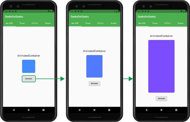
By default, the main screen shows the AnimatedXYZ widget which we have defined in the animated_xyz.dart file. This shows the first type of implicit widget we have talked about. The file has the following code
Dart
import 'package:flutter/material.dart';
class AnimatedXYZ extends StatefulWidget {
@override
_AnimatedXYZState createState() => _AnimatedXYZState();
}
class _AnimatedXYZState extends State<AnimatedXYZ> {
bool _toggle = true;
@override
Widget build(BuildContext context) {
return SafeArea(
child: Center(
child: Column(
mainAxisAlignment: MainAxisAlignment.center,
children: [
Padding(
padding: const EdgeInsets.all(20),
child: Text(
'AnimatedContainer',
style: TextStyle(fontSize: 20),
),
),
AnimatedContainer(
decoration: BoxDecoration(
color: _toggle == true
? Colors.blueAccent
: Colors.deepPurpleAccent,
borderRadius: BorderRadius.all(Radius.circular(8)),
),
curve: Curves.easeInOutBack,
duration: Duration(seconds: 1),
height: _toggle == true ? 100 : 400,
width: _toggle == true ? 100 : 200,
),
SizedBox(
height: 20,
),
RaisedButton(
onPressed: () {
setState(() {
_toggle = !_toggle;
});
},
child: Text('Animate'),
)
],
),
),
);
}
}
|
This file has a Column that contains different widgets and an AnimatedContainer which apart from normal functions also has a curve and a duration defined. When the button is pressed the size and color of the Container changes as shown:
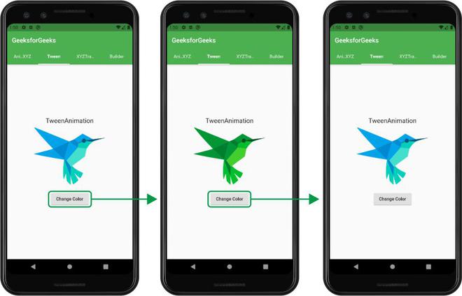
In the next Screen, we have made a tween animation in the tween_animation.dart file. In this animation, we have a picture of a bird which on pressing the button changes the color of the bird. The file has the following code
Dart
import 'package:flutter/material.dart';
class TweenAnimation extends StatefulWidget {
@override
_TweenAnimationState createState() => _TweenAnimationState();
}
class _TweenAnimationState extends State<TweenAnimation> {
Color c1 = Colors.white;
Color c2 = Colors.yellow;
@override
Widget build(BuildContext context) {
return SafeArea(
child: Center(
child: Column(
mainAxisAlignment: MainAxisAlignment.center,
children: [
Text(
'TweenAnimation',
style: TextStyle(fontSize: 20),
),
SizedBox(
height: 10,
),
TweenAnimationBuilder(
tween: ColorTween(begin: c1, end: c2),
duration: Duration(seconds: 1),
builder: (_, Color color, __) {
return ColorFiltered(
child: Image.asset(
'images/bird.png',
height: 180,
),
colorFilter: ColorFilter.mode(color, BlendMode.modulate),
);
},
),
SizedBox(
height: 20,
),
RaisedButton(
onPressed: () {
setState(() {
c1 = c1 == Colors.white ? Colors.yellow : Colors.white;
c2 = c2 == Colors.yellow ? Colors.white : Colors.yellow;
});
},
child: Text('Change Color'),
)
],
),
),
);
}
}
|
In this file, we have simply defined a Column that contains the different widgets and apart from these has a TweenAnimationBuilder which accepts the type of tween (here we have used ColorTween) and the duration of the animation. It also has a builder property that builds the widget provided according to the tween.
Now that we are done with the implicit animation. We will be defining the explicit animation in the next two screens. The explicit Animation widgets provide more manual control over how to manage our animations.
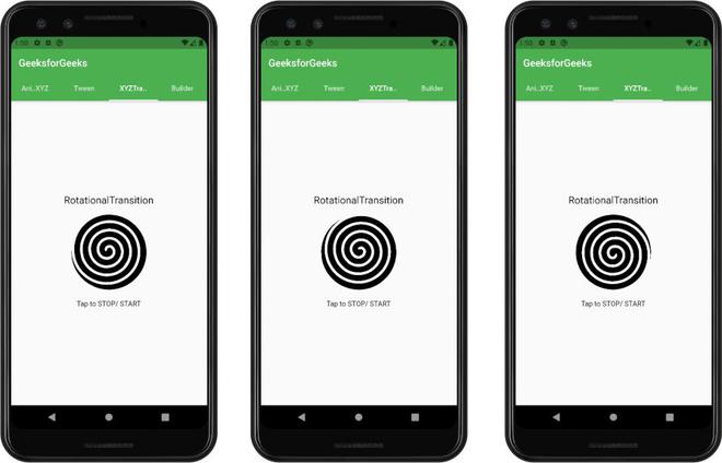
The third screen shows an example of RotationTransition. The code is as follows
Dart
import 'package:flutter/material.dart';
class XYZTransition extends StatefulWidget {
@override
_XYZTransitionState createState() => _XYZTransitionState();
}
class _XYZTransitionState extends State<XYZTransition>
with SingleTickerProviderStateMixin {
AnimationController _animationController;
@override
void initState() {
super.initState();
_animationController = AnimationController(
vsync: this,
duration: Duration(seconds: 3),
)..repeat();
}
@override
void dispose() {
_animationController.dispose();
super.dispose();
}
@override
Widget build(BuildContext context) {
return Scaffold(
body: SafeArea(
child: Column(
mainAxisAlignment: MainAxisAlignment.center,
children: [
Text(
'RotationalTransition',
style: TextStyle(fontSize: 20),
),
SizedBox(
height: 10,
),
GestureDetector(
onTap: () {
_animationController.isAnimating
? _animationController.stop()
: _animationController.repeat();
},
child: Padding(
padding: const EdgeInsets.all(8.0),
child: Center(
child: Column(
mainAxisAlignment: MainAxisAlignment.center,
children: [
RotationTransition(
child: Image.asset('images/hypno.png',
height: 150, width: 150),
alignment: Alignment.center,
turns: _animationController,
),
SizedBox(
height: 20,
),
Text('Tap to STOP/ START')
],
),
),
),
),
],
),
),
);
}
}
|
Explicit widgets provide us with more manual control. To get access to these controls we need to have a controller. So we define an AnimationController object for this. We need to initialize the animation when the screen is built and also dispose of it when we move to another screen. Here we have used RotationTransition for rotating the given image infinitely. The rotation can be stopped/ restarted by tapping on the image as mentioned on the screen. The transition accepts the AnimationController object as the turns. We have defined to repeat the animation once completed in the initState.
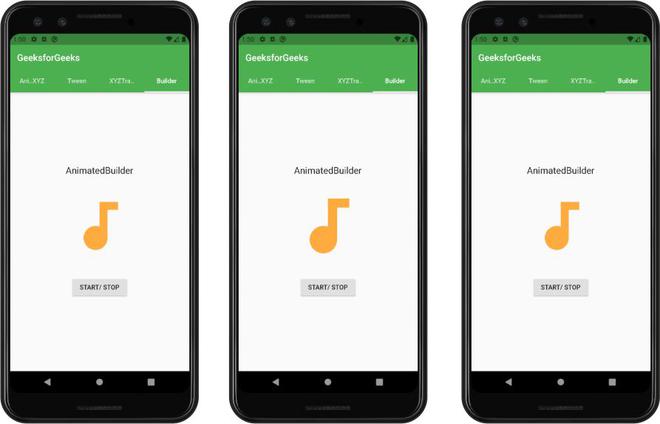
The above said explicit animation work on the predefined XYZTransition but to work on our custom object we can use the AnimationBuilder to build our own animation. The code is as follows
Dart
import 'package:flutter/material.dart';
class BuilderAnimation extends StatefulWidget {
@override
_BuilderAnimationState createState() => _BuilderAnimationState();
}
class _BuilderAnimationState extends State<BuilderAnimation>
with TickerProviderStateMixin {
Animation _starAnimation;
AnimationController _starAnimationController;
bool toggle = false;
@override
void initState() {
super.initState();
_starAnimationController =
AnimationController(vsync: this, duration: Duration(milliseconds: 500));
_starAnimation = Tween(begin: 140.0, end: 160.0).animate(CurvedAnimation(
curve: Curves.elasticInOut, parent: _starAnimationController));
_starAnimationController.addStatusListener((AnimationStatus status) {
if (status == AnimationStatus.completed) {
_starAnimationController.repeat();
}
});
}
@override
void dispose() {
super.dispose();
_starAnimationController?.dispose();
}
@override
Widget build(BuildContext context) {
return SafeArea(
child: Column(
mainAxisAlignment: MainAxisAlignment.center,
children: <Widget>[
Text(
'AnimatedBuilder',
style: TextStyle(fontSize: 20),
),
SizedBox(
height: 10,
),
Container(
height: 200,
width: 200,
child: AnimatedBuilder(
animation: _starAnimationController,
builder: (context, child) {
return Center(
child: Container(
child: Center(
child: Icon(
Icons.audiotrack,
color: Colors.orangeAccent,
size: _starAnimation.value,
),
),
),
);
},
),
),
SizedBox(
height: 10,
),
RaisedButton(
child: Text('START/ STOP'),
onPressed: () {
toggle = !toggle;
toggle == true
? _starAnimationController.forward()
: _starAnimationController.stop();
},
),
],
),
);
}
}
|
This widget shows a music track icon that repeatedly grows. Most of the details remain the same from the explicit XYZTransition defined above. But here we have to pass a builder with a child and the context. Here we have to pass the controller to the animation property of the AnimatedBuilder. The Button is used to start and stop the animation.
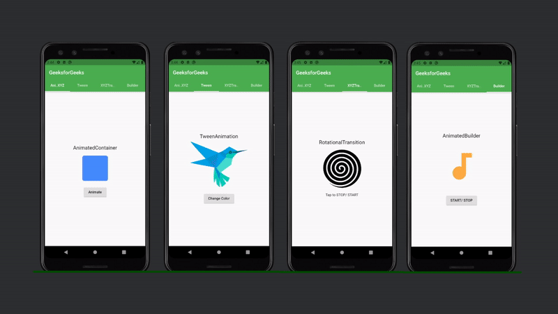
The output of all the animation screens:
Share your thoughts in the comments
Please Login to comment...