Flutter – SizeTransition Widget
Last Updated :
04 Jul, 2023
In this article, we will explore the Flutter SizeTransition Widget. The Size Transition Widget is a key tool in Flutter that lets you animate the size of a child widget. It can be used to make a widget appear or vanish, create a zoom-in or zoom-out effect, and for many more things. A sample video is given below to get an idea about what we are going to do in this article.
Step By Step Implementation
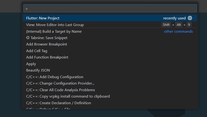
Step 1: Open your VS-code create a Flutter Application And Installing Module using the following steps:
- Open the Command Palette (Ctrl+Shift+P (Cmd+Shift+P on macOS)).
- Select the Flutter: New Project command and press Enter.
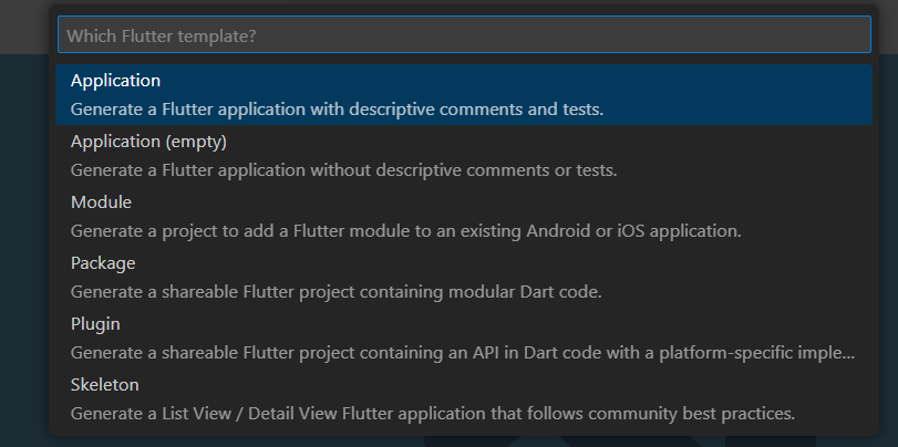
- Select Application and press Enter.
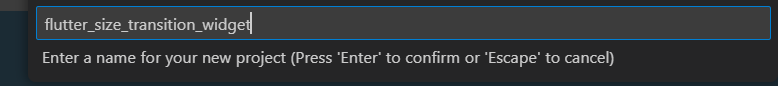
- Select a Project location.
- Enter your desired Project name.
Now your project structure looks like this: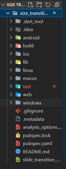
Step 2: Create a stateless widget by writing the following code inside your main.dart file
Dart
import 'package:flutter/material.dart';
void main() => runApp(const SizeTransitionGeeksExample());
class SizeTransitionGeeksExample extends StatelessWidget {
const SizeTransitionGeeksExample({Key? key});
@override
Widget build(BuildContext context) {
return const MaterialApp(
home: GfgSizeTransition(),
);
}
}
class GfgSizeTransition extends StatefulWidget {
const GfgSizeTransition({Key? key});
@override
State<GfgSizeTransition> createState() => _GfgSizeTransitionState();
}
class _GfgSizeTransitionState extends State<GfgSizeTransition>
with TickerProviderStateMixin {
late final AnimationController _controller = AnimationController(
duration: const Duration(seconds: 3),
vsync: this,
)..repeat();
late final Animation<double> _animationa = CurvedAnimation(
parent: _controller,
curve: Curves.bounceIn,
);
late final Animation<double> _animationb = CurvedAnimation(
parent: _controller,
curve: Curves.slowMiddle,
);
late final Animation<double> _animationc = CurvedAnimation(
parent: _controller,
curve: Curves.fastLinearToSlowEaseIn,
);
late final Animation<double> _animationd = CurvedAnimation(
parent: _controller,
curve: Curves.easeOutQuint,
);
late final Animation<double> _animatione = CurvedAnimation(
parent: _controller,
curve: Curves.decelerate,
);
@override
void dispose() {
_controller.dispose();
super.dispose();
}
@override
Widget build(BuildContext context) {
return Scaffold(
appBar: AppBar(
backgroundColor: Colors.green,
title: const Text("GFG Size Transition")),
body: Column(
children: [
Container(
height: 500,
child: Column(
children: [
SizeTransition(
sizeFactor: _animationa,
axis: Axis.horizontal,
axisAlignment: -1,
child: Center(
child: Image.network(
),
),
SizeTransition(
sizeFactor: _animationb,
axis: Axis.horizontal,
axisAlignment: -1,
child: Center(
child: Image.network(
),
),
SizeTransition(
sizeFactor: _animationc,
axis: Axis.horizontal,
axisAlignment: -1,
child: Center(
child: Image.network(
),
),
SizeTransition(
sizeFactor: _animationd,
axis: Axis.horizontal,
axisAlignment: -1,
child: Center(
child: Image.network(
),
),
SizeTransition(
sizeFactor: _animatione,
axis: Axis.vertical,
axisAlignment: -1,
child: Center(
child: Image.network(
),
),
],
),
),
SizedBox(child: const Text("More Explore yourself..."))
],
),
);
}
}
|
Now let’s understand the complete code:
import 'package:flutter/material.dart';
We import flutter/material.dart package so that we can implement the material design, we can use widgets like stateless widgets, materialApp, etc
void main() => runApp(const SizeTransitionGeeksExample());
Every flutter code has an entry point from the main function, inside the main function we call the runApp method provided by ‘flutter/material.dart’ package and we pass the widget SizeTransitionGeeksExample as a parameter.
class SizeTransitionGeeksExample extends StatelessWidget {
  const SizeTransitionGeeksExample({Key? key}); // Widget for the main app
  @override
  Widget build(BuildContext context) {
     // Material app
    return const MaterialApp(
      home: GfgSizeTransition(),
    );
  }
}
The SizeTransitionGeeksExample class is a stateless widget that serves as the main app widget. It returns a MaterialApp widget as the root of the widget tree. The MaterialApp is configured with a home property set to an instance of the GfgSizeTransition widget, which represents the main content of the app
// The following code sets up animations and their curves.
class _GfgSizeTransitionState extends State<GfgSizeTransition>
    with TickerProviderStateMixin {
  late final AnimationController _controller = AnimationController(
    duration: const Duration(seconds: 3),
    vsync: this,
  )..repeat(); // Animation controller with a repeating animation
  late final Animation<double> _animationa = CurvedAnimation(
    parent: _controller,
    curve: Curves.bounceIn,
  ); // Animation with a bounce-in curve
  late final Animation<double> _animationb = CurvedAnimation(
    parent: _controller,
    curve: Curves.slowMiddle,
  ); // Animation with a slow middle curve
  late final Animation<double> _animationc = CurvedAnimation(
    parent: _controller,
    curve: Curves.fastLinearToSlowEaseIn,
  ); // Animation with a fast linear to slow ease-in curve
  late final Animation<double> _animationd = CurvedAnimation(
    parent: _controller,
    curve: Curves.easeOutQuint,
  ); // Animation with an ease-out quint curve
  late final Animation<double> _animatione = CurvedAnimation(
    parent: _controller,
    curve: Curves.decelerate,
  );
- _animationa: This animation causes the visuals to initially enter with a slight bounce before gradually amplifying it.
- _animationb: This animation starts off slowly, picks up speed in the middle, and then slows down once again towards the conclusion to provide a seamless and gentle transition for the visuals.
- _animationc: This animation transitions between a faster initial animation and a slower transition by beginning swiftly with a linear motion and then easing in gradually.
- _animationd: A seamless and organic easing-out effect is produced by the animation, which begins with a fast acceleration and then progressively slows down towards the end.
- _animatione: The beginning velocity of this animation is fast, but it gradually decreases over time to produce a decelerating effect.
These animations were produced using various predefined curves from Flutter’s Curves class. These animations are driven by the animation controller _controller. It is programmed to loop continuously, producing an animation.
These animations are applied to the images in the UI using the SizeTransition widget. One of the animation objects (_animationa, _animationb, etc.) is assigned as the sizeFactor property of the SizeTransition widget, which controls the size transition behaviour.
  @override
  void dispose() {
    _controller.dispose();
    super.dispose();
  }
The dispose() method is used to dispose of the animation controller _controller.
 @override
  Widget build(BuildContext context) {
    return Scaffold(
      appBar: AppBar(
          backgroundColor: Colors.green,
          title: const Text("GFG Size Transition")), // App bar with a title
      // Column contains SizeTrasition Widget
      body: Column(
        children: [
          Container(
            height: 500, // Container with a fixed height
            child: Column(
              children: [
                // SizeTransition widget
                SizeTransition(
                  sizeFactor: _animationa,
                  axis: Axis.horizontal,
                  axisAlignment: -1,
                  child: Center(
                    child: Image.network(
                        'https://media.geeksforgeeks.org/wp-content/cdn-uploads/20210419113249/gfg-new-logo-min.png'),
                  ),
                ),
                // SizeTransition widgets with different animations and alignments
                SizeTransition(
                  sizeFactor: _animationb,
                  axis: Axis.horizontal,
                  axisAlignment: -1,
                  child: Center(
                    child: Image.network(
                        'https://media.geeksforgeeks.org/wp-content/cdn-uploads/20210419113249/gfg-new-logo-min.png'),
                  ),
                ),
                SizeTransition(
                  sizeFactor: _animationc,
                  axis: Axis.horizontal,
                  axisAlignment: -1,
                  child: Center(
                    child: Image.network(
                        'https://media.geeksforgeeks.org/wp-content/cdn-uploads/20210419113249/gfg-new-logo-min.png'),
                  ),
                ),
                SizeTransition(
                  sizeFactor: _animationd,
                  axis: Axis.horizontal,
                  axisAlignment: -1,
                  child: Center(
                    child: Image.network(
                        'https://media.geeksforgeeks.org/wp-content/cdn-uploads/20210419113249/gfg-new-logo-min.png'),
                  ),
                ),
                SizeTransition(
                  sizeFactor: _animatione,
                  axis: Axis.vertical,
                  axisAlignment: -1,
                  child: Center(
                    child: Image.network(
                        'https://media.geeksforgeeks.org/wp-content/cdn-uploads/20210419113249/gfg-new-logo-min.png'),
                  ),
                ),
              ],
            ),
          ),
          // sizedbox widget
          SizedBox(child: const Text("More Explore yourself...")) // Text widget at the end
        ],
      ),
    );
  }
- The Scaffold widget, which has an appBar and a body, provides the basic structure of the application.
- The appBar is an AppBar widget with a “GFG Size Transition” title text and a green background color.
- A Column widget that organizes its children vertically makes up the body.
- Having a fixed height of 500, the Container widget is the first child of the Column. The SizeTransition widgets are gathered in this container.
- Inside the container, there is another Column widget. This nested Column contains multiple SizeTransition widgets.
- Each SizeTransition widget applies a size transition animation to its child widget.
- Each SizeTransition widget’s sizeFactor property is set to one of the animation objects (_animationa, _animationb, etc.) previously declared. Based on the corresponding animation, this defines the size transition behavior.
- The
axis property of the SizeTransition widgets are set to either Axis.horizontal or Axis.vertical to control the direction of the size transition.
- SizeTransition widgets axisAlignment attribute is set to -1, which indicates that the child widget should be positioned at the beginning of the axis.
- A SizedBox widget with a child Text widget follows the SizeTransition widgets. The words “More Explore yourself…” is displayed here as a placeholder. The text widget has a defined size thanks to the SizedBox.
Step 3: Run the following code by selecting the Android emulator or on your physical device by connecting it.
Output:
Share your thoughts in the comments
Please Login to comment...