Creating Custom Utility Classes in Tailwind CSS and React JS
Last Updated :
08 Mar, 2024
Tailwind CSS empowers development with a variety of utility classes out of the box, helping us in rapid development and consistent styling. However, In some scenarios, you might want to implement your custom styling.
We will discuss the following approaches to create Custom Utility Classes in Tailwind and React.
Steps to Create a React App and Installing Required Module
Step 1: Create a new react application and enter it into the directory by running the following commands in the terminal
npx create-react-app tw-custom-utility
cd tw-custom-utility
Step 2: Install tailwind CSS and initialize the tailwind configuration file by running the following commands.
npm i tailwindcss
npx tailwindcss init
Updated Dependencies: The updated package.json file should look like this
 "dependencies": {
    "@testing-library/jest-dom": "^5.17.0",
    "@testing-library/react": "^13.4.0",
    "@testing-library/user-event": "^13.5.0",
    "react": "^18.2.0",
    "react-dom": "^18.2.0",
    "react-scripts": "5.0.1",
    "tailwindcss": "^3.4.1",
    "web-vitals": "^2.1.4"
 }
Folder Structure:
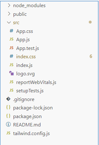
Project Structure
Creating Custom Utility Classes Using Tailwind ‘Extend’ Option
- Integrate Tailwind CSS for efficient styling.
- We have made four boxes using <div> element with style including background color, text color, rounded corners, height, and width.
- Now implement custom style, use “Extend” option to implement in tailwind.config.js file for colors.
Example: Illustration of creating a Custom Utility Classes in Tailwind CSS and React JS using the tailwind `Extend` Option
CSS
@tailwind base;
@tailwind components;
@tailwind utilities;
|
Javascript
module.exports = {
content: ["./src/**/*.{html,js}"],
theme: {
extend: {
colors: {
'blood-red': '#ff2200',
'purple-extended': '#74207d',
'parrot-feather' : '#bbff00',
'lemon-yellow' : '#ffee00',
'rose-pink' : '#ff0048'
}
},
},
plugins: [],
}
|
Javascript
function App() {
return (
<div className="App p-12">
<h1 className='tracking-wide text-gray-600 text-3xl font-bold'>Custom Utility Colors Using Tailwind `extend`</h1>
<div className='flex flex-wrap gap-4 mx-auto w-full flex justify-center p-12 rounded-md'>
<div className='flex items-center justify-center text-gray-800 bg-lemon-yellow w-40 h-40 rounded-md shadow-xl'>Lemon Yellow</div>
<div className='flex items-center justify-center text-gray-100 bg-rose-pink w-40 h-40 rounded-md shadow-xl'>Rose Pink</div>
<div className='flex items-center justify-center text-gray-100 bg-blood-red w-40 h-40 rounded-md shadow-xl'>Blood Red</div>
<div className='flex items-center justify-center text-gray-700 bg-parrot-feather w-40 h-40 rounded-md shadow-xl'>Parrot Feather</div>
<div className='flex items-center justify-center text-gray-100 bg-purple-extended w-40 h-40 rounded-md shadow-xl'>Purple Extended</div>
</div>
</div>
);
}
export default App;
|
Steps to run the application:
Step 1: Type the following command in the terminal.
npm start
Step 2: Open the web browser and type the following URL
http://localhost:3000/
Output:
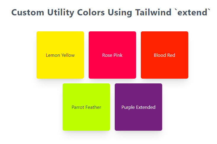
Output
Creating Custom Utility Classes Using ‘@layer’ directive
- Integrate Tailwind CSS for efficient styling.
- Use layer directive to implement your custom styling in index.css file.
- We have made three buttons with style including small button, medium button, and large button with some styling including background color, text color, rounded corners, height, and width.
Example: Illustration of Creating Custom Utility Classes in Tailwind CSS and React JS using the ‘@layer’ directive
CSS
@tailwind base;
@tailwind components;
@tailwind utilities;
@layer utilities {
.btn-blue-sm {
@apply bg-blue-500 text-white text-xs w-24 h-12 rounded;
}
.btn-blue-md {
@apply bg-blue-500 text-white font-bold text-xs h-16 px-4 rounded;
}
.btn-blue-lg {
@apply bg-blue-500 text-white font-bold py-6 px-4 rounded;
}
}
|
Javascript
function App() {
return (
<div className="App p-12">
<h1 className='tracking-wide text-gray-600 text-3xl font-bold'>Custom Utility Colors Using Tailwind `extend`</h1>
<div className='mt-12 flex justify-center gap-12'>
<div><button className='btn-blue-sm'>Small Button</button></div>
<div><button className='btn-blue-md'>Medium Button</button></div>
<div><button className='btn-blue-lg'>Large Button</button></div>
</div>
</div>
);
}
export default App;
|
Steps to run the application:
Step 1: Type the following command in the terminal.
npm start
Step 2: Open the web browser and type the following URL
http://localhost:3000/
Output:
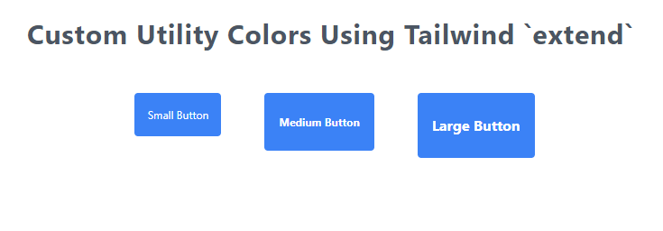
Output
Share your thoughts in the comments
Please Login to comment...