Correlograms in R
Last Updated :
05 Feb, 2023
A correlogram, also known as a correlation matrix plot or a scatterplot matrix, is a graphical representation of the pairwise relationships between a set of variables. In R Programming Language, the corrplot package provides an easy way to create correlograms. Here’s an example of how to create a correlogram in R using the corrplot package.
Correlograms using corrplot package in R
But first, we need to install ‘corrplot’ package in RStudio.
install.packages("corrplot")
Now we can use corrplot in our program.
R
install.packages('corrplot')
library(corrplot)
data(mtcars)
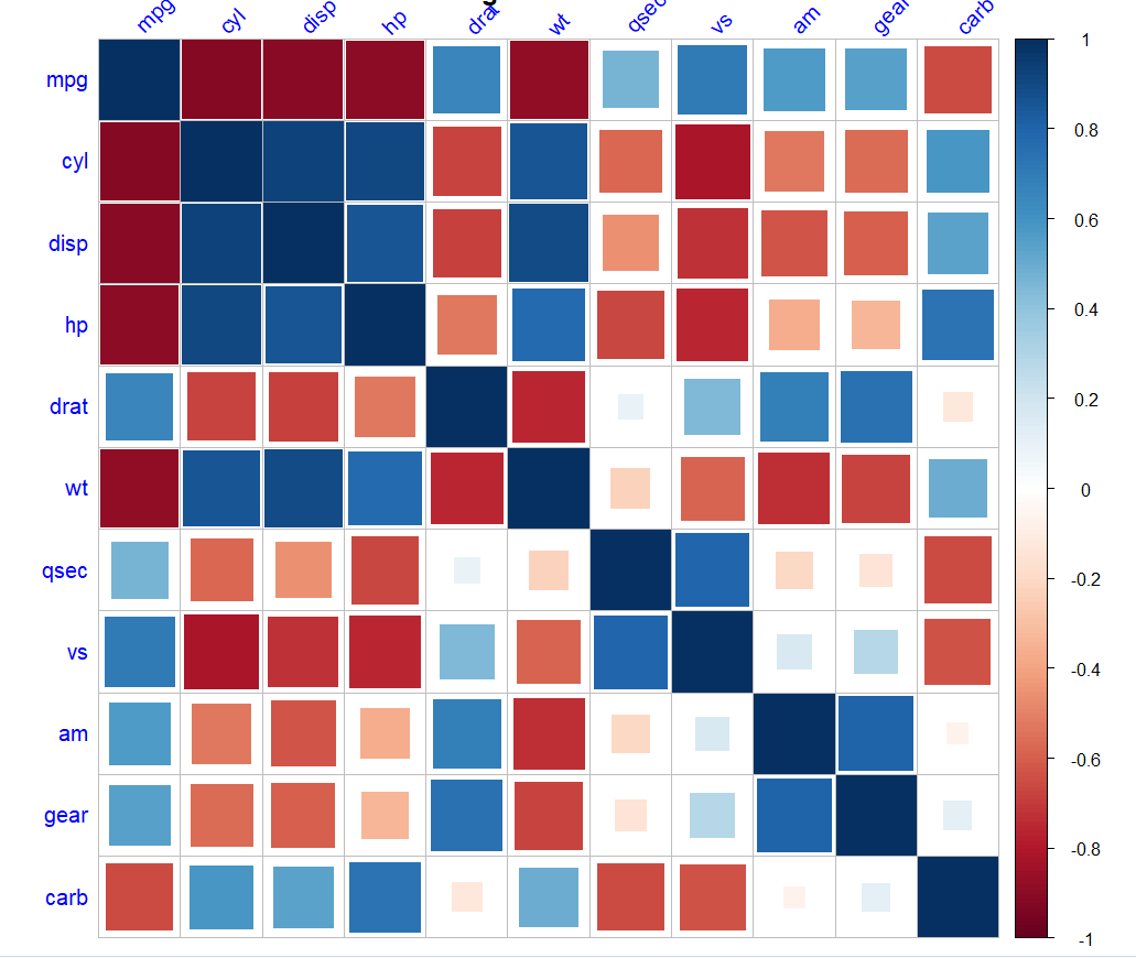
cor_matrix = cor(mtcars)
corrplot(cor_matrix, type = "upper",
method = "square",
addCoef.col = "black",
tl.col = "black", tl.srt = 45)
|
Output:

Correlogram using corrplot package in R
This code uses the cor() function to calculate the correlation matrix of the variables in the mtcars dataset. Then it uses the corrplot() function to create a correlogram of the correlation matrix, with upper triangle matrix type, square method, and the options for coefficient and title labels colors and angle.
We can customize the correlogram by changing the arguments passed to the corrplot() function, such as type of matrix, method of plotting, colors, labels of coefficients, p-values, and significance levels.
Additionally, we can use ggcorrplot package to make more refined and customizable correlograms using the ggplot2 package. With this package, we have more control over the layout and colors, and it also provides various options such as significance level indicators and different types of correlation coefficients (Pearson, Kendall, Spearman).
It’s important to note that a correlation matrix can be difficult to read, especially if the matrix is large and/or the correlation coefficients are close to zero. So, we should choose the appropriate type of correlogram, visualization, and customization to better convey the information and make it more readable.
Correlograms using ggstatsplot package in R
Correlogram can also be formed using ggstatsplot. Let us now understand this package. ‘ggstatsplot’ is an R package that provides a flexible and user-friendly way to create various types of statistical plots using ggplot2. One of the key features of ggstatsplot is that it allows you to easily add statistical annotations to plots, such as p-values, effect sizes, and confidence intervals.
In addition to correlograms, ggstatsplot can be used to create a variety of other plots, including:
- Scatter plots with regression lines and confidence intervals
- Box plots with significance tests
- Bar plots with significance tests
- Histograms with density plots and significance tests
- Q-Q plots
- Forest plots
- Violin plots
The ggstatsplot package in R provides an easy way to create correlograms. The ggcorrmat() function can be used to create a correlogram.
R
library(ggstatsplot)
data(mtcars)
ggcorrmat(mtcars,
method = "pearson",
label = TRUE,
cor.vars = c("mpg", "disp", "hp",
"drat", "wt", "qsec"),
size = 2)
|
Output:

Correlogram using ggstatsplot package in R
In this example, the ggcorrmat() function is being used to create a correlogram for the mtcars dataset using the Pearson correlation coefficient. The cor.vars argument is used to specify the variables for which the correlation is to be calculated, and the label argument is used to indicate whether or not to display the correlation coefficient on the plot.
Correlograms using lares package in R
We can also take the help of the lares package. Lares is an R package that provides a variety of advanced statistical methods and visualizations. It does not have a specific function to create a correlogram, however, you can use the corrplot function from corrplot package to create a correlogram using Lares.
But first, we need to install ‘lares’ package in RStudio, just type in the console.
install.packages("lares")
After installation, we are ready to use ‘lares’.
R
library(lares)
data(mtcars)
corr <- cor(mtcars, method = "spearman")
corrplot(corr, method = "square",
title = "Correlogram of mtcars data set",
tl.col = "blue",
tl.srt = 45)
|
Output:
Correlogram using lares package in R
Share your thoughts in the comments
Please Login to comment...