Containers in Bootstrap with examples
Last Updated :
02 Dec, 2022
In bootstrap, the container is used to set the content’s margin. It contains row elements and the row elements are containers of columns. This is known as the grid system.
There are two container classes in bootstrap:
- .container
- .container-fluid
Let’s look at each of the above two classes in detail with examples:
.container: The .container class provides a responsive fixed width container.
In the below example, the div with class “container” will have a fixed left and right margin and will not take the complete width of its parent or the viewport.
HTML
<!doctype html>
<html lang="en">
<head>
<meta charset="utf-8">
<meta name="viewport" content="width=device-width, initial-scale=1">
<title>Bootstrap Example</title>
</head>
<body>
<div class="container mt-4">
<div class="bg-dark">
<h1 class="text-success">GeeksforGeeks</h1>
<p class="text-light">A computer science portal for geeks.</p>
</div>
</div>
</body>
</html>
|
Output:
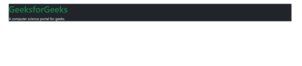
Container
.container-fluid: The .container-fluid class provides a full-width container which spans the entire width of the viewport.
In the below example, the div with class “container-fluid” will take up the complete width of the viewport and will expand or shrink whenever the viewport is resized.
HTML
<!doctype html>
<html lang="en">
<head>
<meta charset="utf-8">
<meta name="viewport" content="width=device-width, initial-scale=1">
<title>Bootstrap Example</title>
</head>
<body>
<div class="mt-4 container-fluid bg-dark">
<h1 class="text-success">GeeksforGeeks</h1>
<p class="text-light">A computer science portal for geeks.</p>
</div>
</body>
</html>
|
Output:

Container-fluid
Supported Browser:
- Google Chrome
- Internet Explorer
- Firefox
- Opera
- Safari
Share your thoughts in the comments
Please Login to comment...