Colors In R
Last Updated :
02 May, 2024
In making pictures and graphs with numbers, colors are super important. R Programming Language is a special computer language that helps us do this. It has lots of ways to change colors in our pictures and graphs, making them look cool and easy to understand.
Colors In R
The colors in R are like the paints an artist uses on a canvas. They’re essential for making our charts, graphs, and plots not only visually appealing but also informative. In R, we have a wide range of colors to choose from, allowing us to express different meanings and highlight various aspects of our data.
Here are the types of colors in R :
- Qualitative Colors: Used to distinguish different categories or groups in data visualization.
- Sequential Colors: Applied to display progression or order in data, such as time series or numeric scales.
- Diverging Colors: Highlight contrasts or differences between two extremes in data comparisons.
- Custom Color Palettes: Allow users to create unique color schemes tailored to specific needs and preferences.
Checking Built-in Colors In R
In R, we can access a list of 657 named colors using the colors() function.
R
# View all named colors in R
all_colors <- colors()
print(all_colors)
Output:
  [1] "white"                "aliceblue"            "antiquewhite"
  [4] "antiquewhite1"        "antiquewhite2"        "antiquewhite3"
  [7] "antiquewhite4"        "aquamarine"           "aquamarine1"
 [10] "aquamarine2"          "aquamarine3"          "aquamarine4"
 [13] "azure"                "azure1"               "azure2"
 [16] "azure3"               "azure4"               "beige"
 [19] "bisque"               "bisque1"              "bisque2"
 [22] "bisque3"              "bisque4"              "black"
 [25] "blanchedalmond"       "blue"                 "blue1"
 [28] "blue2"                "blue3"                "blue4......................................................................................
Methods to Specifying Colors
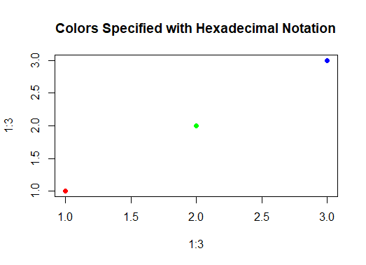
1. Hexadecimal Notation
Hexadecimal notation represents colors using a pound sign followed by six alphanumeric characters representing the intensity of red, green, and blue (RGB) components.
R
# Define colors using hexadecimal notation
red_hex <- "#FF0000"
green_hex <- "#00FF00"
blue_hex <- "#0000FF"

# Plot points with defined colors
plot(x = 1:3, y = 1:3, col = c(red_hex, green_hex, blue_hex), pch = 19,
     main = "Colors Specified with Hexadecimal Notation")
Output:
Colors In R
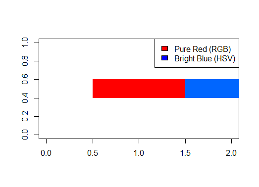
2. Using Functions
R provides functions like rgb() and hsv() for creating colors programmatically.
R
# Define colors using functions
red_rgb <- rgb(1, 0, 0)  # Pure red using RGB components (1, 0, 0)
blue_hsv <- hsv(0.6, 1, 1)  # Bright blue color using HSV components

# Create a plot with the defined colors
plot(1, type = "n", xlab = "", ylab = "", xlim = c(0, 2), ylim = c(0, 1))

# Add rectangles with defined colors
rect(0.5, 0.4, 1.5, 0.6, col = red_rgb, border = NA)
rect(1.5, 0.4, 2.5, 0.6, col = blue_hsv, border = NA)

# Add legend
legend("topright", legend = c("Pure Red (RGB)", "Bright Blue (HSV)"),
       fill = c("red", "blue"))
Output:
Colors In R
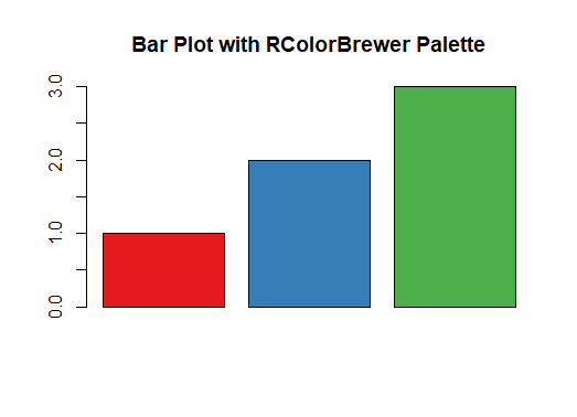
3. Using RColorBrewer Palettes
RColorBrewer offers pre-defined color palettes optimized for various data visualization purposes, such as distinguishing categories or showing sequential trends.
R
# Load necessary library
library(RColorBrewer)

# Define a qualitative color palette from RColorBrewer
qual_palette <- brewer.pal(3, "Set1")  # Using Set1 palette with 3 colors

# Plot a bar chart with colors from the qualitative palette
barplot(c(1, 2, 3), col = qual_palette, main = "Bar Plot with RColorBrewer Palette")
Output:
Colors In R
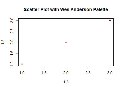
4. Utilizing Wes Anderson Color Palettes
Inspired by the distinct color schemes in Wes Anderson films, these palettes evoke nostalgia and whimsy, making them popular for unique and vibrant visualizations.
R
install.packages("wesanderson")
# Load necessary library
library(wesanderson)

# Define a color palette inspired by Wes Anderson films
wes_palette <- wes_palette("GrandBudapest1", 3)

# Plot a scatter plot with colors from the Wes Anderson palette
plot(1:3, 1:3, col = wes_palette, pch = 19,
     main = "Scatter Plot with Wes Anderson Palette")
Output:
Colors In R
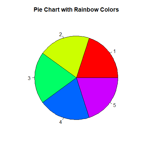
5. Creating a Vector of n Contiguous Colors
Functions like rainbow(), heat.colors(), or terrain.colors() generate sequences of contiguous colors suitable for visualizing ordered or continuous data.
R
# Define a vector of 5 contiguous colors using rainbow()
rainbow_colors <- rainbow(5)

# Plot a pie chart with colors from the rainbow vector
pie(rep(1, 5), col = rainbow_colors, main = "Pie Chart with Rainbow Colors")
Output:
Using a Vector of n Contiguous Colors
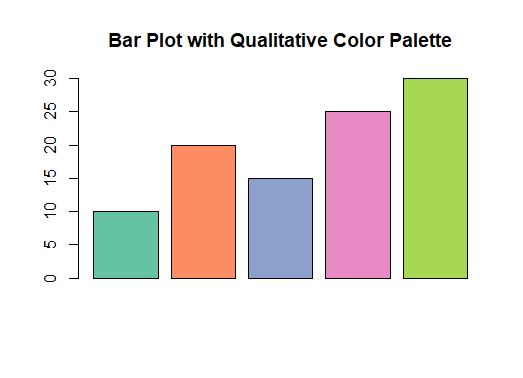
Qualitative Palettes
Qualitative color palettes are useful for distinguishing different categories or groups in data visualization.
R
# Load necessary libraries
library(RColorBrewer)

# Create sample data
data <- c(10, 20, 15, 25, 30)

# Create a qualitative color palette with 5 colors
qual_palette <- brewer.pal(5, "Set2")

# Create a bar plot with the qualitative palette
barplot(data, col = qual_palette, main = "Bar Plot with Qualitative Color Palette")
Output:
Colors In R
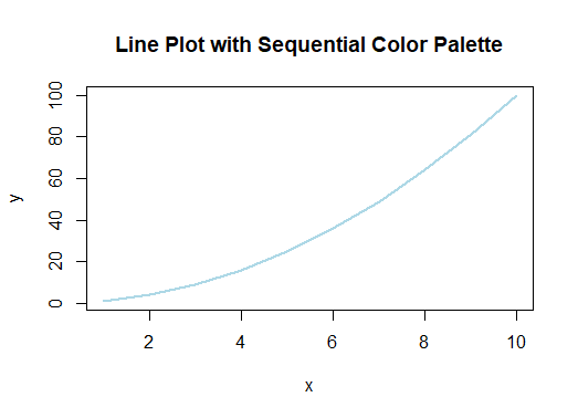
Sequential Palettes
Sequential color palettes are used to display progression or order in data.
R
# Create a sequential color palette with 5 colors
seq_palette <- colorRampPalette(c("lightblue", "darkblue"))(5)

# Generate sample data
x <- 1:10
y <- x^2

# Plot a line with the sequential palette
plot(x, y, col = seq_palette, type = "l", lwd = 2,
     main = "Line Plot with Sequential Color Palette")
Output:
Colors In R
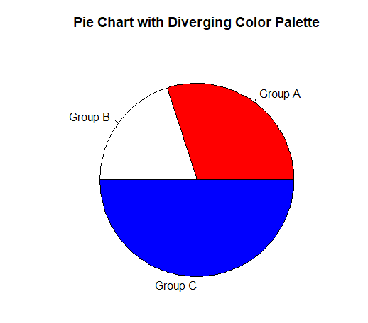
Diverging Palettes
Diverging color palettes highlight contrasts or differences between two extremes in data comparisons.
R
# Create a diverging color palette with 3 colors
div_palette <- colorRampPalette(c("red", "white", "blue"))(3)

# Generate sample data
sizes <- c(30, 20, 50)
labels <- c("Group A", "Group B", "Group C")

# Create a pie chart with the diverging palette
pie(sizes, labels = labels, col = div_palette,
    main = "Pie Chart with Diverging Color Palette")
Output:
Using Diverging Palettes
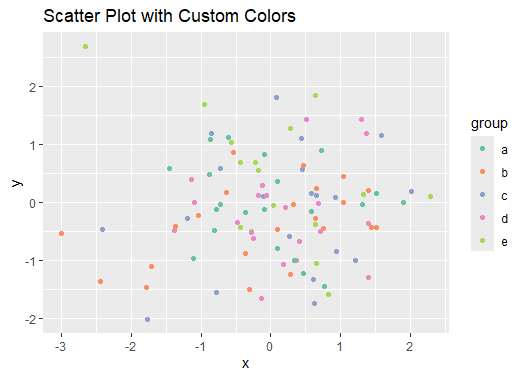
Custom Color Palettes
We’ll create a scatter plot with custom colors.
R
# Load necessary libraries
library(ggplot2)

# Generate sample data
set.seed(42)
data <- data.frame(x = rnorm(100), y = rnorm(100), group = sample(letters[1:5], 100,
                                                                  replace = TRUE))

# Create a scatter plot with custom colors
ggplot(data, aes(x = x, y = y, color = group)) + geom_point() +
  scale_color_manual(values = qual_palette) +
  ggtitle("Scatter Plot with Custom Colors")
Output:
Colors In R
Conclusion
Colors are crucial for effective data visualization in R. We explored different ways to specify and use colors, such as using hexadecimal notation, color functions, RColorBrewer palettes, Wes Anderson color palettes, and functions like rainbow(). With these tools, we can create visually appealing and informative plots, whether we’re highlighting categories, showing trends, or just making our visualizations more attractive.
Share your thoughts in the comments
Please Login to comment...