Change matplotlib line style in mid-graph
Last Updated :
12 Nov, 2020
Prerequisite: Matplotlib
In this article we will learn how to change line style in mid-graph using matplotlib in Python.
- Matplotlib: It is a tremendous visualization library in Python for 2D plots of arrays. Matplotlib may be a multi-platform data visualization library built on NumPy arrays and designed to figure with the broader SciPy stack. It was introduced by John Hunter within the year 2002.
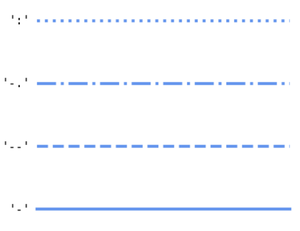
- Line style: Line style is a feature that describes in which fashion or style line is drawn. Following image shows the key that has to provided as input parameter and what line style it will produce:
Approach:
- Import the matplotlib.pyplot library and other for data (optional)
- Import or create some data
- Draw a graph plot with different line style is middle.
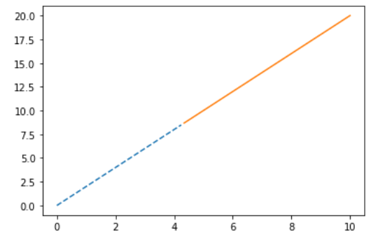
Example 1:
In this example we will use simple steps mentioned above and form a graph with two different line styles.
Python3
import matplotlib.pyplot as plt
import numpy as np
x = np.linspace(0, 10, 100)
y = 3 * x + 2
below = y < 15
above = y >= 15
plt.plot(x[below], y[below], '--')
plt.plot(x[above], y[above], '-')
plt.show()
|
Output :
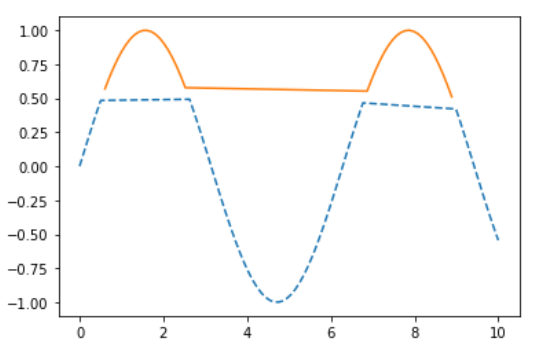
Example 2 :
In this example we will use simple steps mentioned above and form a graph with two different line styles in one sine function.
Python3
import matplotlib.pyplot as plt
import numpy as np
x = np.linspace(0, 10, 100)
y = np.sin(x)
below = y < .5
above = y >= .5
plt.plot(x[below], y[below], '--')
plt.plot(x[above], y[above], '-')
plt.show()
|
Output :
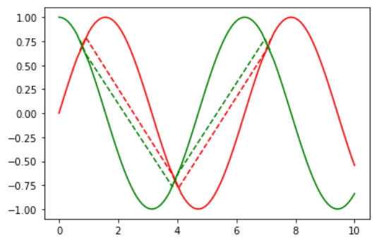
Example 3 :
This is similar to above example with extra cosine function to show different feature of line styles in mid graph.
Python3
import matplotlib.pyplot as plt
import numpy as np
x = np.linspace(0, 10, 100)
y1 = np.sin(x)
y2 = np.cos(x)
below = abs(y1-y2) < .2
above = abs(y1-y2) >= .2
plt.plot(x[below], y1[below], 'r--')
plt.plot(x[below], y2[below], 'g--')
plt.plot(x[above], y1[above], 'r-')
plt.plot(x[above], y2[above], 'g-')
plt.show()
|
Output :
Share your thoughts in the comments
Please Login to comment...