Autocorrelation plot using Matplotlib
Last Updated :
06 Aug, 2021
Autocorrelation plots are a commonly used tool for checking randomness in a data set. This randomness is ascertained by computing autocorrelations for data values at varying time lags.
Characteristics Of Autocorrelation Plot :
- It measures a set of current values against a set of past values and finds whether they correlate.
- It is the correlation of one-time series data to another time series data which has a time lag.
- It varies from +1 to -1.
- An autocorrelation of +1 indicates that if time series one increases in value the time series 2 also increases in proportion to the change in time series 1.
- An autocorrelation of -1 indicates that if time series one increases in value the time series 2 decreases in proportion to the change in time series 1.
Application of Autocorrelation:
- Pattern recognition.
- Signal detection.
- Signal processing.
- Estimating pitch.
- Technical analysis of stocks.
Plotting the Autocorrelation Plot
To plot the Autocorrelation Plot we can use matplotlib and plot it easily by using matplotlib.pyplot.acorr() function.
Syntax: matplotlib.pyplot.acorr(x, *, data=None, **kwargs)
Parameters:
- ‘x’ : This parameter is a sequence of scalar.
- ‘detrend’ : This parameter is an optional parameter. Its default value is mlab.detrend_none.
- ‘normed’ : This parameter is also an optional parameter and contains the bool value. Its default value is True.
- ‘usevlines’ : This parameter is also an optional parameter and contains the bool value. Its default value is True.
- ‘maxlags’ : This parameter is also an optional parameter and contains the integer value. Its default value is 10.
- ‘linestyle’ : This parameter is also an optional parameter and used for plotting the data points, only when usevlines is False.
- ‘marker’ : This parameter is also an optional parameter and contains the string. Its default value is ‘o’.
Returns: (lags, c, line, b)
Where:
- lags are a length 2`maxlags+1 lag vector.
- c is the 2`maxlags+1 auto correlation vector.
- line is a Line2D instance returned by plot.
- b is the x-axis.
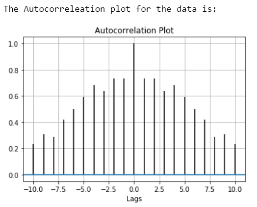
Example 1:
Python3
import matplotlib.pyplot as plt
import numpy as np
data = np.array([12.0, 24.0, 7., 20.0,
7.0, 22.0, 18.0,22.0,
6.0, 7.0, 20.0, 13.0,
8.0, 5.0, 8])
plt.title("Autocorrelation Plot")
plt.xlabel("Lags")
plt.acorr(data, maxlags = 10)
print("The Autocorrelation plot for the data is:")
plt.grid(True)
plt.show()
|
Output:
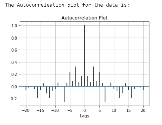
Example 2:
Python3
import matplotlib.pyplot as plt
import numpy as np
np.random.seed(42)
data = np.random.randn(25)
plt.title("Autocorrelation Plot")
plt.xlabel("Lags")
plt.acorr(data, maxlags = 20)
print("The Autocorrelation plot for the data is:")
plt.grid(True)
plt.show()
|
Output:
Share your thoughts in the comments
Please Login to comment...