Angular PrimeNG Table Component
Last Updated :
29 Dec, 2022
Angular PrimeNG is an open-source framework with a rich set of native Angular UI components that are used for great styling and this framework is used to make responsive websites with very much ease. It provides a lot of templates, components, theme design, an extensive icon library, and much more. In this article, we will see the Angular PrimeNG Table Component.
The Table component is used to display tabular data. PrimeNG provides a lot of customization in properties, methods, templates, and styling to make the component look and function as required. The Table component can also be made dynamic so that the data can be loaded efficiently.
Angular PrimeNG Table Components:
- Dynamic Columns: The columns of the Table can be dynamically instead of one by one. Simple ngFor directive is used to implement dynamic columns. cols property below is an array of objects that represent a column. The other alternative is binding the cols array to the columns property.
- Templates: The table is a template-driven component with named templates such as header and body. Templates grant a great level of customization and flexibility providing total control over the presentation.
- Change Detection: The Table needs to make aware of changes in the data in case of sorting or similar conditions. Due to performance reasons, this is only done when the reference of the value changes.
- Sections: The table has various templates which can display additional information such as a caption or summary.
- Column Grouping: The Table Columns can easily be grouped using templating.
- Row Group: The Row grouping has two modes, subheader mode where rows are grouped by a header row along with an optional group footer, and rowspan mode which uses rowspans instead of a header to group rows.
- Paginator: The Pagination can be enabled by setting the paginator property to true. The rows property defines the number of rows per page, and page links specify the number of page links to display.
- Sorting: The sorting can be enabled in the Table by adding the pSortableColumn directive and a sort indicator via the p-sortIcon component.
- Filtering: The filtering is enabled by defining the filter elements and calling the filter method on the local template.
- Data Types: The ColumnFilter requires a field to reference a data property along with a type to define the built-in form element to use in filtering.
- Separate Row and Filter Menu: They are two different modes of filtering and are used to filter the column data.
- Match modes: Different match modes are provided by default to customize the filtering.
- Custom Form Elements: Using templating, a custom element can be defined as the filter.
- Global Filtering: We can enable global filtering which searches all the fields from a single form element.
- ColumnFilter Properties: This has the properties of the ColumnFilter and can be modified according to the needs and customized accordingly.
- ColumnFilter Templates: The templates are used to add extra customizability providing greater control over the presentation of ColumnFilter.
- Custom Filters: Custom filters can be created using FilterService API.
- TableCheckbox Properties: The TableCheckbox is used to select the rows of the Table and has properties to customize the TableCheckbox column.
- TableHeaderCheckbox Properties: The Table header has a checkbox that can be customized using the properties.
- TableRadioButton Properties: The TableRadio buttons can be customized using these properties.
- ContextMenu: ContextMenu provides a special integration with the Table which displays a menu on the right click.
- Cell Editing: The Cell values can be edited and saved with the new values.
- Row Editing: The Row editing toggles the visibility of all the editors in the row at once and provides additional options to save and cancel editing
- Expandable Rows: The Expandable Rows in the Table are used to display some extra details with each and every entry as putting all the values in columns is not always a good display and view of the application.
- Column Resize: The columns can be resized using drag drop by setting the resizable columns to true.
- Column Reordering: The Columns can be reordered using drag drop by setting the reorderableColumns to true and adding the pReorderableColumn directive to the columns that can be dragged.
- Rows Reordering: Row reordering is enabled by adding the pReorderableRow directive with a row index binding to the rows that can be reordered with drag and drop.
- Data Export: The table can export its data in CSV format using the built-in exportCSV() function.
- Scrolling: The Table supports both horizontal and vertical scrolling as well as frozen columns and rows.
- Flex Scroll: Setting the scrollHeight option as flex, the viewport adjusts itself according to the table parent’s height.
- Full Page Scroll: FlexScroll can also be used for cases where a scrollable viewport should be responsive with respect to the window size.
- Horizontal Scrolling: Horizontal scrollbar is displayed whenever the table width exceeds the viewport.
- Frozen Rows: Frozen rows are used to fix certain rows while scrolling, this data is defined with the frozenValue property.
- Frozen Columns: Certain columns can be frozen by using the pFrozenColumn directive of the table component.
- pFrozenColumn Properties: The Frozen column can be customized using the properties.
- Virtual Scrolling: Setting the virtualScroll property as true and providing a virtualScrollItemSize in pixels enables this feature.
- Lazy Loading: Large amounts of data can be loaded easily by loading small chunks of data is loaded by invoking the onLazyLoad callback.
- TableState: The Table state of sorting, page, and filtering can be saved in a session or browser.
- EmptyMessage: When there is no data, an emptymessage template can be used to display a message.
- Loading Status: The table has a loading property, when enabled a spinner icon is displayed to indicate data load.
- Scroll Layout: When there is not enough space for the table to fit all the content efficiently, the table displays a horizontal scrollbar.
- Stack Layout: In stack layout, columns are displayed as stacked after a certain breakpoint.
- Performance Tips: The data can be loaded and displayed efficiently using some rules.
- Properties: The properties are used to customize the Table and display and make it functional accordingly.
- Events: When the user interacts with the component, we can trigger some functions to call some methods and customize them accordingly.
- Methods: The methods are used to control the functionality of the component by calling some of its methods.
- Styling: The default style of the component can be changed using the style classes of the component.
Syntax:
Import the Module
import {TableModule} from 'primeng/table';
Use it as follows:
<p-table #dt [columns]="..."
    [value]="..." responsiveLayout="...">
    <ng-template pTemplate="body"
        let-rowData let-columns="...">
        <tr [pSelectableRow]="...">
            <td *ngFor="....">
                {{ .... }}
            </td>
        </tr>
    </ng-template>
</p-table>
Creating Angular application & Module Installation:
Step 1: Create an Angular application using the following command.
ng new geeks_angular
Step 2: After creating your project folder i.e. geeks_angular, move to it using the following command.
cd geeks_angular
Step 3: Install PrimeNG in your given directory.
npm install primeng --save
npm install primeicons --save
Project Structure: The project structure will look like the following:
Steps to run the application: Run the below command to see the output
ng serve --save
Example 1: Below is the example that illustrates the use of the Angular PrimeNG Table Component.
app.component.html:
HTML
<h1 style="color: green; text-align: center;">GeeksforGeeks</h1>
<h3>Angular PrimeNG Table Component</h3>
<p-table #dt [columns]="cols"
[value]="tutorials" responsiveLayout="scroll">
<ng-template pTemplate="header" let-columns>
<tr>
<th *ngFor="let col of columns">
{{ col.header }}
</th>
</tr>
</ng-template>
<ng-template pTemplate="body" let-rowData let-columns="columns">
<tr [pSelectableRow]="rowData">
<td *ngFor="let col of columns">
{{ rowData[col.field] }}
</td>
</tr>
</ng-template>
</p-table>
|
app.component.ts:
Javascript
import { Component } from "@angular/core";
import { SelectItem, FilterService, FilterMatchMode } from "primeng/api";
@Component({
selector: "app-root",
templateUrl: "./app.component.html"
})
export class AppComponent {
cols: any[];
tutorials: Tutorial[];
matchModeOptions: SelectItem[];
constructor(private filterService: FilterService) {}
ngOnInit() {
this.tutorials = [
{
title: "Queue",
category: "Data Structure",
rating: 8
},
{
title: "Circularly LinkedList",
category: "Data Structure",
rating: 1
},
{
title: "Doubly LinkedList",
category: "Data Structure",
rating: 3
},
{
title: "Singly LinkedList",
category: "Data Structure",
rating: 5
},
{
title: "Doubly Ended Queue",
category: "Data Structure",
rating: 10
},
{
title: "Binary Search Tree",
category: "Data Structure",
rating: 2
},
{
title: "Red Black Tree",
category: "Data Structure",
rating: 9
},
{
title: "Breadth First Search",
category: "Graph",
rating: 6
},
{
title: "Floyd's Cycle",
category: "Algorithm",
rating: 7
},
{
title: "Travelling Salesman Problem",
category: "Algorithm",
rating: 4
},
{
title: "Bellman Ford",
category: "Graph",
rating: 8
},
{
title: "KMP Algorithm",
category: "String",
rating: 10
}
];
this.cols = [
{ field: "title", header: "Title" },
{ field: "category", header: "Category" },
{ field: "rating", header: "Rating" }
];
}
}
export interface Tutorial {
title?: string;
category?: string;
rating?: number;
}
|
app.module.ts:
Javascript
import { NgModule } from "@angular/core";
import { BrowserModule } from "@angular/platform-browser";
import { HttpClientModule } from "@angular/common/http";
import { FormsModule } from "@angular/forms";
import { BrowserAnimationsModule }
from "@angular/platform-browser/animations";
import { AppComponent } from "./app.component";
import { ButtonModule } from "primeng/button";
import { TableModule } from "primeng/table";
import { AutoCompleteModule } from "primeng/autocomplete";
import { InputTextModule } from "primeng/inputtext";
@NgModule({
imports: [
BrowserModule,
BrowserAnimationsModule,
ButtonModule,
AutoCompleteModule,
FormsModule,
TableModule,
InputTextModule,
HttpClientModule
],
declarations: [AppComponent],
bootstrap: [AppComponent]
})
export class AppModule {}
|
Output:
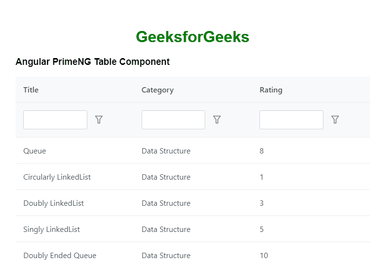
Example 2: Below is another example in which we have enabled the filter property and we can filter the data.
app.component.html:
HTML
<h1 style="color: green; text-align: center;">GeeksforGeeks</h1>
<h3>Angular PrimeNG Table Component</h3>
<p-table #dt [columns]="cols"
[value]="tutorials" responsiveLayout="scroll">
<ng-template pTemplate="header" let-columns>
<tr>
<th *ngFor="let col of columns">
{{ col.header }}
</th>
</tr>
<tr>
<th *ngFor="let col of columns">
<p-columnFilter
type="text"
[field]="col.field"
></p-columnFilter>
</th>
</tr>
</ng-template>
<ng-template pTemplate="body" let-rowData let-columns="columns">
<tr [pSelectableRow]="rowData">
<td *ngFor="let col of columns">
{{ rowData[col.field] }}
</td>
</tr>
</ng-template>
</p-table>
|
app.component.ts:
Javascript
import { Component } from "@angular/core";
import { FilterService } from "primeng/api";
@Component({
selector: "app-root",
templateUrl: "./app.component.html"
})
export class AppComponent {
cols: any[];
tutorials: Tutorial[];
constructor(private filterService: FilterService) {}
ngOnInit() {
this.tutorials = [
{
title: "Queue",
category: "Data Structure",
rating: 8
},
{
title: "Circularly LinkedList",
category: "Data Structure",
rating: 1
},
{
title: "Doubly LinkedList",
category: "Data Structure",
rating: 3
},
{
title: "Singly LinkedList",
category: "Data Structure",
rating: 5
},
{
title: "Doubly Ended Queue",
category: "Data Structure",
rating: 10
},
{
title: "Binary Search Tree",
category: "Data Structure",
rating: 2
},
{
title: "Red Black Tree",
category: "Data Structure",
rating: 9
},
{
title: "Breadth First Search",
category: "Graph",
rating: 6
},
{
title: "Floyd's Cycle",
category: "Algorithm",
rating: 7
},
{
title: "Travelling Salesman Problem",
category: "Algorithm",
rating: 4
},
{
title: "Bellman Ford",
category: "Graph",
rating: 8
},
{
title: "KMP Algorithm",
category: "String",
rating: 10
}
];
this.cols = [
{ field: "title", header: "Title" },
{ field: "category", header: "Category" },
{ field: "rating", header: "Rating" }
];
}
}
export interface Tutorial {
title?: string;
category?: string;
rating?: number;
}
|
app.module.ts:
Javascript
import { NgModule } from "@angular/core";
import { BrowserModule } from "@angular/platform-browser";
import { HttpClientModule } from "@angular/common/http";
import { FormsModule } from "@angular/forms";
import { BrowserAnimationsModule }
from "@angular/platform-browser/animations";
import { AppComponent } from "./app.component";
import { ButtonModule } from "primeng/button";
import { TableModule } from "primeng/table";
import { AutoCompleteModule } from "primeng/autocomplete";
import { InputTextModule } from "primeng/inputtext";
@NgModule({
imports: [
BrowserModule,
BrowserAnimationsModule,
ButtonModule,
AutoCompleteModule,
FormsModule,
TableModule,
InputTextModule,
HttpClientModule
],
declarations: [AppComponent],
bootstrap: [AppComponent]
})
export class AppModule {}
|
Output:
Reference: https://primefaces.org/primeng/table
Share your thoughts in the comments
Please Login to comment...