Angular MDBootstrap Tooltips Component
Last Updated :
07 Mar, 2022
MDBootstrap is a Material Design and bootstrap-based Angular UI library that is used to make good-looking webpages with its seamless and easy-to-use component. In this article, we will know how to use Tooltips Component in Angular MDBootstap. Tooltips are used to provide interactive textual hints to the user about the element when the mouse pointer moves over. we can use the tooltip in any direction i.e. top, right, bottom, left.
Important points:
- Tooltips of zero (0) length are never displayed.
- Tooltips on hidden element are never displayed.
- Tooltips for .disabled or disabled must be on wrapper element.
- Tooltips must be hidden from before the elements have removed from the DOM.
Properties:
- container: it is used to make a selector specifying the element the tooltip should be appended to.
- isDisabled: it is used to disable tooltip.
- isOpen: it used to return whether the tooltip is open or not.
- placement: It used to show the placement of a tooltip.
- mdbTooltip: it used to show the content of your tooltip.
- triggers: it is used to specify the events that will be triggered.
- delay: it is used to specify the delay after which tooltip will be fired.
- customHeight: it is used to specifies the height of the tooltip if was overwritten in styles.scss.
Syntax:
<button mdbTooltip="Top">Top</button>
Approach:
npm install
or
npm install -y
- After creating your project folder i.e. appname, move to it using the following command:
cd appname
- Start the server using the following command:
ng serve
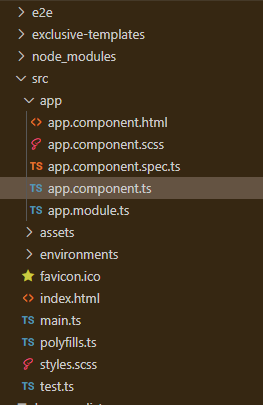
Project Structure: After complete installation, it will look like the following:
Example 1: This is the basic example that illustrates how to use the Tooltips component.
app.component.html
<div id='gfg'>
<h2>GeeksforGeeks</h2>
<h4>Angular MDBootstrap Tooltips Component</h4>
<br />
<a mdbTooltip="GeeksforGeeks" placement="top">Hover Here</a>
</div>
|
app.component.ts
import { Component } from '@angular/core';
@Component({
selector: 'app-root',
templateUrl: './app.component.html',
styleUrls: ['./app.component.css']
})
export class AppComponent { }
|
app.module.ts
import { BrowserModule } from '@angular/platform-browser';
import { NgModule } from '@angular/core';
import { BrowserAnimationsModule } from
'@angular/platform-browser/animations';
import { AppComponent } from './app.component';
import { MDBBootstrapModule } from 'angular-bootstrap-md';
import { FormsModule } from '@angular/forms';
@NgModule({
declarations: [
AppComponent
],
imports: [
BrowserModule,
BrowserAnimationsModule,
MDBBootstrapModule.forRoot(),
FormsModule,
],
providers: [],
bootstrap: [AppComponent]
})
export class AppModule { }
|
Output:

Example 2: In this example, we will know hot add tooltips in a button
app.component.html
<div id='gfg'>
<h2>GeeksforGeeks</h2>
<h4>Angular MDBootstrap Tooltips Component</h4>
<br />
<button type="button" mdbBtn color="info"
class="bwaves-light" mdbTooltip="Tooltip on top"
placement="top" mdbWavesEffect>
Top
</button>
<button type="button" mdbBtn color="danger"
class="waves-light" mdbTooltip="Tooltip on right"
placement="right" mdbWavesEffect>
Right
</button>
<button type="button" mdbBtn color="warning"
class="waves-light" mdbTooltip="Tooltip on bottom"
placement="bottom" mdbWavesEffect>
Bottom
</button>
<button type="button" mdbBtn color="success"
class="waves-light" mdbTooltip="Tooltip on left"
placement="left" mdbWavesEffect>
Left
</button>
</div>
|
app.component.ts
import { Component } from '@angular/core';
@Component({
selector: 'app-root',
templateUrl: './app.component.html',
styleUrls: ['./app.component.css']
})
export class AppComponent { }
|
app.module.t
import { BrowserModule } from '@angular/platform-browser';
import { NgModule } from '@angular/core';
import { BrowserAnimationsModule } from
'@angular/platform-browser/animations';
import { AppComponent } from './app.component';
import { MDBBootstrapModule } from 'angular-bootstrap-md';
import { FormsModule } from '@angular/forms';
@NgModule({
declarations: [
AppComponent
],
imports: [
BrowserModule,
BrowserAnimationsModule,
MDBBootstrapModule.forRoot(),
FormsModule,
],
providers: [],
bootstrap: [AppComponent]
})
export class AppModule { }
|
Output:

Reference: https://mdbootstrap.com/docs/angular/advanced/tooltips/
Share your thoughts in the comments
Please Login to comment...