How to Add Horizontal & Vertical Space Between Elements in Tailwind CSS ?
Last Updated :
04 Apr, 2024
Tailwind CSS simplifies web design with its utility-first approach. Creating websites that look good is important in web development. Tailwind CSS is a tool that helps make this easier. One important thing to learn is how to put space between elements.
Below are the approaches to Add Horizontal & Vertical Space Between Elements in Tailwind CSS:
Adding Space Using Margin Utility Classes
We can add horizontal and vertical spacing between elements using Margin Classes in CSS. Margin utility classes in Tailwind CSS allow you to add space around an element. They provide options for adding margin on all sides or specific sides. and replace {size} with a numeric value to specify the desired margin size in the syntax.
Syntax:
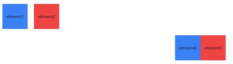
<div class="m-{size}"></div>Example: Illustration of Adding Space Using Margin Utility Classes.
HTML
<!DOCTYPE html>
<html lang="en">

<head>
    <meta charset="UTF-8">
    <meta name="viewport" content="width=device-width,
                                   initial-scale=1.0">
    <title>Tailwind CSS Space Between Elements</title>
    <script src=
"https://cdn.tailwindcss.com"></script>
</head>

<body class="p-6">
    <!-- Adding Horizontal Space -->
    <div class="flex">
        <div class="w-24 h-24 bg-blue-500
                    flex justify-center
                    items-center mr-6">
          <span>element1</span></div>
        <div class="w-24 h-24 bg-red-500
                    flex justify-center
                    items-center mr-6">
          <span>element2</span></div>
    </div>

    <!-- Adding Vertical Space -->
    <div class="flex justify-center
                items-center mt-6">
        <div class="w-24 h-24 bg-blue-500
                    flex justify-center
                    items-center mb-6">
          <span>element4</span></div>
        <div class="w-24 h-24 bg-red-500
                    flex justify-center
                    items-center mb-6">
          <span>element5</span></div>

    </div>
</body>

</html>
Output:
Adding Space Using Padding Utility Classes
We use padding utility classes in Tailwind CSS to make space inside elements. These classes let us choose where to add padding, either all around or just on certain sides. and Replace {size} with a numeric value to specify the desired padding size in the syntax.
Syntax:
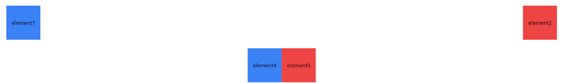
<div class="p-{size}"></div>Example: Illustration of Adding Spaces using Padding Utility Classes.
HTML
<!DOCTYPE html>
<html lang="en">

<head>
    <meta charset="UTF-8">
    <meta name="viewport" content="width=device-width,
                                   initial-scale=1.0">
    <title>Tailwind CSS Space Between Elements</title>
    <script src=
"https://cdn.tailwindcss.com">
      </script>
</head>

<body class="p-6">
    <!-- Adding Horizontal Space -->
    <div class="flex justify-between
                items-center">
        <div class="w-24 h-24 bg-blue-500
                    flex justify-center
                    items-center px-4">
          <span>element1</span></div>
        <div class="w-24 h-24 bg-red-500
                    flex justify-center
                    items-center px-4">
          <span>element2</span></div>

    </div>

    <!-- Adding Vertical Space -->
    <div class="flex justify-center
                items-center mt-6">
        <div class="w-24 h-24 bg-blue-500
                    flex justify-center
                    items-center py-4">
          <span>element4</span></div>
        <div class="w-24 h-24 bg-red-500
                    flex justify-center
                    items-center py-4">
          <span>element5</span></div>

    </div>
</body>

</html>
Output:
Adding Space Using Flexbox Utility Classes
We use flexbox utility classes in Tailwind CSS to easily arrange elements with precise spacing. With flexbox properties, we can control both horizontal and vertical spacing between elements effectively.
Syntax:
<div class="flex justify-{value} items-{value}"></div>Parameters:
- flex: Sets display to flex for flexbox layout.
- justify-{value}: Options like start, end, or center align items horizontally.
- items-{value}: Options like start, end, or center align items vertically.
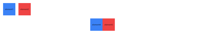
Example: Illustration of Adding Space Using Flexbox Utility Classes.
HTML
<!DOCTYPE html>
<html lang="en">

<head>
    <meta charset="UTF-8">
    <meta name="viewport" content="width=device-width,
                                   initial-scale=1.0">
    <title>Tailwind CSS Space Between Elements</title>
    <script src=
"https://cdn.tailwindcss.com">
      </script>
</head>

<body class="p-6">
    <!-- Adding Horizontal Space -->
    <div class="flex space-x-6">
        <div class="w-24 h-24 bg-blue-500
                    flex justify-center
                    items-center">
          <span>element1</span></div>
        <div class="w-24 h-24 bg-red-500
                    flex justify-center
                    items-center">
          <span>element2</span></div>
    </div>

    <!-- Adding Vertical Space -->
    <div class="flex justify-center
                items-center mt-6 ">
        <div class="w-24 h-24 bg-blue-500
                    flex justify-center
                    items-center">
          <span>element4</span></div>
        <div class="w-24 h-24 bg-red-500
                    flex justify-center
                    items-center">
            <span>element5</span>
        </div>
    </div>
</body>

</html>
Output:
Share your thoughts in the comments
Please Login to comment...