Uses of CSS
Last Updated :
06 Nov, 2023
What is CSS?
CSS stands for Cascading Style Sheets and it is used for designing and responsiveness of web pages. It helps in maintaining the positioning of each and every element that should be displayed on the web page. It is highly used for creating interactive user interfaces.’
What are the uses of CSS?
1. Helps in Styling
- Because of CSS, It is easier to add font style, background color, alignment, and many other properties to web pages.
- We can target the tags of HTML for decorating the web pages by using these features or attributes provided by CSS.
- It mainly helps in the responsiveness of a web page so that we can access the web page on any existing device with proper height, width, and other required specifications.
2. Time efficient
- There are three ways by which we can implement or apply CSS on web pages.
- Internal CSS: Used in the head tag of HTML within the style tag.
- External CSS: This external CSS file is linked to the HTML using a link tag in the head section of the HTML file.
- Inline CSS: It is used in HTML files directly. CSS styling is used in elements of HTML.
- External CSS mainly helps save a lot of time while loading web pages on Bowser. As external CSS changes will not break the code of HTML and for change in any kind of design only CSS files need to be changed.
3. Many more attributes
- CSS has lots of styling that helps in adding more and more features to web pages.
- Some of the important attributes are:
4. Helps in the maintenance of web pages
- CSS has many properties that help to change and provide many extra features to the web page.
- We only need to change the CSS file for any change in web page design.
- CSS is convenient for any change in web pages.
Applications of CSS
- Used in animation, As many web pages use animation for more user interactivity so it helps in implementing that features on web browsers.
- Used in creating social media. It is highly used in styling the UI of social media.
- Used in dynamic templates. Many CSS frameworks help to create the dynamic element of the web page.
Practical Implementation of CSS
- Responsiveness of Web Page: The web page will change its color, font-size, and width of the image according to the size of the device. For doing this we are using media query which helps us to implement the responsiveness of a web page.
Examples: In this example, we are using the explained approach, in order to create the Responsive Webpage.
HTML
<!DOCTYPE html>
<html>
<head>
<meta name="viewport"
content="width=device-width,
initial-scale=1.0">
<link rel="stylesheet"
href="./style.css">
</head>
<body>
<div>
<h2>GeekForGeeks</h2>
<img src=
</div>
</body>
</html>
|
CSS
body {
background-color: wheat;
}
h2 {
font-size: 60px;
}
@media only screen and (max-width: 1000px) {
body {
background-color: rgb(61, 239, 224);
}
h2 {
font-size: 45px;
}
img {
width: 350px;
height: 350px;
}
}
@media only screen and (max-width: 600px) {
body {
background-color: green;
}
h2 {
font-size: 35px;
}
img {
width: 250px;
height: 250px;
}
}
|
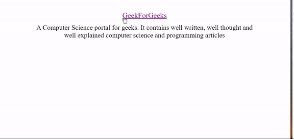
Output:

Responsiveness using CSS
- Add Styles on Link using CSS: In this approach, we are displaying how the link will change its color according to the activity on the web page. The hyperlink has three basic features that show different behaviors according to the attribute for eg: active, visited, and hover.
Example: In this example, we are using the above-explained approach.
HTML
<!DOCTYPE html>
<html lang="en">
<head>
<meta charset="UTF-8">
<meta name="viewport"
content="width=device-width,
initial-scale=1.0">
<title>link behaviour</title>
<link rel="stylesheet"
href="./style.css">
</head>
<body>
<div>
target="_blank">
GeekForGeeks
</a>
<p>
A Computer Science portal for geeks.
It contains well written, well thought
and well explained computer
science and programming articles
</p>
</div>
</body>
</html>
|
CSS
* {
text-align: center;
margin: auto;
padding: 15px;
}
p {
font-size: 24px;
width: 800px;
text-align: center;
}
a {
color: green;
font-size: 26px;
}
a:visited {
color: purple;
}
a:hover {
color: coral;
}
a:active {
color: blue;
}
|
Output:
Links in CSS
Share your thoughts in the comments
Please Login to comment...