React Suite Input Component
Last Updated :
24 Jun, 2022
React Suite is a popular front-end library with a set of React components that are designed for the middle platform and back-end products. Input component allows the user to allow the user to create a basic widget for getting the user input is a text field. We can use the following approach in ReactJS to use the React Suite Input Component.
Input Props:
- classPrefix: It is used to denote the prefix of the component CSS class.
- defaultValue: It is used to denote the default value.
- disabled: It is used to disable the component.
- onChange: It is a callback function that is triggered when the value is changed.
- size: It is used to denote the input size.
- type: It is used to denote the HTML input type.
- value: It is used to denote the value (Controlled).
InputGroup Props:
- classPrefix: It is used to denote the prefix of the component CSS class.
- inside: It is used to set the composition content internally.
- size: It is used to denote the input group size.
Creating React Application And Installing Module:
Step 1: Create a React application using the following command:
npx create-react-app foldername
Step 2: After creating your project folder i.e. foldername, move to it using the following command:
cd foldername
Step 3: After creating the ReactJS application, Install the required module using the following command:
npm install rsuite
Project Structure: It will look like the following.

Project Structure
Example 1: Now write down the following code in the App.js file. Here, App is our default component where we have written our code.
Javascript
import React from 'react'
import 'rsuite/dist/styles/rsuite-default.css';
import { Input } from 'rsuite';
export default function App() {
const [dreamCity, setDreamCity] = React.useState('')
return (
<div style={{
display: 'block', width: 700, paddingLeft: 30
}}>
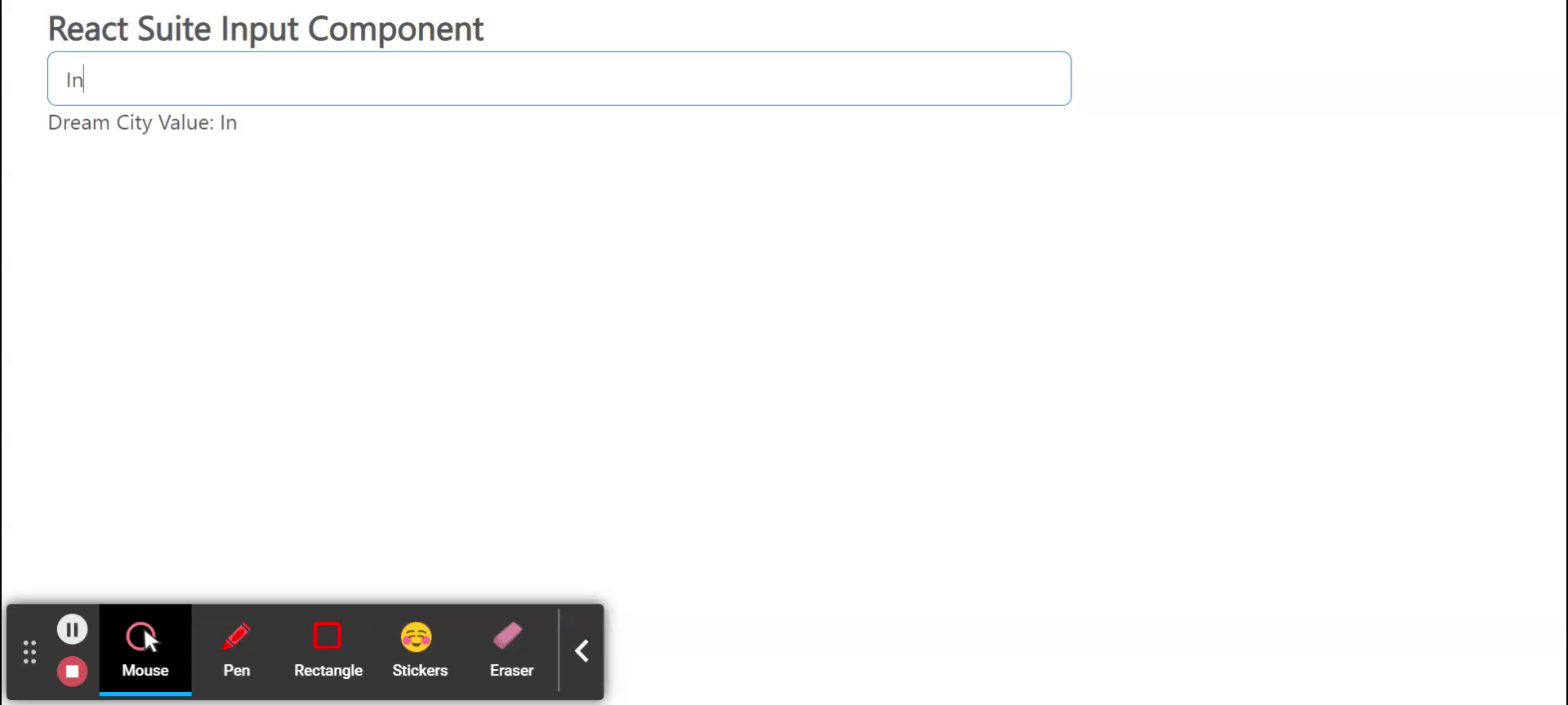
<h4>React Suite Input Component</h4>
<Input
placeholder="Enter your dream city"
onChange={(e) => setDreamCity(e)}
/>
Dream City Value: {dreamCity}
</div>
);
}
|
Step to Run Application: Run the application using the following command from the root directory of the project:
npm start
Output: Now open your browser and go to http://localhost:3000/, you will see the following output:
Example 2: In this example, we will learn how can we use Tooltip with Input Component. This tooltip can be used to show whether any entry is compulsory or not.
Javascript
import React from 'react'
import 'rsuite/dist/rsuite.min.css';
import { Input } from 'rsuite';
import { Whisper,Tooltip } from 'rsuite';
export default function App() {
return (
<div style={{
display: 'block', width: 700, paddingLeft: 30
}}>
<h1 style={{color:'green'}}>GeeksforGeeks</h1>
<h3>React Suite Input Component</h3>
<Whisper trigger="focus" speaker={<Tooltip>Required</Tooltip>}>
<Input style={{ width: 300 }} placeholder="Default Input" />
</Whisper>
</div>
);
}
|
Output:
Reference: https://rsuitejs.com/components/input/
Share your thoughts in the comments
Please Login to comment...