Power BI – Decomposition Tree
Last Updated :
13 Mar, 2024
In this article, we will learn to implement decomposition charts using Power BI. This discusses some important concepts used to create the very common decomposition tree charts so as to make large business data analysis. We will be discussing the following topics and their implementation in the Power BI desktop. Power BI has the capacity to incorporate AI and machine learning.
Pre-requisite: You can refer to Power BI interactive dashboards for easy implementation of the following charts. Learning Power platforms tools will be very useful for working quickly for business needs.
What is the decomposition tree in Power BI?
We break down (decompose) data into individual categories and determine the average, sum, high, and low values using different AI functions. This visual decomposition tree helps in analyzing data very quickly in order to publish or export business reports.
Uses or aim of the decomposition tree:
- It provides an interactive and easy visual interface for data exploration.
- It helps in the aggregation of data and it’s easy to drill down.
- The drill-down technique helps in providing detailed data.
- Saves a lot of time by providing quick root cause analysis for finding patterns and trends in data.
- The decomposition tree visuals let you analyze data across multiple dimensions.
- It provides visualization based on artificial intelligence (AI) like finding the next category, or dimension, based on some criteria doing further drill down.
When to use a decomposition tree?
- When the data is nested at multiple levels or dimensions.
- Whenever you need to drill into data fields in any order.
- Whenever you need to analyze data in any particular order or hierarchy.
Dataset used:
The dataset used is “SaleData“. Upload the dataset in Power BI and refer to the dataset to follow along with the below-given sections of the article.
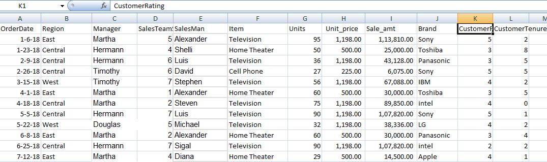
Data: We will be working with “SaleData” data with data fields as shown in the above image. The major variables used to show the charts are as follows.
The visualization requires two types of input:
- Analyze: This is the metric needed for analyzing. It must be a measure or an aggregate. This is the column the user needs for the breakdown of the data tree.
- Explain By: This holds one or more dimensions needed to drill down into. With the help of these columns, further analysis can be done.
Load Data in Power BI Desktop
- Click the “Get Data” option and select “Excel” for data source selection and extraction.
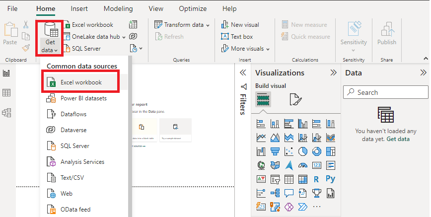
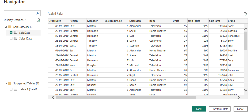
- Select the relevant desired file from the folder for data load. In this case, the file is “SaleData.xlsx”. Click the “Load” button once the preview is shown for the Excel data file.
- The dashboard is seen once the file is loaded with the “Visualizations” Pane and “Data fields” Pane which stores the different variables of the data file.

- In the “Visualizations” pane, we can select the chart type needed for our visual representation of business data. In the image, the red-colored square represents the “decomposition” chart that can be dragged for the “Report” view for further process.
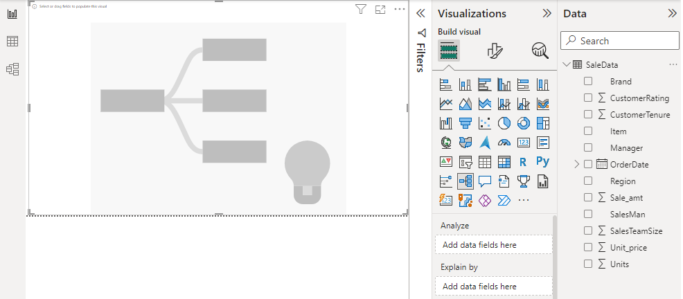
Decomposition tree chart in Power BI:
The key elements are as follows
- Root Value: The root value is the last node value (last column) reached after all the drill-down expansion.
- Branches: Each time the user adds a dimension, a new branch and related set of root nodes are created and can be seen for further expansion. The values are shown in the order of highest to lowest by default.
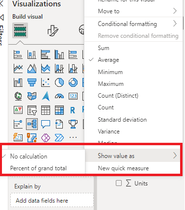
- Percentage Contribution: The node values of “Analyze” and “Explain by” metrics can be represented in percentages also by setting the “show value as ” option.
Click on the “Decomposition tree chart” (the second one from the above red square box) in the “Visualizations” pane. This creates a chart box in the canvas. Resize after the drag as per the user’s requirement and set options for the “Analyze” and “Explain by” and other fields. You can also set other arguments as per your preference.
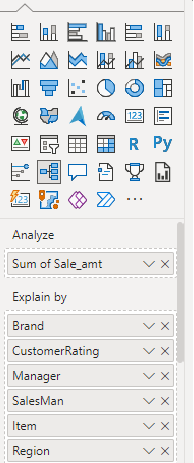
Note: “Sum of Sale_amt” is dragged to the “Analyze” field as we have chosen this as the metric for analysis based on the criteria of other data fields which are dragged to the “Explain by” field as shown above. The “Sale_amt” is analyzed based on the “Brand”, “CustomerRating”, “Manager”, “SalesMan”, “Item”, and “Region”.
Initial Output: This is the output based on the “Item” category. You can see a light bulb icon appears next to the nodes based on the “Explain by” data fields. This is called AI split. We will learn some concepts of AI splits.

AI Splits: The AI split is the feature of the Power BI decomposition tree which uses artificial intelligence to find the highest value and lowest value in your data. A light bulb icon appears next to the nodes based on the “Explain by” data fields. The tree also provides a dotted line showing that the dotted line leads to the highest value of the previous node in the data path. If the user hovers over the light bulb icon, the tooltip can be seen with an explanation.
1. AI split is used to know where to look next for the data.

2. AI split helps in finding high and low data automatically.
- High value: This shows the highest value of a field for any selected metric.

Another view:

The following explains AI split with different columns namely “Item”, “Brand” and “Region” which are basically the fields dragged to “Explain by” in the visualization pane.
1. When the user hovers over the “Item” column, it shows the ‘Average of Sale_amt is highest when the item is “Television“‘.
2. When the user hovers over the “Brand” column, it shows the ‘Average of Sale_amt is highest when the brand is “Intel“‘.
3. When the user hovers over the “Region” column, it shows the ‘Average of Sale_amt is highest when the item is “Central“‘.

- low value: This shows the lowest value of a field for any selected metric.

Another view on selecting “low value” for any selected node.

3. The user can have multiple AI levels chained together or mix up different AI levels like going from high to low and again to highest value.
Level 2 expansion: When further expanded by clicking the (“+”) sign in the right top corner of any category.

Output:

Another view: When the tree is drilled down further based on other categories.

Another view: When the first two columns (“Item” and “Region”) are deleted by clicking the “X” in the top right corner.
Note: For each selection of node from the previous level, the data path changes. In the last level, the node cross-filters data.

Some of the outputs which are set by “Percentage contribution” are as follows.

With three columns:

The data analysis done by following the above steps can also be preserved in the form of various data sources like CSV files or tabular format. Click on “More options” in the right corner of the main canvas.
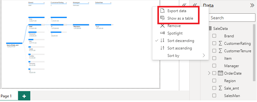
If “Export Data” is clicked (from the more options), the output will be saved in the CSV file ( “data.csv” ) format. The file can be accessed from this link.

If the “Show as a table” option is clicked (from the more options), the output will be saved in the CSV file format.

Benefits of Decomposition Tree:
- It supports easy drill-down features.
- It supports conditional formatting of nodes with different colors and custom changes.
- It supports sort capabilities and cross-highlight features.
- It supports improved filtering and keyboard shortcuts.
Conclusion: Decomposition trees analyze one value by one or multiple categories, or dimensions. Keep selecting high value until the user has a decomposition tree. You can delete levels by selecting the X in the heading whichever column is unwanted in that particular time. While trying out multiple dimensions in the decomposition tree or exploring the data, one can find the hierarchy and dataset of interest using the drill-down options.
Share your thoughts in the comments
Please Login to comment...