Logical Properties in CSS
Last Updated :
08 Apr, 2024
CSS logical properties use the terms block and inline to elaborate the direction of the flow of writing.
- Block properties: Sets up the top and bottom properties of the webpage (for standard English text), you could say that the dimension is perpendicular to the flow of text within a line. In simpler words, the vertical dimensions in horizontal writing modes (e.g., English) and horizontal dimensions in vertical writing modes (e.g., Japanese).
- Inline properties: Sets up the left and right properties of the webpage (for standard English text), you could say that the dimension is parallel to the flow of text within a line. In simpler words, the horizontal dimensions are in horizontal writing modes (e.g., English) and vertical in vertical writing modes (e.g., Japanese).
When we are working with logical properties instead of directional properties spacing and layout, both depend on writing modes and the direction of the flow of text. It enables the webpage’s layout and spacing to adjust according to the writing mode of the user, hence making it a better and more responsive website.
We think about the directional properties in terms of:
These terms in the physical properties refer to the physical layout of the user’s device.
We think about logical properties in terms of:
- block-start
- block-end
- inline-start
- inline-end
Logical properties are more flexible as compared to directional properties. If the writing mode (language style) changes, the content spacing and layout will also change according to the writing mode of the user.
Logical Properties are as follows:
Syntax:
 .container
 {
    text-align: end;
    border-inline-start: 1rem red solid;
    border-inline-end: 1rem black solid;
    border-block-start: 1rem blue solid;
    border-block-end: 1rem green solid;
}
Example 1: The below example will give you a syntactical overview of how to use the logical properties in CSS. Even if your pages are translated into some other language, your layout/design will adjust accordingly. This is the power of logical properties over directional properties. To make your website more responsive, you should use logical properties instead of directional properties. The border-block-start, border-block-end, border-inline-start, border-inline-end logical properties.
HTML
<html>
<head>
    <meta charset="UTF-8" />
    <meta http-equiv="X-UA-Compatible"
          content="IE=edge" />
    <meta name="viewport"
          content="width=device-width, initial-scale=1.0" />
    <title>GeeksforGeeks</title>
    <style>
        html
        {
            background: #f1f1f1;
        }
        .add-border
        {
            font-size: 1.5rem;
            font-weight: 800;
            line-height: 1.5;
            color: #2f4f4f;
            padding: 2rem;
            border-inline-start: 1rem red solid;
            border-block-start: 1rem green solid;
            border-inline-end: 1rem blue solid;
            border-block-end: 1rem purple solid;
        }

        .inline-start
        {
            color: red;
        }
        .block-start
        {
            color: green;
        }
        .inline-end
        {
            color: blue;
        }
        .block-end
        {
            color: purple;
        }

        p {
            margin: 0.25rem;
        }
    </style>
</head>
<body>
    <div style="text-align: center">
       <h1 style="color: green">GeeksforGeeks</h1>
    </div>
    <div class="container-box">
        <div class="add-border">
            <p class="block-start">block-start</p>
            <p class="block-end">block-end</p>
            <p class="inline-start">inline-start</p>
            <p class="inline-end">inline-end</p>
        </div>
    </div>
    <br/><br/>
</body>
</html>
Output:

The result of the above code
Example 2: The below example will show you the difference and use of block and inline logical properties.
HTML
<!DOCTYPE html>
<html lang="en">
<head>
    <meta charset="UTF-8" />
    <meta http-equiv="X-UA-Compatible"
          content="IE=edge" />
    <meta name="viewport"
          content="width=device-width, initial-scale=1.0" />
    <title>GeeksforGeeks</title>
    <style>
        *
        {
            margin: 0;
            box-sizing: border-box;
        }
        body
        {
            background-color: black;
            padding: 22px;
            text-align: center;
        }
        main
        {
            display: flex;
            flex-direction: column;
            justify-content: center;
            align-items: center;
            height: 100vh;
        }
        .border-block
        {
            border-block: 10px solid blue;
            font-size: 100px;
            width: 800px;
            margin-block-end: 150px;
        }
        .border-inline
        {
            border-inline: 10px solid blue;
            font-size: 100px;
            width: 800px;
        }
    </style>
</head>
<body>
    <header>
        <h1 style="color: green">GeeksforGeeks</h1>
    </header>
    <main>
        <p class="border-block"    style="color:white">border-block</p>
        <p class="border-inline" style="color:white">border-inline</p>
    </main>
</body>
</html>
Output:
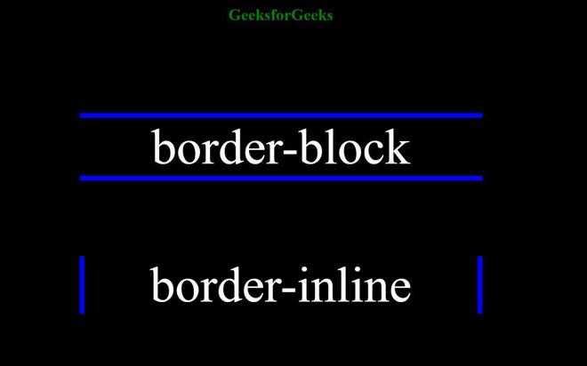
The result of the above code
You can easily see the use of block and inline logical properties. Using logical properties instead of directional properties is a good practice.
Share your thoughts in the comments
Please Login to comment...