How to Style Checkboxes in Tailwind CSS ?
Last Updated :
13 Mar, 2024
In Tailwind CSS, you can style checkboxes using utility classes to customize their appearance. You can use utility classes like appearance-none to remove the default browser styles from checkboxes.
Approach
- Begin with the basic HTML structure, including the
<!DOCTYPE html> declaration, <html>, <head>, and <body> tags. Import Tailwind CSS for styling by adding a <script> tag in the <head> section. - Create a checkbox component by using
<input type="checkbox"> elements along with associated <label> elements. Each checkbox can have different states such as default, checked, or disabled. Apply Tailwind CSS classes to style the checkboxes, labels, and their respective states. - Implement a switch-style inline checkbox component using
<input type="checkbox"> elements nested within <label> elements. Utilize Tailwind CSS classes to style the switch toggles and their associated labels. Use custom CSS properties and pseudo-elements to create the toggle effect when the checkboxes are checked or unchecked. - Apply Tailwind CSS classes to style the checkboxes, labels, and container elements. Customize the colors, sizes, padding, and margins to create visually appealing checkbox components.
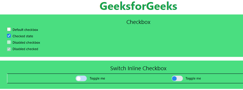
Example 1: Implementation to design checkboxes using Tailwind CSS
HTML
                    <!DOCTYPE html>
<html lang="en">

<head>
    <meta charset="UTF-8">
    <meta name="viewport"
          content="width=device-width, initial-scale=1.0">
    <title>Checkboxes</title>
    <script src="https://cdn.tailwindcss.com"></script>
</head>

<body class="text-center mx-8 space-y-4">
    <h1 class="text-green-600 text-5xl font-bold">
        GeeksforGeeks
    </h1>
    <div class="bg-green-400  px-8 py-4">
        <h3 class="text-2xl text-center"> Checkbox</h3>
        <div class="flex justify-start m-2 ">
            <input id="first" type="checkbox"
                   class="w-4 h-4 text-blue-800
                          focus:ring-red-500 focus:ring-2">
            <label for="first" class="ms-2 text-sm font-medium">
                  Default checkbox
              </label>
        </div>
        <div class="flex justify-start m-2">
            <input checked id="second" type="checkbox"
                   class="w-4 h-4 text-blue-800
                          focus:ring-red-500 focus:ring-2">
            <label for="second" class="ms-2 text-sm font-medium">
                  Checked state
              </label>
        </div>
        <div class="flex justify-start m-2">
            <input disabled id="disabled" type="checkbox"
                   class="w-4 h-4 text-blue-600 ">
            <label for="disabled" class="ms-2 text-sm font-medium">
                  Disabled checkbox
              </label>
        </div>
        <div class="flex items-center m-2">
            <input disabled checked id="disabled-first"
                   type="checkbox" class="w-4 h-4 text-blue-600">
            <label for="disabled-first"
                   class="ms-2 text-sm font-medium">
                  Disabled checked
              </label>
        </div>
    </div>
    <div class="bg-green-400 px-8 py-4">
        <h3 class="text-2xl text-center">
              Switch Inline Checkbox
          </h3>
        <div class="flex justify-evenly border border-y-
                    slate-950 p-2 m-2">
            <label class="inline-flex items-center cursor-pointer">
                <input type="checkbox" class="sr-only peer">
                <div class="relative w-12 h-6 bg-blue-200 rounded-full
                            peer peer-checked:after:translate-x-full
                            rtl:peer-checked:after:-translate-x-full
                            peer-checked:after:border-white after:content-['']
                            after:absolute after:top-[2px] after:start-[2px]
                            after:bg-white after:border-gray-300 after:border
                            after:rounded-full after:h-5
                            after:w-5 after:transition-all
                            peer-checked:bg-blue-500">
                </div>
                <span class="ms-3 text-sm font-medium">
                      Toggle me
                  </span>
            </label>
            <label class="inline-flex items-center cursor-pointer">
                <input type="checkbox" class="sr-only peer">
                <div class="relative w-12 h-6 bg-gray-200
                            rounded-full peer
                            peer-checked:after:translate-x-full
                            rtl:peer-checked:after:-translate-x-full
                            peer-checked:after:border-white after:content-['']
                            after:absolute after:top-[2px] after:start-[2px]
                            after:bg-blue-500   after:rounded-full after:h-5
                            after:w-5 after:transition-all
                            peer-checked:bg-gray-300">
                </div>
                <span class="ms-3 text-sm font-medium">
                      Toggle me
                  </span>
            </label>
        </div>
    </div>
</body>

</html>
Output:
Example 2: Implementation to design some more checkboxes using Tailwind CSS
HTML
                    <!DOCTYPE html>
<html lang="en">

<head>
    <meta charset="UTF-8">
    <meta name="viewport"
          content="width=device-width, initial-scale=1.0">
    <title>Checkboxes</title>
    <script src="https://cdn.tailwindcss.com"></script>
</head>

<body class="text-center  m-6 space-y-4">
    <h1 class="text-green-600 text-3xl font-bold">
        GeeksforGeeks
    </h1>
    <div class="items-center space-y-4 p-3 bg-green-300">
        <div class="flex   ">
            <input checked id="orange-checkbox"
                   type="checkbox"
                   class="w-4 h-4 accent-orange-500">
            <label for="orange-checkbox"
                   class="ms-2 text-sm font-medium ">
                  Orange Checkbox
              </label>
        </div>
        <div class="flex   ">
            <input checked id="red-checkbox"
                   type="checkbox"
                   class="w-4 h-4 accent-red-500">
            <label for="red-checkbox"
                   class="ms-2 text-sm font-medium ">
                  Red Checkbox
              </label>
        </div>
        <div class="flex  ">
            <input checked id="green-checkbox"
                   type="checkbox"
                   class="w-4 h-4 accent-green-500">
            <label for="green-checkbox"
                   class="ms-2 text-sm font-medium">
                  Green Checkbox
              </label>
        </div>
        <div class="flex  ">
            <input type="checkbox"
                   class="peer relative appearance-none w-5 h-5
                          border rounded-full border-pink-400
                          cursor-pointer
                          checked:bg-pink-600"
                   checked id="circular-checkbox" />

            <label for="circular-checkbox"
                   class="ms-2 text-sm font-medium ">
                  (Rounded Checked Checkbox) Pink Fill
              </label>
        </div>
        <div class="flex  ">
            <input type="checkbox"
                   class="peer relative appearance-none
                          w-5 h-5 border
                          rounded-full border-red-400
                          cursor-pointer
                          checked:bg-teal-600"
                   id="unchecked-circular-checkbox" />
            <label for="unchecked-circular-checkbox"
                   class="ms-2 text-sm font-medium ">
                  (Rounded Checkbox) Teal Fill
              </label>
        </div>
    </div>
</body>

</html>
Output:
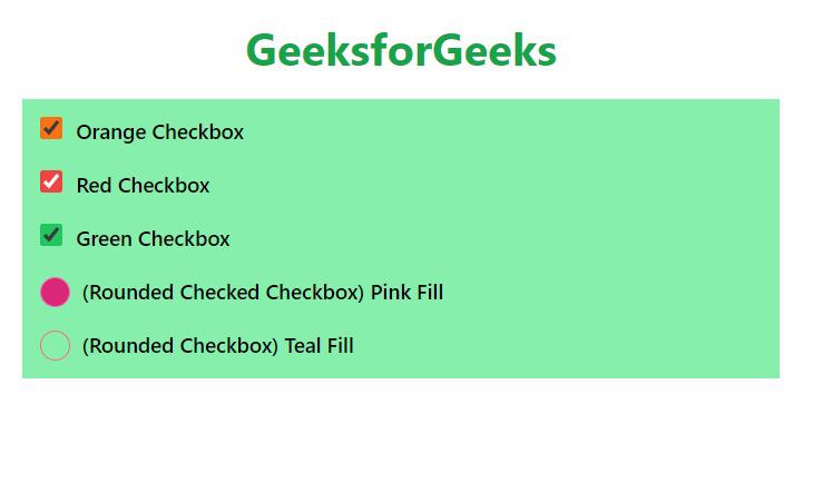
Colored and Rounded Checkbox using Tailwind CSS
Share your thoughts in the comments
Please Login to comment...