How to move Flex Items to the Right in Tailwind CSS ?
Last Updated :
20 Feb, 2024
Aligning flex items to the right within a flex container refers to positioning the child elements (flex items) towards the right-hand side of the container when using the flexbox layout in CSS. This alignment can be achieved through various techniques or Tailwind CSS utility classes.
Using justify-end
In this approach, the justify-end class is utilized to align flex items to the right within the flex container by positioning them at the end of the main axis.
Approach
- Apply the
flex class to the container element to enable Flexbox.
- Assign the
justify-end class to the flex container. This class aligns the flex items to the end of the main axis, pushing them to the right in a row direction.
- Optionally, you can utilize utility classes such as
flex-grow to control the sizing behaviour of flex items. For instance, applying flex-grow to the first flex item will make it take up the remaining space in the flex container.
- Create flex items within the container, and they will naturally be positioned to the right due to the
justify-end class applied to the container.
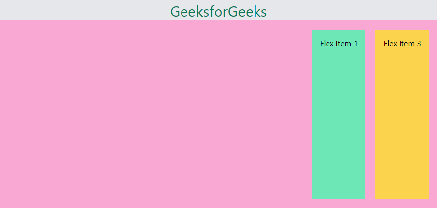
Example: The below code shows the example using the justify-end.
HTML
<!DOCTYPE html>
<html lang="en">
<head>
<meta charset="UTF-8">
<meta name="viewport"
content="width=device-width, initial-scale=1.0">
<title>Flexbox with Tailwind CSS</title>
<link href=
rel="stylesheet">
</head>
<body class="bg-gray-200 p-8 w-full h-60">
<h1 class="text-green-700 text-center text-3xl text-bolder">
GeeksForGeeks
</h1>
<div class="flex justify-end bg-pink-300 p-5 w-84 h-96">
<div class="bg-green-300 p-4">Flex Item 1</div>
<div class="bg-yellow-300 ml-5 p-4">Flex Item 3</div>
</div>
</body>
</html>
|
Output:
Using margin auto
By applying the ml-auto utility class, the left margin of a flex item is set to auto, causing it to be pushed to the rightmost side within the flex container.
Approach
- Start by applying the
flex class on the container to activate flexbox layout.
- Then, add the
ml-auto class to the first flex item, which automatically sets its left margin to push it to the right.
- This adjustment effectively allocates remaining space to the first item, causing other items to shift to the right within the container.
- As a result, all flex items are aligned to the right within the flex container.
Example: The below code shows the example using the margin-left:auto.
HTML
<!DOCTYPE html>
<html lang="en">
<head>
<meta charset="UTF-8">
<meta name="viewport"
content="width=device-width, initial-scale=1.0">
<title>Moving Flex Item to right</title>
<link href=
rel="stylesheet">
</head>
<body class="bg-gray-200 p-8">
<h1 class="text-green-700 text-center text-3xl text-bolder">
GeeksforGeeks
</h1>
<div class="flex bg-pink-300 p-5 w-84 h-96">
<div class="ml-auto bg-blue-300 p-4">Flex Item 1</div>
<div class="bg-green-300 ml-5 p-4">Flex Item 2</div>
<div class="bg-yellow-300 ml-5 p-4">Flex Item 3</div>
</div>
</body>
</html>
|
Output:

Share your thoughts in the comments
Please Login to comment...