How to change the Order of Flex Items in Tailwind CSS ?
Last Updated :
09 Feb, 2024
In Tailwind CSS, Changing the order of flex items allows you to create a responsive design and adjust the layout based on screens of different sizes or orientations. It applies to the elements under the flex container.
Using the order utility class
The order utility class in tailwind CSS is one of the widely used ways to set the order of the flex items. The default order is 0, however, you can use positive or negative values to rearrange the items.
Syntax:
// n can take positive as well as negative values.
<div class="order-{n}"></div>
Example: Implementation using the order utility class.
HTML
<!DOCTYPE html>
<html lang="en">
<head>
<meta charset="UTF-8">
<meta name="viewport"
content="width=device-width, initial-scale=1.0">
<link href=
rel="stylesheet">
<title>Tailwind CSS Order Utility</title>
</head>
<body class="p-8">
<h2 class="text-green-300 text-2xl font-bold mb-4">
Using the 'order' Utility Class in Tailwind CSS
</h2>
<div class="flex">
<div class="order-2 bg-blue-300 p-4 m-2">
Item 1 (Order 2)
</div>
<div class="order-1 bg-green-300 p-4 m-2">
Item 2 (Order 1)
</div>
<div class="order-3 bg-yellow-300 p-4 m-2">
Item 3 (Order 3)
</div>
</div>
<div class="flex mt-4">
<div class="order-3 bg-yellow-300 p-4 m-2">
Item 1 (Order 3)
</div>
<div class="order-(-1) bg-red-300 p-4 m-2">
Item 2 (Order -1)
</div>
<div class="order-1 bg-green-300 p-4 m-2">
Item 3 (Order 1)
</div>
</div>
</body>
</html>
|
Output: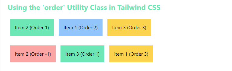
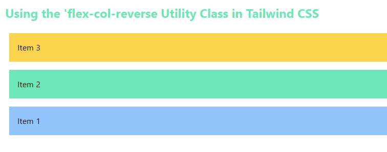
Using the flex-col-reverse utility class
The flex-col-reverse utility class is used when you want to reverse the order of the flex container but in a column-oriented manner.
Syntax:
<div class="flex flex-col-reverse">
  <!-- Flex items in reversed order -->
</div>
Example: Implementation using the flex-col-reverse utility class.
HTML
<!DOCTYPE html>
<html lang="en">
<head>
<meta charset="UTF-8">
<meta name="viewport"
content="width=device-width, initial-scale=1.0">
<link href=
rel="stylesheet">
<title>Tailwind CSS flex-col-reverse Utility</title>
</head>
<body class="p-8">
<h2 class="text-2xl text-green-300 font-bold mb-4">
Using the 'flex-col-reverse' Utility Class in Tailwind CSS
</h2>
<div class="flex flex-col-reverse">
<div class="bg-blue-300 p-4 m-2">Item 1</div>
<div class="bg-green-300 p-4 m-2">Item 2</div>
<div class="bg-yellow-300 p-4 m-2">Item 3</div>
</div>
</body>
</html>
|
Output:
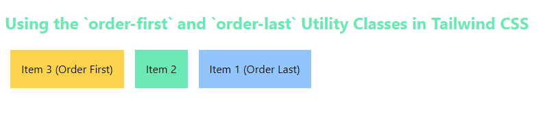
Using the order-first and order-last utility class
The order-first and order-last utility classes are applied over two div elements. The order first brings the elements to the beginning of flex container. On the other hand, order-last brings the flex item to the end of the container.
Syntax:
<div class="order-first"></div>
<div class="order-last"></div>
Example: Implementation using the using the order-first and order-last utility class.
HTML
<!DOCTYPE html>
<html lang="en">
<head>
<meta charset="UTF-8">
<meta name="viewport"
content="width=device-width, initial-scale=1.0">
<link href=
rel="stylesheet">
<title>Tailwind CSS order-first and order-last Utility</title>
</head>
<body class="p-8">
<h2 class="text-2xl text-green-300 font-bold mb-4">
Using the `order-first` and `order-last`
Utility Classes in Tailwind CSS
</h2>
<div class="flex">
<div class="order-last bg-blue-300 p-4 m-2">
Item 1 (Order Last)\
</div>
<div class="bg-green-300 p-4 m-2">Item 2</div>
<div class="order-first bg-yellow-300 p-4 m-2">
Item 3 (Order First)
</div>
</div>
</body>
</html>
|
Output:
Share your thoughts in the comments
Please Login to comment...