How to make react-bootstrap modal draggable?
Last Updated :
23 Nov, 2023
In this article, we will learn how to make a react-bootstrap modal draggable. React-bootstrap is a popular library for building effective components for React applications. It provides various styled components, modals, attributes, etc.
To make a React-Bootstrap modal draggable, you can use a third-party library like react-draggable. Install it, and wrap your modal component with Draggable. Now, your modal can be smoothly dragged around the screen, offering a user-friendly and intuitive experience.
Steps to create the application:
Step 1: Create the react app using the following CRA command.
npx create-react-app appdemo
Step 2: Now, navigate to your current project i.e. appdemo using the following command.
cd appdemo
Step 3: Install the required modules i.e. react-bootstrap, react-draggable, and bootstrap using the following command.
npm install react-bootstrap bootstrap react-draggable
Step 4: Import the necessary components from react-bootstrap, react-draggable, and bootstrap.
import React from 'react';
import { Modal } from 'react-bootstrap';
import Draggable from 'react-draggable';
import 'bootstrap/dist/css/bootstrap.min.css';
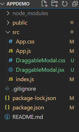
Project Structure:
The updated dependencies in package.json file will look like:
"dependencies": {
    "@testing-library/jest-dom": "^5.17.0",
    "@testing-library/react": "^13.4.0",
    "@testing-library/user-event": "^13.5.0",
    "bootstrap": "^5.3.2",
    "react": "^18.2.0",
    "react-bootstrap": "^2.8.0",
    "react-dom": "^18.2.0",
    "react-draggable": "^4.4.6",
    "react-router-dom": "^6.18.0",
    "react-scripts": "5.0.1",
    "web-vitals": "^2.1.4"
}
Example: In this example we will see how to implement a draggable modal triggering with a button in react.
Javascript
import React from 'react';
import { Modal } from 'react-bootstrap';
import Draggable from 'react-draggable';
import "./DraggableModal.css"
const DraggableModal = ({ show, onHide, title, body }) => {
return (
<Modal show={show} onHide={onHide}
dialogClassName="draggable-modal">
<h5 className='modal-container'>Drag the below div</h5>
<Draggable handle=".modal-header">
<div className='dragg-it'>
<Modal.Header>
<Modal.Title>{title}</Modal.Title>
</Modal.Header>
<Modal.Body>{body}</Modal.Body>
</div>
</Draggable>
</Modal>
);
};
export default DraggableModal;
|
Javascript
import React, { useState } from "react";
import Button from "react-bootstrap/Button";
import DraggableModal from "./DraggableModal";
import "bootstrap/dist/css/bootstrap.min.css";
import "./App.css";
const App = () => {
const [showModal, setShowModal] = useState(false);
const handleShowModal = () => setShowModal(true);
const handleHideModal = () => setShowModal(false);
return (
<div>
<div className="component">
<Button variant="success" onClick={handleShowModal}>
click here
</Button>
</div>
<DraggableModal
show={showModal}
onHide={handleHideModal}
title="Draggable Modal"
>
<p>Modal content goes here.</p>
</DraggableModal>
</div>
);
};
export default App;
|
CSS
.draggable-modal {
display: flex !important;
align-items: flex-start;
margin: 0;
}
.modal-container {
display: flex;
justify-content: center;
align-items: center;
}
.dragg-it {
cursor: move;
background-color: #f5f5f5;
border-bottom: 1px solid #ddd;
}
.modal-content {
padding: 15px;
}
|
CSS
body {
display: flex;
align-items: center;
justify-content: center;
height: 100vh;
margin: 0;
}
.component {
text-align: center;
}
|
Steps to run the application:
- To run the react application, Open the terminal > cd appdemo > npm start
npm start
Output: Now open your browser and go to http://localhost:3000/, you will see the following output:
.gif)
Explanation:
- Component Structure: The
DraggableModal component returns a react-bootstrap Modal with a draggable container using the react-draggable library, and it takes show, onHide, title, and body as props.
- Props Usage: The
DraggableModal component utilizes props like show, onHide, title, and body to control the appearance, hiding, and content of the modal.
- Draggable Functionality: By wrapping the Modal header and body with the
Draggable element from react-draggable, the modal becomes draggable, allowing users to move it around the screen.
- State Handling in App.js: In the
App.js file, the useState hook is employed to manage the state of a button component, and the DraggableModal component is utilized, providing a draggable modal experience.
Share your thoughts in the comments
Please Login to comment...