How to Make Oblique Lines with CSS / Bootstrap 3 ?
Last Updated :
16 Nov, 2020
In order to make oblique lines with CSS, there are two main approaches. The first approach involves the clip-path property of CSS and in the second approach, we use transform property with skew() of CSS.
Approach 1: Using clip-path property: The clip-path property is generally used to clip an element to a basic shape. But it can also be used to create oblique lines with tweaking property of polygon shape of clip-path. The main disadvantage of this property is its implementation and since many changes are needed to be observed and changed for converting it into oblique lines.
HTML
<!DOCTYPE html>
<html lang="en">
<head>
<meta charset="UTF-8">
<meta name="viewport" content=
"width=device-width, initial-scale=1.0">
<title>Oblique Lines in CSS</title>
<link rel="stylesheet" href=
integrity=
"sha384-BVYiiSIFeK1dGmJRAkycuHAHRg32OmUcww7on3RYdg4Va+PmSTsz/K68vbdEjh4u"
crossorigin="anonymous">
<style>
body{
background-color: burlywood;
margin:0;
}
div.polygon{
height: 100vh;
width: 100vw;
background: aliceblue;
clip-path: polygon(0 60%,
100% 3%, 100% 100%, 0 75%);
display:flex;
}
.content{
height: 50%;
width: 100%;
padding-top: 10px;
margin: auto;
color: green;
}
</style>
</head>
<body>
<div class="content">
<h2>GeeksForGeeks</h2>
<p>
This is a example of creating
oblique lines with content
using clip-path property of CSS.
</p>
</div>
<div class="polygon"></div>
</body>
</html>
|
Output:
The output image contains two oblique lines this is the zoomed output of the above part.
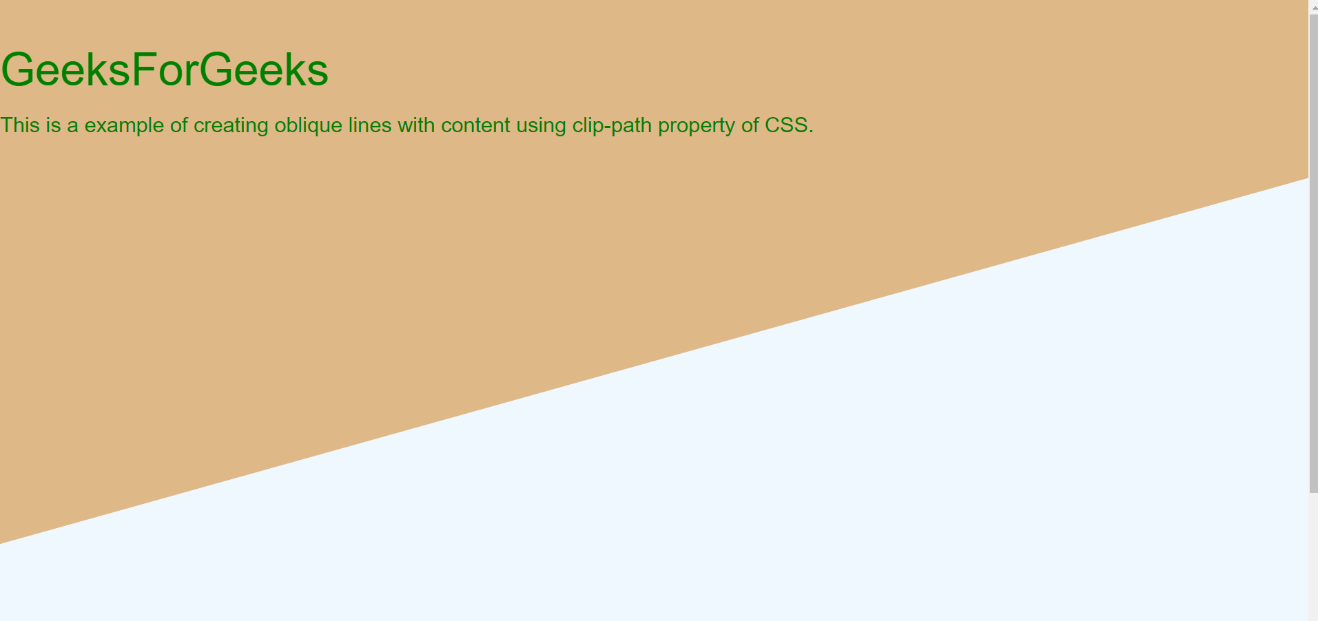
Using clip-path property and polygon as shape
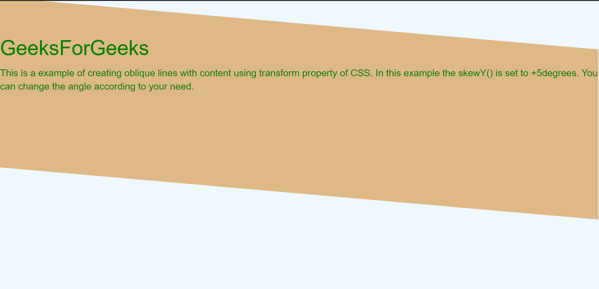
Approach 2: Using transform property: The transform skew property of CSS helps in rotating the division along x and y-axis. The skewX() and skewY() takes degrees of rotation as input. This property implementation is simple as compared to clip-path. Also, if you don’t want to rotate the content then we need to rotate in the reverse direction of division.
HTML
<!DOCTYPE html>
<html lang="en">
<head>
<meta charset="UTF-8">
<meta name="viewport" content=
"width=device-width, initial-scale=1.0">
<title>Oblique line using CSS</title>
<link rel="stylesheet" href=
integrity=
"sha384-BVYiiSIFeK1dGmJRAkycuHAHRg32OmUcww7on3RYdg4Va+PmSTsz/K68vbdEjh4u"
crossorigin="anonymous">
<style>
body {
background-color: aliceblue;
}
.maintransform {
margin-right: 1px;
margin-left: 0px;
background-color: burlywood;
position: absolute;
top: 33px;
left: 0px;
right: 0px;
height: 250px;
color: green;
font-family: Arial, Helvetica, sans-serif;
-ms-transform: skewY(5deg);
-webkit-transform: skewY(5deg);
transform: skewY(5deg);
}
.content {
-ms-transform: skewY(5deg);
-webkit-transform: skewY(5deg);
transform: skewY(-5deg);
padding-left: 0px;
}
</style>
</head>
<body>
<div class="maintransform">
<h2 class="content">GeeksForGeeks</h2>
<p class="content">
This is a example of creating oblique
lines with content using transform
property of CSS. In this example
the skewY() is set to +5degrees.
You can change the angle according
to your need.
</p>
</div>
</body>
</html>
|
Output:
Here the rotation is around the y-axis and skew angle is +5(deg) whereas the text angle is at -5(deg) to make the text straight.
Share your thoughts in the comments
Please Login to comment...