How to make Custom Buttons in Plotly?
Last Updated :
01 Oct, 2020
A Plotly is a Python library that is used to design graphs, especially interactive graphs. It can plot various graphs and charts like histogram, barplot, boxplot, spreadplot, and many more. It is mainly used in data analysis as well as financial analysis. plotly is an interactive visualization library.
Making Custom Buttons
In plotly, actions custom Buttons are used to quickly make actions directly from a record. Custom Buttons can be added to page layouts in CRM, Marketing, and Custom Apps. There are 4 possible methods that can be applied in custom buttons:
- restyle: modify data or data attributes
- relayout: modify layout attributes
- update: modify data and layout attributes
- animate: start or pause an animation
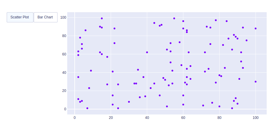
Example 1: Using Restyle Method
Python3
import plotly.graph_objects as px
import numpy as np
np.random.seed(42)
random_x = np.random.randint(1, 101, 100)
random_y = np.random.randint(1, 101, 100)
plot = px.Figure(data=[px.Scatter(
x=random_x,
y=random_y,
mode='markers',)
])
plot.update_layout(
updatemenus=[
dict(
type="buttons",
direction="left",
buttons=list([
dict(
args=["type", "scatter"],
label="Scatter Plot",
method="restyle"
),
dict(
args=["type", "bar"],
label="Bar Chart",
method="restyle"
)
]),
),
]
)
plot.show()
|
Output:
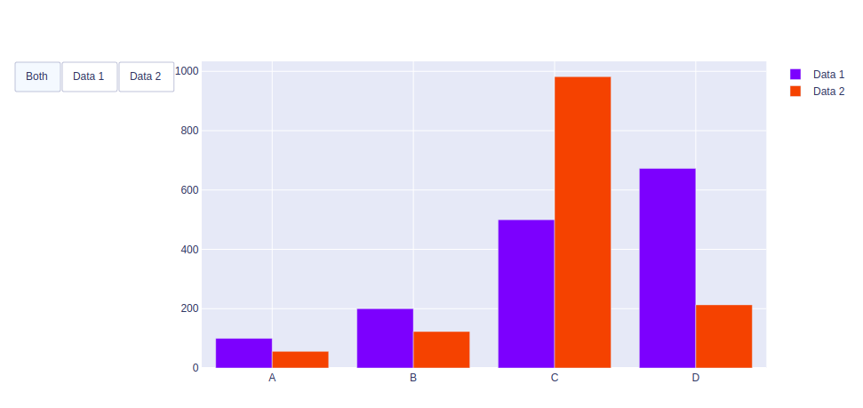
Example 2: Using Update method
Python3
import plotly.graph_objects as px
import numpy
np.random.seed(42)
random_x = np.random.randint(1, 101, 100)
random_y = np.random.randint(1, 101, 100)
x = ['A', 'B', 'C', 'D']
plot = px.Figure(data=[go.Bar(
name='Data 1',
x=x,
y=[100, 200, 500, 673]
),
go.Bar(
name='Data 2',
x=x,
y=[56, 123, 982, 213]
)
])
plot.update_layout(
updatemenus=[
dict(
type="buttons",
direction="left",
buttons=list([
dict(label="Both",
method="update",
args=[{"visible": [True, True]},
{"title": "Both"}]),
dict(label="Data 1",
method="update",
args=[{"visible": [True, False]},
{"title": "Data 1",
}]),
dict(label="Data 2",
method="update",
args=[{"visible": [False, True]},
{"title": "Data 2",
}]),
]),
)
])
plot.show()
|
Output:
Share your thoughts in the comments
Please Login to comment...