How to make Basic Navbar using jQuery Mobile ?
Last Updated :
23 Dec, 2020
jQuery Mobile is a web-based technology used to make responsive content that can be accessed on all smartphones, tablets and desktops. In this article, we will be making Basic navbar using jQuery Mobile.
Approach: First, add jQuery Mobile scripts needed for your project.
<link rel=”stylesheet” href=”http://code.jquery.com/mobile/1.4.5/jquery.mobile-1.4.5.min.css”/>
<script src=”http://code.jquery.com/jquery-1.11.1.min.js”></script>
<script src=”http://code.jquery.com/mobile/1.4.5/jquery.mobile-1.4.5.min.js”></script>
Example:
HTML
<!DOCTYPE html>
<html>
<head>
<link rel="stylesheet" href=
<script src=
</script>
<script src=
</script>
</head>
<body>
<center>
<h1>GeeksforGeeks</h1>
<h4>Basic Navbars using jQuery Mobile</h4>
</center>
<div data-role="navbar">
<ul>
<li><a href=
class="ui-btn-active">One</a>
</li>
</ul>
</div>
</body>
</html>
|
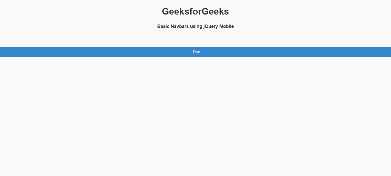
Output:
Share your thoughts in the comments
Please Login to comment...