How to make a Split Navigation Bar in Tailwind CSS ?
Last Updated :
13 Feb, 2024
Split Navigation Bars in Tailwind CSS implement the different classes that help to distribute the content across the header of a webpage, providing a visually balanced layout. By separating navigation items into distinct sections, it becomes easier for users to identify and access different parts of the website or application. Split navigation bars can enhance the visual appeal of a website or application by providing a clean and organized design.
Using Flexbox and justify-between Property
Flexbox is one of the easiest ways to implement a split navigation bar with full responsiveness. By relying on Tailwind CSS utility classes, you can easily modify and maintain the split navbar without delving into complex CSS files.
Here, the bg-green-400 sets the background color of the navigation bar to green, p-4 adds padding of 4 units to the navigation bar, flex displays the navigation bar as a flex container, justify-between distributes the space evenly between the elements inside the flex container, pushing the left and right sections to the edges, font-medium sets the font weight to 500, mr-4 adds a right margin of 4 units to create spacing between the navigation links.
Syntax
<parent_element  class="flex justify-between">
        <element_left  class="flex"> links </element_left>
       <element_right  class="flex"> links </element_right>
</parent_element>
Here, the flex Property will displays the navigation bar as a flex container. The justify-between Property will distributes the space evenly between the elements.
Example: Implementation of Split Navigation Bar in Tailwind CSS.
HTML
<!doctype HTML>
<html>
<head>
<title>Split Nav Bar</title>
<meta charset="UTF-8">
<meta name="viewport" content=
"width=device-width, initial-scale=1.0">
<link href=
rel="stylesheet">
</head>
<body>
<nav class="bg-green-400 p-4
flex justify-between
font-medium">
<div class="flex">
<a href="#" class="mr-4">Home</a>
<a href="#" class="mr-4">About</a>
<a href="#" class="mr-4">Services</a>
</div>
<div class="flex">
<a href="#" class="mr-4">Contact</a>
<a href="#" class="mr-4">Login</a>
</div>
</nav>
</body>
</html>
|
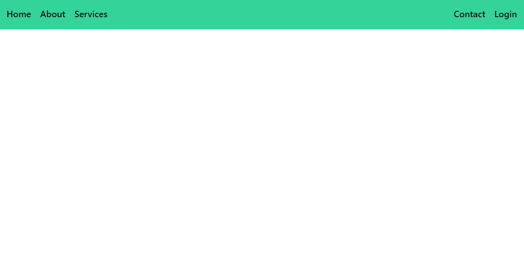
Output:
Using Grid Layout
In Tailwind CSS, the grid system allows you to create complex layouts using a straightforward set of utility classes. It’s based on CSS Grid Layout but simplified and optimized for rapid development. The navigation bar container utilizes CSS grid layout with grid-cols-2 to create two equal-width columns. Each column contains a section of the navigation bar: the left side and the right side. Inside each column, flexbox is used to align the navigation items horizontally.
Syntax
<parent_element  class="grid grid-cols-2">
        <element_left  class="flex justify-start"> links </element_left>
       <element_right  class="flex justify-end"> links </element_right>
</parent_element>
Where,
- grid: This class applies a CSS Grid layout to the parent element.
- grid-cols-2: It creates a grid container with two columns
- justify-start: The justify-start class aligns the child elements to the start of the container, effectively pushing them towards the left edge of the column they occupy.
- justify-end: The justify-end class aligns the child elements to the end of the container, effectively pushing them towards the right edge of the column they occupy.
Example: Implementation of Split Navigation Bar in Tailwind CSS.
HTML
<!DOCTYPE html>
<html>
<head>
<title>Split Nav Bar</title>
<meta charset="UTF-8" />
<meta name="viewport" content=
"width=device-width, initial-scale=1.0" />
<link href=
rel="stylesheet" />
</head>
<body>
<nav class="bg-green-400 p-4
grid grid-cols-2
font-medium">
<div class="flex justify-start">
<a href="#" class="mr-4">Home</a>
<a href="#" class="mr-4">About</a>
<a href="#" class="mr-4">Services</a>
</div>
<div class="flex justify-end">
<a href="#" class="mr-4">Contact</a>
<a href="#" class="mr-4">Login</a>
</div>
</nav>
</body>
</html>
|
Output:
Share your thoughts in the comments
Please Login to comment...