How To Make A Graph With Multiple Axes With Excel?
Last Updated :
24 Jun, 2022
Excel gives many built-in features related to graphs and dataset representations, which helps to visualize and analyze data easily. One of these features is the Secondary Axis, which allows for drawing multiple axes on a single graph. But, before we add a secondary axis to a graph we need to know why we need a secondary or multiple axis curves.
Secondary axis
In order to understand why a secondary axis is required, we will see an example. Suppose we have a sales dataset for a single product for five different years along with the profit margin for that product for all five years. Below is the dataset we will be using for our example.
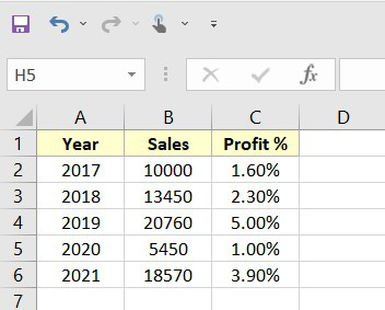
Fig 1 – Dataset
Now, we will insert a column chart for the above dataset. In order to insert the chart, we can use How to Create a Column Chart in Excel? Below is the graph which we have created using the above data,
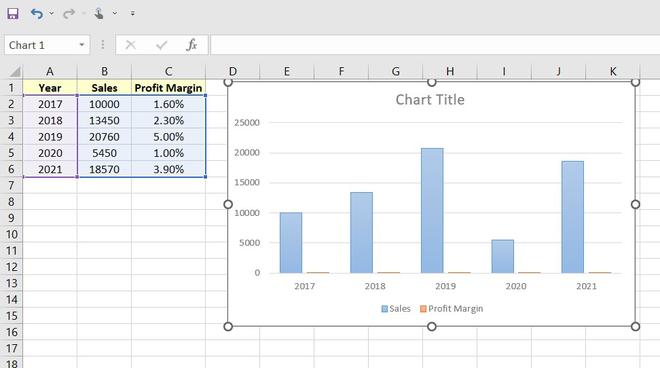
Fig 2 – Graph
Once, we have inserted the graph we can easily see that there are may raise many issues or problems while analyzing the graphs. For example, we can not tell the change in profit margin as the graph is plotted with the same axis for sales this loses the ability to compare the data change in profit margin as it is very less. In order to resolve these problems, we use multiple axes on graphs.
Step-by-step implementation to add secondary axis
Step 1: Create Dataset
For this example, we will be using the above sales data as our dataset.
Step 2: Adding Secondary Axis
In this step, we will insert the graph for the above dataset along with the secondary axis. For this Select Data > Insert > Charts > Recommended Charts.
Once, we click on Recommended Charts option, the excel will popup a window of various charts depending upon our dataset. We will use the chart as per our requirement. (You can select your chart as per your requirement from the left pane window of Recommended Charts tab).
After selecting our chart we need to click on the OK button. The excel will automatically plot the graph for our dataset.
In the above graph, the Sales data is tracking the primary axis (0 – 25000) and the Profit Margin is tracking the secondary axis (0% – 6%).
Step 3: Formatting Chart
In this step, we will format the chart. This will enhance our chart and also provide information that will help to analyze the chart easily.
- Adding Chart Title: In order to add a title to the chart, double-click on the Chart Title view and, add whatever title you want.
- Adding Axis: In order to add an axis, we need to click on the plus (+) button beside the chart and check the Axis Titles checkbox and add the axis name.
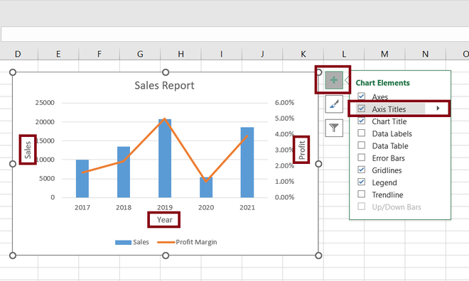
Fig 7 – Adding axis
- Adding Data Labels: In order to add a data label, we need to click on the plus (+) button beside the chart and check the Data Labels checkbox.
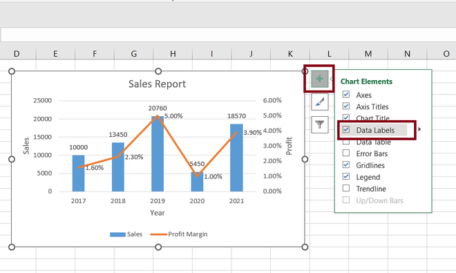
Fig 8 – Adding data labels
Step 4: Output
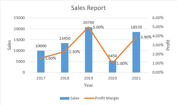
Fig 9 – Output
Share your thoughts in the comments
Please Login to comment...