How to Import a Specific Component from React Bootstrap ?
Last Updated :
01 Nov, 2023
In this article, we are going to learn about how to import a specific component from React-Bootstrap into your project. React Bootstrap is one of the most popular libraries used for application styling. It has various components embedded in it, which makes the behavior of the application more attractive and user-friendly. React Bootstrap consists of different layout components, forms, information indicators, navigation components, and many more.
Prerequisites:
Steps to create React app and installing Bootstrap:
- Create a React application using the following command:
npx create-react-app import-comp
- After creating your project folder(i.e. import-comp), move to it by using the following command:
cd import-comp
- Now install react-bootstrap in your working directory i.e. import-comp by executing the below command in the VScode terminal:
npm install react-bootstrap bootstrap
- Now we need to Add Bootstrap CSS to the index.js or App.js file:
import 'bootstrap/dist/css/bootstrap.min.css';
- Then we need to import components at the top of file
import { COMPONENT_NAME } from 'react-bootstrap';
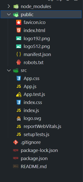
Project Structure:
Approach
To import any component from React Bootstrap, we have to choose first which component we need to import, then import that component using the import keyword at the top of the file where we want to call that component. Then we will call those components using brackets like <Component/>.}”.
Example 1: In this example, we have used various components from react-bootstrap. We have imported the components of Alert, Button, and Form.
- Alert: Used for displaying notifications or messages.
- Button: Used to create interactive buttons.
- Form: Used for creating forms and input fields.
We have imported this components by below using the below statement:
import { Alert, Button, Form, Container, Row, Col } from 'react-bootstrap';
Javascript
import React, { useState } from "react";
import {Alert,Button,Form,Container,Row,Col}
from "react-bootstrap";
import "bootstrap/dist/css/bootstrap.min.css";
function App() {
const [alert, show_Alert] = useState(false);
const [input, set_Input] = useState("");
const [submit, set_Submit] = useState("");
const btnClickFunction = () => {
show_Alert(true);};
const formSubmitFunction = (e) => {
e.preventDefault();
set_Submit(input);
};
return (
<Container className="mt-5">
<Row className="text-center">
<Col>
<h1 style={{color: "green",}}>
GeeksforGeeks
</h1>
<h3>
Button, Alert, Form Components
</h3>
</Col>
</Row>
<Row className="mt-3">
<Col>
<div>
<p style={{ color: "red",
fontWeight: "bold", }}>
This is: Button Component
</p>
<Button variant="primary"
onClick={ btnClickFunction }>
Submit Article
</Button>
</div>
</Col>
</Row>
{alert && (
<Row className="mt-3">
<Col>
<div>
<p style={{color: "red",
fontWeight: "bold", }}>
This is: Alert Component
</p>
<Alert variant="success"
onClose={() => show_Alert(false)}
dismissible>
Article Submitted Successfully
</Alert>
</div>
</Col>
</Row>)}
<Row className="mt-3">
<Col>
<div>
<p style={{ color: "red",
fontWeight: "bold", }}>
This is: Form Component
</p>
<Form
onSubmit={formSubmitFunction}>
<Form.Group controlId= "formBasicText">
<Form.Label>
Enter Text:
</Form.Label>
<Form.Control type="text"
placeholder="Enter text"
value={input}
onChange={(e) =>
set_Input(e.target.value)} />
</Form.Group>
<Button variant="primary"
type="submit">
Submit Text
</Button>
</Form>
</div>
</Col>
</Row>
{submit && (
<Row className="mt-3">
<Col>
<div>
<p style={{ color: "red",
fontWeight: "bold",}}>
This is: Alert Component
</p>
<Alert variant="info">
You submitted:{" "}{submit}
</Alert>
</div>
</Col>
</Row>)}
</Container>
);}
export default App;
|
Output:

Example 2: In this example, we have imported different components from react-bootstrap like Image, Badge, Form, and Modal.
- Image: Used to display images in your application.
- Badge: Used to show the notifications number
- Form (CheckBox): Used to create checkboxes for user input in forms.
- Modal: Used to create modal dialogs for displaying additional content or interactions.
Same like Example 1, we have imported all this components using the import statement.
import { Container, Row, Col, Image, Button, Form, Modal, Badge } from 'react-bootstrap';
Javascript
import React, { useState } from "react";
import {
Container, Row, Col, Image, Button, Form, Modal, Badge,
} from "react-bootstrap";
import "bootstrap/dist/css/bootstrap.min.css";
import "./App.css";
function App() {
const [cbox_Checked, set_Cbox_Checked] = useState(false);
const [cnt, set_Cnt] = useState(0);
const [modal, set_Modal] = useState(false);
return (
<Container>
<Row className="justify-content-center
align-items-center" >
<Col>
<h1 className="green-text">
GeeksforGeeks
</h1>
<h3>
<center>
Image, Badge, Check
Box, Modal Components
</center>
</h3>
</Col>
</Row>
<Row className="align-items-center
component-row">
<Col xs={12} md={3}>
<Image src=
fluid />
<p className="component-name">
Image Component
</p>
</Col>
<Col xs={12} md={3}>
<Button variant="primary"
onClick={() =>
set_Cnt(cnt + 1)}>
<span className="button-text">
Count Me
</span>
<Badge variant="light">
{cnt}
</Badge>
</Button>
<p className="component-name">
Button with Badge
</p>
</Col>
<Col xs={12} md={3}>
<Form.Check type="checkbox"
label="ReactJS Article"
checked={cbox_Checked}
onChange={() =>
set_Cbox_Checked(!cbox_Checked)} />
<p className="component-name">
CheckBox Component
</p>
</Col>
<Col xs={12} md={3}>
<p className="component-name">
Modal Component
</p>
<Button onClick={() =>
set_Modal( true )}
className="toast-button">
Show Modal
</Button>
<Modal show={modal}
onHide={() =>
set_Modal(false)}>
<Modal.Header closeButton>
<Modal.Title>
GeeksforGeeks
</Modal.Title>
</Modal.Header>
<Modal.Body>
Article Submit Successfully.
</Modal.Body>
<Modal.Footer>
<Button variant="secondary"
onClick={() =>set_Modal(false)}>
Close
</Button>
</Modal.Footer>
</Modal>
</Col>
</Row>
</Container>
)}
export default App;
|
CSS
.green-text {
color: green;
font-size: 40px;
text-align: center;
font-weight: bold;
margin: 20px 0;
}
.component-name {
text-align: center;
font-weight: bold;
color: green;
margin-top: 5px;
}
.button-text {
font-weight: bold;
}
.form-check-label {
font-weight: bold;
}
.alert {
margin-top: 20px;
text-align: center;
background-color: #4caf50;
color: white;
border: none;
box-shadow: 0px 4px 6px
rgba(0, 0, 0, 0.1);
}
@media (max-width: 768px) {
.component-name {
font-size: 14px;
}
}
|
Output:

Share your thoughts in the comments
Please Login to comment...