How to Expand Sidebar on Hover in CSS ?
Last Updated :
21 Mar, 2024
Sidebar is the navigational element of the application, through which the user can navigate and explore the entire scope of the application. We can add the functionality of expanding the sidebar on hover in CSS using various approaches.
Below are the approaches to expand the sidebar on hover in CSS:
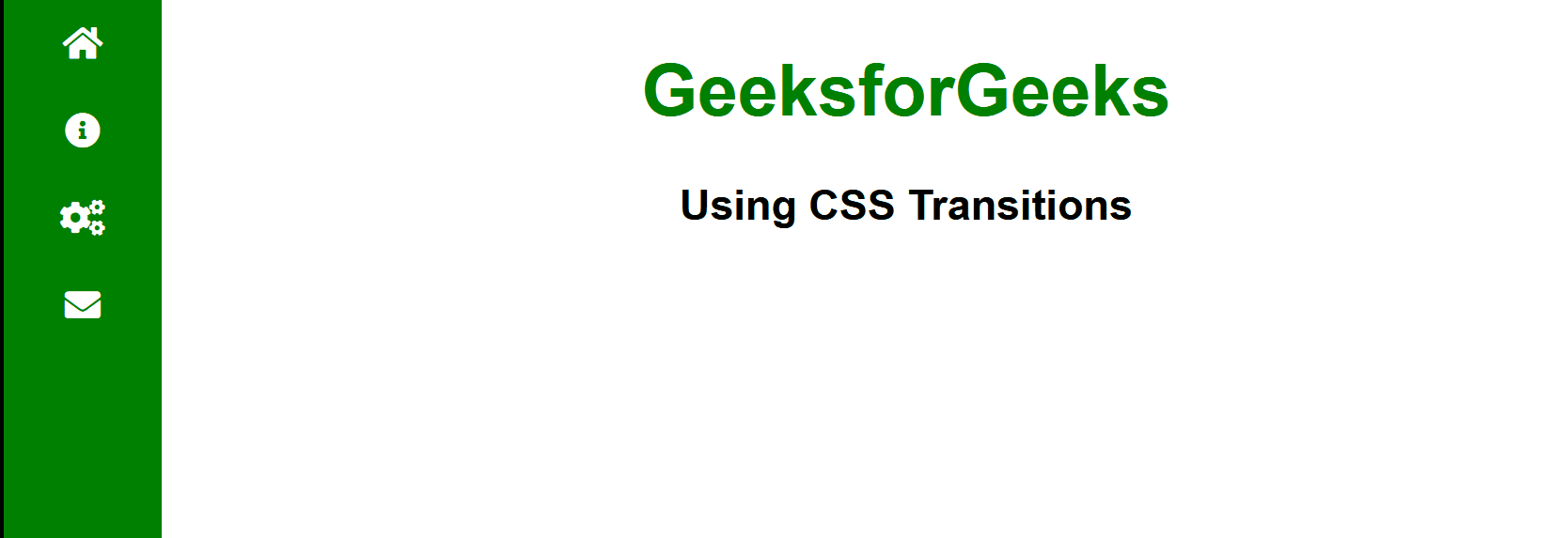
Using CSS Transition
In this approach, we are using CSS transitions to animate the expansion of the sidebar width on hover. The transition property is applied to the .sBar class, specifying a transition effect for the width property with a duration of 0.3s and an easing function of ease. When hovered over, the sidebar width increases to 200px.
Example: The below example uses CSS Transition to expand the sidebar on hover in CSS.
HTML
<!DOCTYPE html>
<html>

<head>
    <title>Using CSS Transitions</title>
    <link rel="stylesheet" href=
"https://cdnjs.cloudflare.com/ajax/libs/font-awesome/5.15.4/css/all.min.css">
    <style>
        body {
            margin: 0;
            font-family: Arial, sans-serif;
        }

        .sBar {
            position: fixed;
            left: 0;
            top: 0;
            height: 100%;
            width: 70px;
            background-color: green;
            transition: width 0.3s ease;
        }

        .sBar:hover {
            width: 200px;
        }

        .sBar ul {
            list-style-type: none;
            padding: 0;
            margin: 0;
        }

        .sBar ul li {
            padding: 10px;
            text-align: center;
            white-space: nowrap;
        }

        .sBar ul li a {
            color: #fff;
            text-decoration: none;
        }

        .sBar ul li span {
            display: none;
        }

        .sBar:hover ul li span {
            display: inline-block;
            margin-left: 10px;
        }

        .sBar ul li:hover {
            background-color: rgb(255, 0, 0);
        }
    </style>
</head>

<body>
    <h3 style="text-align:center">
          Using CSS Transitions
      </h3>
    <div class="sBar">
        <ul>
            <li>
              <a href="#">
                  <i class="fas fa-home"></i>
                      <span>Home</span>
              </a>
              </li>
            <li>
              <a href="#">
              <i class="fas fa-info-circle"></i>
                <span>About</span>
              </a>
              </li>
            <li>
              <a href="#">
                  <i class="fas fa-cogs"></i>
                    <span>Services</span>
              </a>
              </li>
            <li>
              <a href="#">
                  <i class="fas fa-envelope"></i>
                    <span>Contact</span>
              </a>
              </li>
        </ul>
    </div>
</body>

</html>
Output:
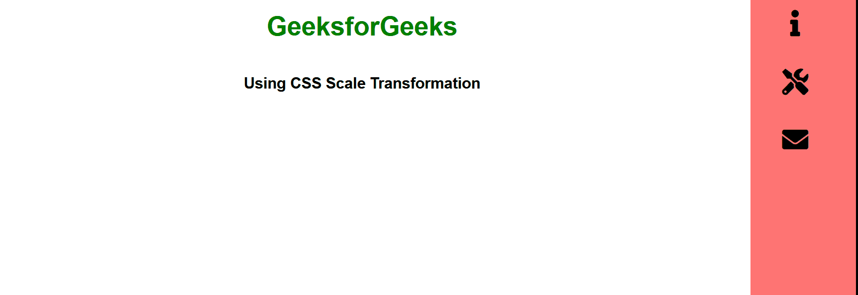
In this approach, we are using CSS Scale Transformation to expand the sidebar on hover. Initially, the sidebar displays only icons, but on hover, it expands to show both icons and text for each menu item.
Example: The below example uses CSS Scale Transformation to expand the sidebar on hover in CSS.
HTML
<!DOCTYPE html>
<html>

<head>
    <title>Using CSS Scale Transformation</title>
    <link rel="stylesheet" href=
"https://cdnjs.cloudflare.com/ajax/libs/font-awesome/5.15.4/css/all.min.css">
    <style>
        body {
            margin: 0;
            font-family: Arial, sans-serif;
            display: flex;
            flex-direction: column;
            align-items: center;
            text-align: center;
        }

        h1 {
            color: green;
        }

        h3 {
            margin-bottom: 20px;
        }

        .sBar {
            position: fixed;
            right: 0;
            top: 0;
            height: 100%;
            width: 130px;
            background-color: rgb(255, 116, 116);
            overflow: hidden;
            transition: transform 0.3s ease, width 0.3s ease;
        }

        .sBar:hover {
            transform: scale(1);
            width: 300px;
        }

        .sBar ul {
            list-style-type: none;
            padding: 0;
            margin: 0;
            transform: scale(2);
        }

        .sBar ul li {
            padding: 10px;
            text-align: center;
            display: flex;
            align-items: center;
            justify-content: center;
        }

        .sBar ul li:hover {
            background-color: rgb(195, 255, 0);
        }

        .sBar ul li a {
            color: rgb(0, 0, 0);
            text-decoration: none;
            display: none;
        }

        .sBar:hover ul li a {
            display: block;
        }

        .icon {
            margin-right: 10px;
        }
    </style>
</head>

<body>
    <h1>GeeksforGeeks</h1>
    <h3>Using CSS Scale Transformation</h3>
    <div class="sBar">
        <ul>
            <li>
              <i class="fas fa-home icon"></i>
                  <a href="#">Home</a>
              </li>
            <li>
              <i class="fas fa-info icon"></i>
                  <a href="#">About</a>
              </li>
            <li>
              <i class="fas fa-tools icon"></i>
                  <a href="#">Services</a>
              </li>
            <li>
              <i class="fas fa-envelope icon"></i>
                  <a href="#">Contact</a>
              </li>
        </ul>
    </div>
</body>

</html>
Output:
Share your thoughts in the comments
Please Login to comment...