How to disable Responsive (mobile) Navbar in Bootstrap 5 ?
Last Updated :
24 Nov, 2023
Bootstrap 5 Navbar Nav is used to make the navbar according to the requirement of the project like navbar navigation links built on .nav options with their own modifier class. Bootstrap 5 Navbar Responsive behaviors help us determine when the content will hide behind a button but in this article, we will see how to disable a responsive navbar using different approaches. The first approach is by using navbar-expand class and the second approach is by using flex-nowrap and flex-row classes.
Syntax
<nav class="navbar navbar-expand">
    ...
</nav>
Using navbar-expand Class
- The navbar-toggler and navbar-collapse classes help the navbar for its responsiveness.
- The navbar-expand class helps in keeping the navbar always horizontal and non-collapsing which effectively avoids the vertical stacking of the list items having nav-link classes.
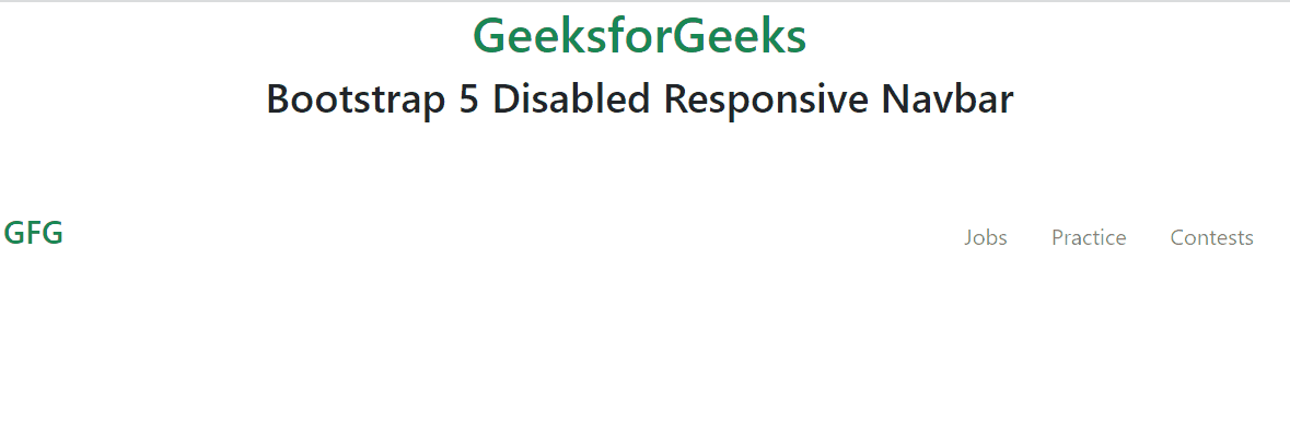
Example 1: In this example the disabled responsive navbar. The use of the navbar-expand class makes sure that the navbar is always horizontal and non-collapsing.
HTML
<!DOCTYPE html>
<html lang="en">
<head>
<meta charset="UTF-8">
<meta name="viewport"
content="width=device-width,
initial-scale=1.0">
<link href=
rel="stylesheet">
<script src=
</script>
</head>
<body>
<div>
<div class="text-center">
<h1 class="text-success">
GeeksforGeeks
</h1>
<h2>
Bootstrap 5 Disabled Responsive Navbar
</h2>
</div>
<br><br>
<nav class="navbar navbar-expand">
<div class="container-fluid text-success">
<h4>GFG</h4>
<button class="navbar-toggler"
data-bs-toggle="collapse"
data-bs-target="#gfgnavbar">
<span class="navbar-toggler-icon">
</span>
</button>
<div class="collapse navbar-collapse ps-3"
id="gfgnavbar">
<ul class="navbar-nav">
<li class="nav-item">
<a class="nav-link"
href="#">
Jobs
</a>
</li>
<li class="nav-item">
<a class="nav-link"
href="#">
Practice
</a>
</li>
<li class="nav-item">
<a class="nav-link"
href="#">
Contests
</a>
</li>
</ul>
</div>
</div>
</nav>
</div>
</body>
</html>
|
Output:

Using flex-nowrap flex-row Class
- To avoid the responsive(mobile) navbar, we have used the justify-content-evenly, flex-nowrap flex-row classes for the navbar. The flex-row class keeps the items horizontally in a row and flex-nowrap class avoids the wrapping up of items and keeps the item wraps in a single line.
- flex-nowrap flex-row classes allow the navbar to remain horizontal at all widths. The flex-row class is used to set a default browser horizontal direction whereas the items will overflow but not be wrapped at all by the use of flex-nowrap class.
Example 2: This also demonstrates the disabled responsive (mobile) navbar in Bootstrap 5.
HTML
<!DOCTYPE html>
<html lang="en">
<head>
<meta charset="UTF-8">
<meta name="viewport"
content="width=device-width,
initial-scale=1.0">
<link href=
rel="stylesheet">
<script src=
</script>
</head>
<body>
<div>
<div class="text-center">
<h1 class="text-success">
GeeksforGeeks
</h1>
<h2>
Bootstrap 5 Disabled Responsive Navbar
</h2>
</div>
<br><br>
<nav class="navbar justify-content-evenly
flex-nowrap flex-row">
<div class="container-fluid text-success">
<h4>GFG</h4>
<ul class="nav navbar-nav
justify-content-evenly
flex-nowrap flex-row">
<li class="nav-item mx-3">
<a class="nav-link"
href="#">
Jobs
</a>
</li>
<li class="nav-item mx-3">
<a class="nav-link"
href="#">
Practice
</a>
</li>
<li class="nav-item mx-3">
<a class="nav-link"
href="#">
Contests
</a>
</li>
</ul>
</div>
</nav>
</div>
</body>
</html>
|
Output:
Share your thoughts in the comments
Please Login to comment...