How to create fading buttons using CSS ?
Last Updated :
10 Jan, 2024
This article will explore how to create fading buttons using CSS. We can create two types of fading effects in buttons including fadeIn and FadeOut. The CSS property opacity is used to give a fading effect on hovering the button. Fading buttons offer an effective way to provide a pleasing visual effect to users, ensuring they are aware of their interactions with the web page.
A FadeOut button smoothly disappears when clicked, creating a gradual vanishing effect through CSS transitions on its opacity property.
Approach
- Define the elements <h1>, <p>, and <button> to structure the web page. Apply Internal CSS Styling to the elements.
- Set the property transition to the button with a value duration of 0.2 seconds and a linear timing function.
- On hovering over button, Set the property opacity to the button to 0.6 for creating a fading effect.
- Also, Set the property
transform to translates the button horizontally by 5 pixels, creating a smooth movement.
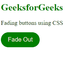
Example: The example illustrates the FadeOut button effect using CSS.
HTML
<!DOCTYPE html>
<html lang="en">
<head>
<meta charset="UTF-8">
<meta name="viewport" content="width=device-width,
initial-scale=1.0">
<title>
Fading Buttons
using CSS
</title>
<style>
button {
height: 50px;
width: 130px;
background-color: green;
color: beige;
border-radius: 30px;
border: none;
font-size: 20px;
transition: 0.2s linear;
}
button:hover {
opacity: 0.6;
transform: translateX(5px);
}
p {
font-size: 20px;
}
h1 {
color: green;
}
</style>
</head>
<body>
<h1>GeeksforGeeks</h1>
<p>Fading buttons using CSS</p>
<button>Fade Out</button>
</body>
</html>
|
Output:
A FadeIn button gradually changes the opacity, for selected elements, from hidden to visible (fading effect).
Approach
- Define the elements <h1>, <p>, and <button> to structure the web page. Apply Internal CSS Styling to the elements.
- Set the property transition to the button with value duration of 0.2 seconds and a linear timing function.
- On hovering over button, Set the property opacity to the button to 1 for creating a fadein effect.
- Also, Set the property
transform to translates the button vertically by 7 pixels, creating a smooth movement.
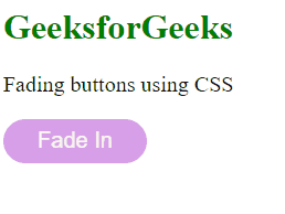
Example: The example illustrate the Fade Out button effect using CSS.
HTML
<!DOCTYPE html>
<html lang="en">
<head>
<meta charset="UTF-8">
<meta name="viewport" content="width=device-width,
initial-scale=1.0">
<title>Fading Buttons using CSS</title>
<style>
button {
height: 40px;
width: 130px;
background-color: rgb(176, 63, 210);
color: beige;
border-radius: 30px;
border: none;
font-size: 20px;
opacity: 0.5;
transition: 0.2s linear;
}
button:hover {
opacity: 1;
transform: translateY(7px);
}
p {
font-size: 20px;
}
h1 {
color: green;
}
</style>
</head>
<body>
<h1>GeeksforGeeks</h1>
<p>Fading buttons using CSS</p>
<button>Fade In</button>
</body>
</html>
|
Output:
Share your thoughts in the comments
Please Login to comment...