How to create Animated Loading Button using CSS ?
Last Updated :
12 Jan, 2024
In this article, we will see the implementation for creating loading buttons using CSS. We can achieve the effect of loading buttons in many ways. In the first approach, we are exploring with Font Awesome Spinner & CSS properties whereas in the second approach, we are using CSS properties and CSS Animation.
Using Font Awesome Spinner and CSS
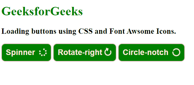
This code illustrates the creation of loading buttons using Font Awesome icons for various spinner animations. The fa-spin class inside <i> tag is essential for rotation.
Approach
- First, make separate HTML and CSS files. Then, link the external stylesheet to the HTML document. Additionally, integrate the Font Awesome CDN Link to the HTML document for using different Font Awesome icons.
- The element <h1> defines the Heading having CSS property (color: green). Set the property (font-size: 20px) to the element <h3>.
- Style the button with different CSS properties including
padding, font-size, font-weight, border-radius, background-color, color, and border.
- Make three button elements. Each button contains an
<i> element with Font Awesome classes for specific spinner animations.
Example: The example illustrates the code for loading buttons using Font Awesome Spinner.
HTML
<!DOCTYPE html>
<html lang="en">
<head>
<meta charset="UTF-8">
<meta name="viewport"
content="width=device-width,
initial-scale=1.0">
<title>Animated Loading Button</title>
<link rel="stylesheet" href=
<link rel="stylesheet"
href="style.css">
</head>
<body>
<h1>GeeksforGeeks</h1>
<h3>
Loading buttons using CSS
and Font Awsome Icons.
</h3>
<button>Spinner
<i class="fa fa-spinner fa-spin"></i>
</button>
<button>Rotate-right
<i class="fa fa-spin
fa-solid
fa-rotate-right">
</i>
</button>
<button>Circle-notch
<i class="fa fa-solid
fa-spin
fa-circle-notch">
</i>
</button>
</body>
</html>
|
CSS
h1 {
color: green;
}
h3 {
font-size: 20px;
}
button {
padding: 10px;
font-size: 20px;
font-weight: 700;
border-radius: 10px;
background-color: green;
color: antiquewhite;
border: 2px solid rgb(223, 190, 190);
transition: all 0.3s ease;
}
button:hover {
background-color: rgb(15, 138, 66);
color: rgb(244, 244, 223);
box-shadow: rgba(32, 31, 31, 0.35) 0px 7px 10px;
font-weight: 900;
}
i {
margin-left: 5px;
}
|
Output:
Using CSS Properties & Animation
In this approach we will use custom CSS to make loading animation with styling a green heading, a smaller subheading, and a button with various properties. Additionally, we will animate circular element is positioned using absolute positioning and defined keyframes for rotation and spinning effects.
Approach
- First, make separate HTML and CSS files. Then, link the external stylesheet to the HTML document.
- The element <h1> defines the heading having CSS property (color: green). Set the property (font-size: 20px) to the element <h3>.
- Style the button with different CSS properties including
padding, relative position, font-size, font-weight, border-radius, background-color, color, and border.
- The element with class .innerbox Positioned absolutely at 20% from the top and 70% from the left within its container.
- The element (.innerbox::before) is an additional circular element positioned within the
.innerbox. The @keyframes loader-animation defines a rotation animation starting from 0 degrees to 360 degrees whereas the @keyframes loader-spin defines a spinning animation, transforming the element by 360 degrees.
Example: The example illustrates the implementation of the code for loading buttons using CSS.
HTML
<!DOCTYPE html>
<html>
<head>
<meta charset="utf-8">
<meta name="viewport"
content="width=device-width">
<title>Loading Buttons</title>
<link rel="stylesheet"
href="style.css">
</head>
<body>
<h1>GeeksforGeeks</h1>
<h3>Spinner with CSS</h3>
<button>Click Me
<div class="box">
<div class="innerbox"></div>
</div>
</button>
</body>
</html>
|
CSS
h1 {
color: green;
}
h3 {
font-size: 20px;
}
.innerbox {
position: absolute;
top: 20%;
left: 70%;
width: 20px;
height: 20px;
border-radius: 50%;
border: 4px solid rgb(231, 214, 214);
border-top-color: #284018;
animation: loader-spin 1.8s linear infinite;
}
.innerbox::before {
content: "";
position: absolute;
top: 12px;
left: 12px;
width: 56px;
height: 56px;
border-radius: 50%;
background-size: 100%;
animation: loader-animation 3s infinite ease-in-out;
}
@keyframes loader-animation {
0% {
transform: rotate(0deg);
}
100% {
transform: rotate(360deg);
}
}
@keyframes loader-spin {
to {
transform: rotate(360deg);
}
}
button {
position: relative;
font-size: 20px;
font-weight: 700;
padding: 10px;
background-color: rgb(39, 138, 39);
border-radius: 20px;
color: antiquewhite;
border: 2px solid rgb(223, 190, 190);
padding-right: 50px;
}
button:hover {
background-color: rgb(15, 138, 66);
color: rgb(244, 244, 223);
box-shadow: rgba(32, 31, 31, 0.35) 0px 7px 10px;
font-weight: 900;
}
|
Output:

Share your thoughts in the comments
Please Login to comment...