How to Create an Ogive Graph in Excel?
Last Updated :
21 Mar, 2022
Ogive graph, the name might scare you, but believe me this is very simple to create. The ogive graph is a cumulative frequency graph. The graph is plotted between the fixed intervals vs the frequency added up before. It is a curve plotted for cumulative frequency distribution on a graph. There are two types of ogive graph available:
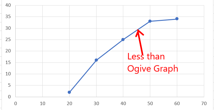
1. Less than ogive graph: Given class intervals, x as the lower limit and y as the upper limit for a particular interval. Then for each of these intervals, it is read as frequency obtained less than y i.e. the upper limit. The slope of the graph will always be increasing positively. For example, one of the very common less than ogive graphs looks like this shown below.
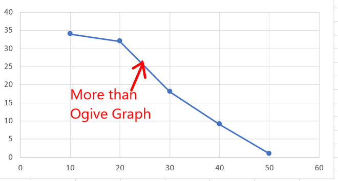
2. More than ogive graph: Given class intervals, x as the lower limit and y as the upper limit for a particular interval. Then for each of these intervals, it is read as frequency obtained more than x i.e. the lower limit. The slope of the graph will always be decreasing negatively. For example, one of the very common more than ogive graphs looks like this shown below.
Creating an Ogive Graph in Excel
There is no direct way to create an ogive graph in excel, but with the use of some functions and basic graphs. You can convert any given data set to an ogive graph.
Creating Less than Ogive Graph
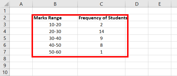
Given the data set, of range of marks with fixed class intervals and frequency of students. Draw a less than Ogive graph.
Note: We take the Upper limit of class intervals while creating a less than ogive graph.
Following are the steps to create Less than Ogive Graph:
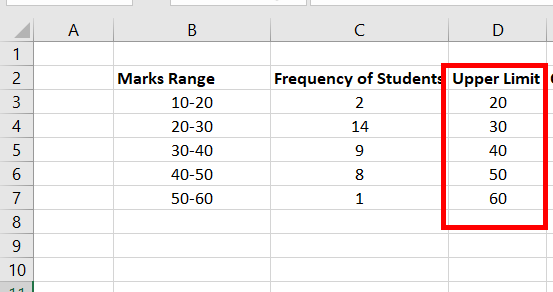
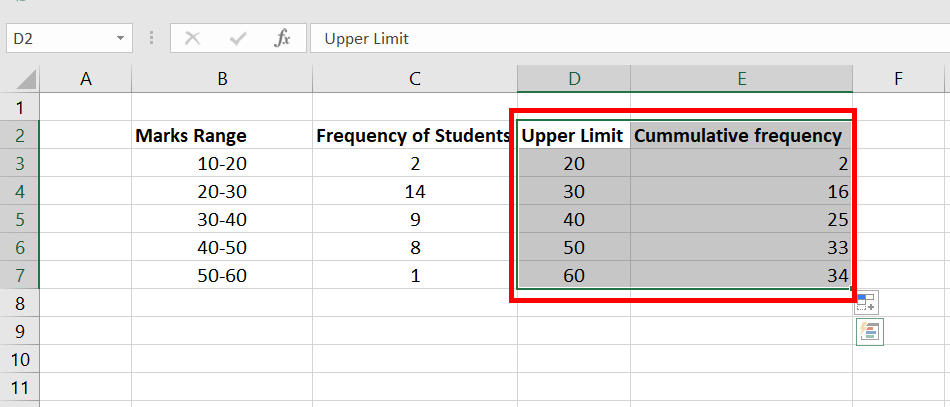
Step 1: Add a new attribute, named Upper Limit. In the cell values D3:D7, insert the upper limit of each Marks Range. For example, in cell B3, the range of marks is 10-20, so the upper limit will be 20. Similarly, fill the entire column.
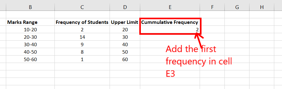
Step 2: Add a new column, named Cumulative Frequency. In Cell E3, fill the value of the first frequency i.e. the cell value of C3.
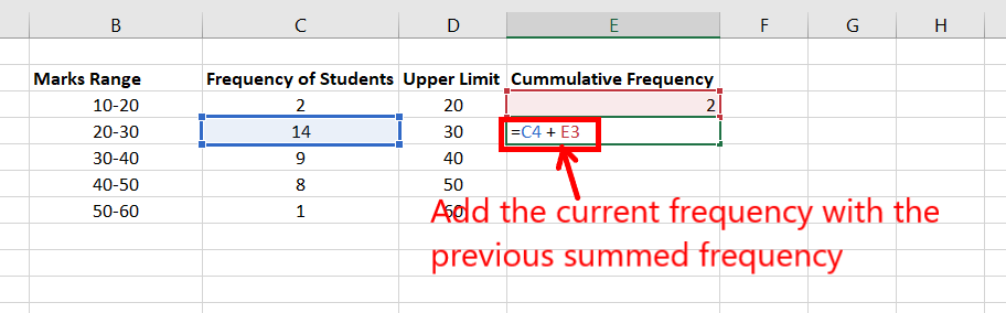
Step 3: Now, you need to present a formula to fill E4:E7. Cell value E4 is the sum of C4 + E3. The formula is the sum of the current frequency plus the frequency added previously. For example, E5 will have the formula C5 + E4.
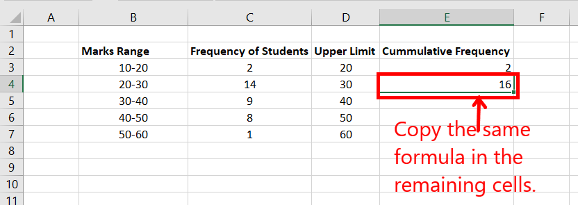
Step 4: Now, copy the formula for the rest of the cells E5:E7. Hover, on the lower right corner of the active cell E4. A plus symbol appears. Double click on it and the entire column will be filled.
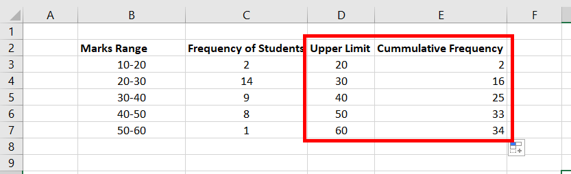
Step 5: The table will look like this now.
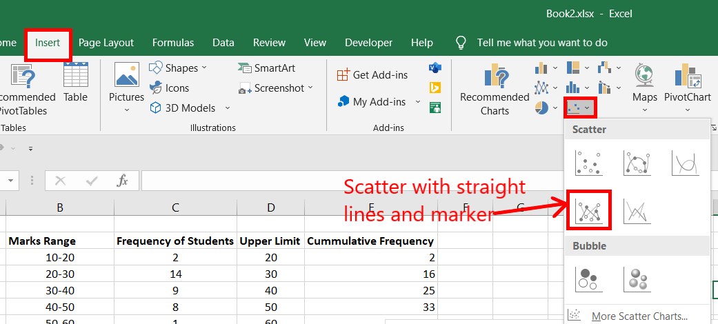
Step 6: Now, the only work left is to create the table. Select range D3:E7.
Step 7: Go to the Insert tab, and in the charts section, select Scatter with straight lines and marker.
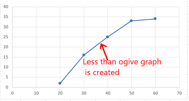
Step 8: A less than ogive graph is created.
Creating More than Ogive graph
Given the data set, of range of marks with fixed class intervals and frequency of students. Draw a more than Ogive graph.
Note: We take Lower limit of class intervals while creating a more than ogive graph.

Following are the steps to create More than Ogive graph:
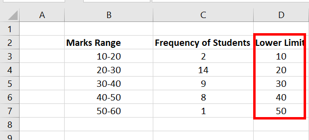
Step 1: Add a new attribute, named LowerLimit. In the cell values D3:D7, insert the lower limit of each Marks Range. For example, in cell B3, the range of marks is 10-20, so the lower limit will be 10. Similarly, fill the entire column.
Step 2: Add a new column, named Cumulative Frequency. This step is the opposite of the less than ogive graph. As the graph type is more than ogive graph, we will start filling the cumulative frequency from the last row. In Cell E7, fill the value of the last frequency i.e. the cell value of C7. Now, you need to present a formula to fill E3:E6. Cell value E6 is the sum of C6 + E7. The formula is the sum of the current frequency plus the frequency added previously. For example, E5 will have the formula C5 + E6.
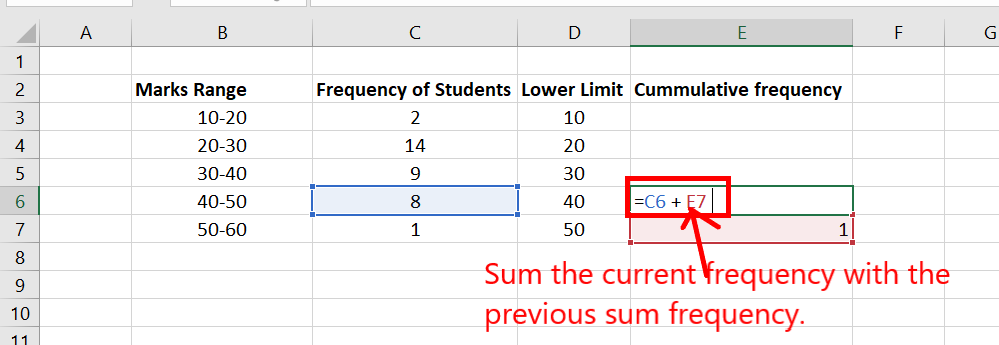
Step 3: Copy the same formula to the rest of the upper cells. In the active cell, E6. Go to the lower right corner of that active cell. A plus symbol appears. Keep clicking it and drag it till E3.
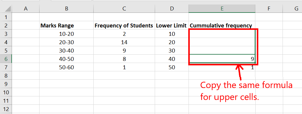
Step 4: The table looks like this now.
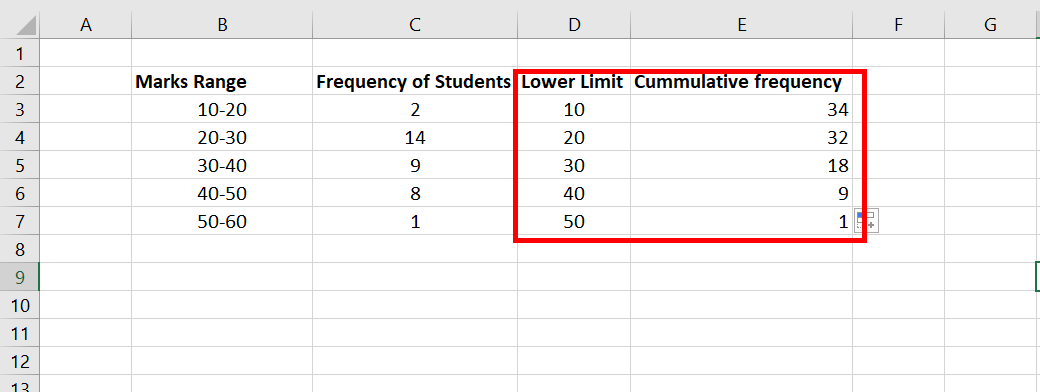
Step 5: Now, the only work left is to create the table. Select range D3:E7. Go to the Insert tab, and in the charts section, select Scatter with straight lines and marker.
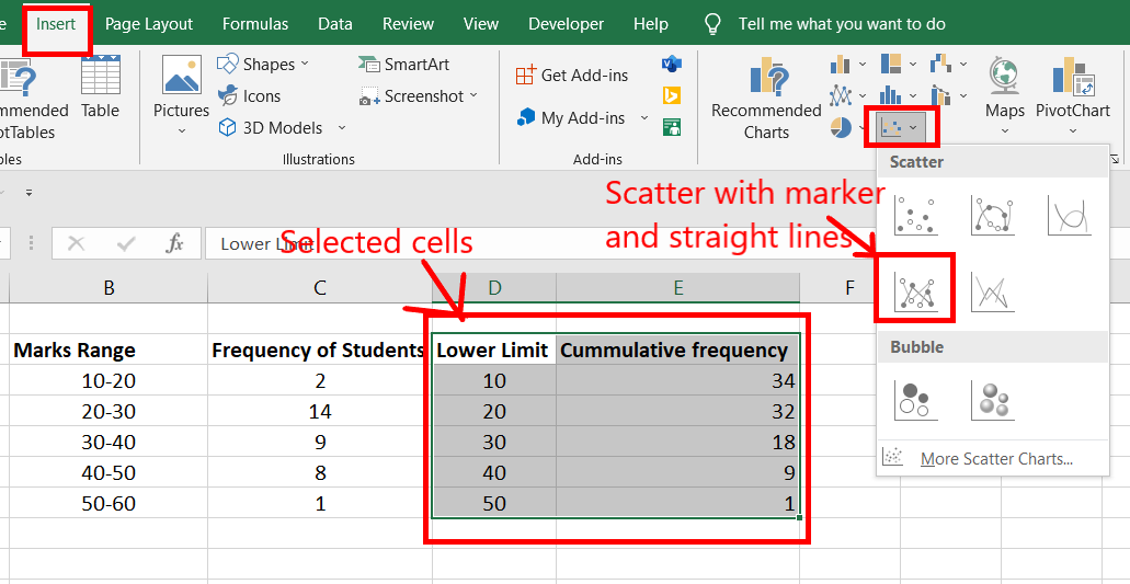
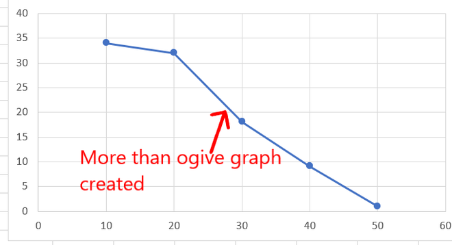
Step 6: A more than ogive graph is created.
Share your thoughts in the comments
Please Login to comment...