How to Create a Responsive Table in Bootstrap ?
Last Updated :
01 May, 2024
A responsive table in Bootstrap adjusts its layout to fit different screen sizes, ensuring readability and usability on all devices. It typically involves using classes like .table-responsive or custom CSS to enable horizontal scrolling on smaller screens.
Using the table-responsive class
Using the .table-responsive class in Bootstrap wraps a table, enabling horizontal scrolling on small screens while maintaining column widths. Ideal for fixed column count tables but may not suit large column counts due to challenging horizontal scrolling on small screens.
Example: To demonstrate creating a responsive table using table responsive class showcasing students’ information with columns such as Index, First Name, Last Name, Age, and Enrolled Course.
HTML
<!DOCTYPE html>
<html lang="en">

<head>
    <meta charset="UTF-8">
    <meta name="viewport"
        content="width=device-width, initial-scale=1.0">
    <title>Sticky Footer with Bootstrap 5</title>
    <!-- Bootstrap CSS -->
    <link href=
"https://cdn.jsdelivr.net/npm/bootstrap@5.3.0-alpha1/dist/css/bootstrap.min.css"
        rel=
            "stylesheet">
    <!-- Bootstrap JS (Optional if you need dropdowns or other features) -->
    <script src=
"https://cdn.jsdelivr.net/npm/bootstrap@5.3.0-alpha1/dist/js/bootstrap.bundle.min.js">
    </script>


</head>

<body>
    <div class="text-center
                py-3 mb-4
                border-bottom">
        <h1 style="color: green;">
            GeeksForGeeks Student Data:
        </h1>
    </div>
    <div class="table-responsive">
        <table class="table table-striped
                    table-bordered table-hover">
            <thead>
                <tr>
                    <th>Index</th>
                    <th>First Name</th>
                    <th>Last Name</th>
                    <th>Age</th>
                    <th>Enrolled Course</th>
                </tr>
            </thead>
            <tbody>
                <tr>
                    <td>1</td>
                    <td>Rahul </td>
                    <td>Mishra</td>
                    <td>23</td>
                    <td>DSA In JAVA</td>
                </tr>
                <tr>
                    <td>2</td>
                    <td>Raj </td>
                    <td>Shukla</td>
                    <td>23</td>
                    <td>Advanced Java</td>
                </tr>
                <tr>
                    <td>3</td>
                    <td>Prahant </td>
                    <td>Shuka</td>
                    <td>19</td>
                    <td>Web Development</td>
                </tr>
            </tbody>
        </table>
    </div>

</body>

</html>
Output:
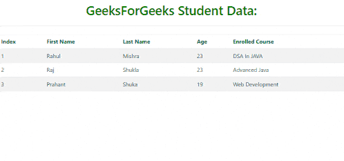
Responsive Table in Bootstrap Example Output
Creating a “table-scrollable” class involves adding custom CSS to create a fixed-height div wrapping the table with overflow-y for vertical scrolling. This maintains fixed headers while enabling horizontal scrolling and consistent column widths across screen sizes.
Example: To demonstrate creating a responsive table using table-scrollable class showcasing students’ information with columns such as Index, First Name, Last Name, Age, and Enrolled Course.
HTML
<!DOCTYPE html>
<html lang="en">

<head>
    <meta charset="UTF-8">
    <meta name="viewport" content="width=device-width, initial-scale=1.0">
    <title>Sticky Footer with Bootstrap 5</title>
    <!-- Bootstrap CSS -->
    <link href=
"https://cdn.jsdelivr.net/npm/bootstrap@5.3.0-alpha1/dist/css/bootstrap.min.css"
          rel="stylesheet">
    <!-- Bootstrap JS (Optional if you need dropdowns or other features) -->
    <script src=
"https://cdn.jsdelivr.net/npm/bootstrap@5.3.0-alpha1/dist/js/bootstrap.bundle.min.js">
    </script>


</head>

<body>
    <div class="text-center py-3 mb-4 border-bottom">
        <h1 style="color: green;">
            GeeksForGeeks Student Data:
        </h1>
    </div>
    <div class="table-scrollable">
        <table class="table table-striped
                      table-bordered table-hover">
            <thead>
                <tr>
                    <th>Index</th>
                    <th>First Name</th>
                    <th>Last Name</th>
                    <th>Age</th>
                    <th>Enrolled Course</th>
                </tr>
            </thead>
            <tbody>
                <tr>
                    <td>1</td>
                    <td>Rahul </td>
                    <td>Mishra</td>
                    <td>23</td>
                    <td>DSA In JAVA</td>
                </tr>
                <tr>
                    <td>2</td>
                    <td>Raj </td>
                    <td>Shukla</td>
                    <td>23</td>
                    <td>Advanced Java</td>
                </tr>
                <tr>
                    <td>3</td>
                    <td>Prahant </td>
                    <td>Shuka</td>
                    <td>19</td>
                    <td>Web Development</td>
                </tr>
            </tbody>
        </table>
    </div>

</body>

</html>
Output:
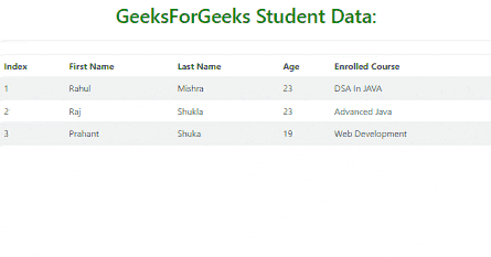
Responsive Table in Bootstrap
Using the Bootstrap Grid System
In this approach, a grid layout is used with rows and columns corresponding to table rows and cells. Each column is wrapped in a div with a grid class like .col-md-4, allowing flexible control of column visibility and display on various screen sizes.
Example: To demonstrate creating a responsive table using bootstrap grid system showcasing students’ information with columns such as Index, First Name, Last Name, Age, and Enrolled Course.
HTML
<!DOCTYPE html>
<html lang="en">

<head>
    <meta charset="UTF-8">
    <meta name="viewport" content="width=device-width,
                                initial-scale=1.0">
    <title>Sticky Footer with Bootstrap 5</title>
    <!-- Bootstrap CSS -->
    <link href=
"https://cdn.jsdelivr.net/npm/bootstrap@5.3.0-alpha1/dist/css/bootstrap.min.css"
          rel="stylesheet">
    <!-- Bootstrap JS (Optional if you need dropdowns or other features) -->
    <script src=
"https://cdn.jsdelivr.net/npm/bootstrap@5.3.0-alpha1/dist/js/bootstrap.bundle.min.js">
    </script>


</head>

<body>
    <div class="text-center py-3 mb-4 border-bottom">
        <h1 style="color: green;">
            GeeksForGeeks Student Data:
        </h1>
    </div>
    <div class="container">
        <div class="row">
            <div class="col">
                <table class="table table-striped
                              table-bordered
                              table-hover">
                    <thead>
                        <tr>
                            <th>Index</th>
                            <th scope="col">First Name</th>
                            <th scope="col">Last Name</th>
                            <th scope="col">Age</th>
                            <th scope="col">Enrolled Course</th>
                        </tr>
                    </thead>
                    <tbody>
                        <tr>
                            <th scope="row">1</th>
                            <td>Raj </td>
                            <td>Shukla</td>
                            <td>23</td>
                            <td>Advanced Java</td>
                        </tr>
                        <tr>
                            <th scope="row">2</th>
                            <td>Rahul </td>
                            <td>Mishra</td>
                            <td>23</td>
                            <td>DSA In JAVA</td>
                        </tr>
                        <tr>
                            <th scope="row">3</th>
                            <td>Prahant </td>
                            <td>Shuka</td>
                            <td>19</td>
                            <td>Web Development</td>
                        </tr>
                    </tbody>
                </table>
            </div>
        </div>
    </div>

</body>

</html>
Output:
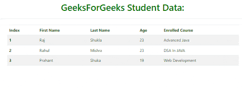
Responsive Table in Bootstrap Example Output
Share your thoughts in the comments
Please Login to comment...