How to create a Pills navigation menu in Bootstrap5 ?
Last Updated :
07 Oct, 2021
In this article, we will learn how to make a Pills navigation menu in Bootstrap 5. Pills are a great navigation style to implement for your websites as it enhances the user experience and navigation flow of your website. Creating a pills navigation menu is simple and easy, all you have to do is to include the right bootstrap classes and understand what function these classes will perform. We will discuss all the cases where pill navigation is beneficial to use. Let’s begin it one by one.
There are 2 ways to apply the bootstrap in the HTML:
- By using the Bootstrap CDN link
- Download the bootstrap from the official site.
For more details related to the installation & configuration process, please refer to the Bootstrap Introduction and Installation article.
Creating a Simple Pills Navigation Menu: In order to create a simple pills navigation menu, you just need to add the class .nav-pills to your nav element along with .nav class, which is the base class for every navigation style available in bootstrap. The .nav class element wraps in all the .nav-link class elements. The .nav-link class should be given to all link elements present in the navbar.
Example: This example shows the basic implementation of the pill navigation menu.
HTML
<!DOCTYPE html>
<html lang="en">
<head>
<meta charset="UTF-8" />
<meta http-equiv="X-UA-Compatible"
content="IE=edge" />
<meta name="viewport"
content="width=device-width,
initial-scale=1.0" />
<title>Pills navigation menu</title>
<link href=
rel="stylesheet"
integrity=
"sha384-EVSTQN3/azprG1Anm3QDgpJLIm9Nao0Yz1ztcQTwFspd3yD65VohhpuuCOmLASjC"
crossorigin="anonymous" />
</head>
<body>
<nav class="nav nav-pills p-4 bg-dark">
<a class="nav-link active bg-warning"
aria-current="true"
href="#">Home
</a>
<a class="nav-link text-warning"
href="#">About Us</a>
<a class="nav-link text-warning"
href="#">Careers</a>
<a class="nav-link text-warning"
href="#">Contact Us</a>
</nav>
<p class="p-4">
GeeksforGeeks - A Computer Science portal for geeks.
It contains well written, well thought and well
explained computer science and programming
articles, quizzes and practice/competitive
programming/company interview Questions.
</p>
</body>
</html>
|
Explanation:
- .p-4 class implements padding for the element.
- .bg-waring implements a background color of a shade of yellow.
- .bg-dark implements a dark background.
- .active class depicts the user’s current view of your webpage.
- .text-warning gives the text color as yellow.
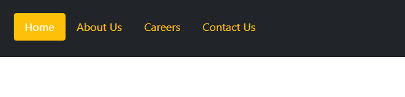
Output:

A simple pills navigation menu
Creating a right-aligned pills navigation: To right-align the elements, you can use .ms-auto class to the element.
Example: In this example, we have used the .ms-auto class with the Signup that is shifted to the right side.
HTML
<!DOCTYPE html>
<html lang="en">
<head>
<meta charset="UTF-8" />
<meta http-equiv="X-UA-Compatible"
content="IE=edge" />
<meta name="viewport"
content="width=device-width,
initial-scale=1.0" />
<title>Pills navigation menu</title>
<link href=
rel="stylesheet"
integrity=
"sha384-EVSTQN3/azprG1Anm3QDgpJLIm9Nao0Yz1ztcQTwFspd3yD65VohhpuuCOmLASjC"
crossorigin="anonymous"/>
</head>
<body>
<nav class="nav nav-pills p-4 bg-dark">
<a class="nav-link active bg-warning"
aria-current="true"
href="#">Home
</a>
<a class="nav-link text-warning"
href="#">About Us
</a>
<a class="nav-link text-warning"
href="#">Careers
</a>
<a class="nav-link text-warning"
href="#">Contact Us
</a>
<a class="nav-link text-warning ms-auto"
href="#">Sign up
</a>
</nav>
<p class="p-4">
GeeksforGeeks - A Computer Science portal for geeks.
It contains well written, well thought and well
explained computer science and programming
articles, quizzes and practice/competitive
programming/company interview Questions.
</p>
</body>
</html>
|
Output:

Right Aligned Pills Navigation
Creating a pills navigation that spans fullscreen: To make Pills that will take the full width of the screen, we can use the .nav-fill class. This class fills up the entire screen by manipulating the width of the .nav-link items.
Example: In this example, we have used the .nav-fill class that will create pill navigation spanning the fullscreen.
HTML
<!DOCTYPE html>
<html lang="en">
<head>
<meta charset="UTF-8" />
<meta http-equiv="X-UA-Compatible"
content="IE=edge" />
<meta name="viewport"
content="width=device-width,
initial-scale=1.0" />
<title>Pills navigation menu</title>
<link href=
rel="stylesheet"
integrity=
"sha384-EVSTQN3/azprG1Anm3QDgpJLIm9Nao0Yz1ztcQTwFspd3yD65VohhpuuCOmLASjC"
crossorigin="anonymous" />
</head>
<body>
<nav class="nav nav-pills nav-fill p-4 bg-dark">
<a class="nav-link active bg-warning"
aria-current="true"
href="#">Home
</a>
<a class="nav-link text-warning"
href="#">About Us
</a>
<a class="nav-link text-warning"
href="#">Careers
</a>
<a class="nav-link text-warning"
href="#">Contact Us
</a>
</nav>
<p class="p-4">
GeeksforGeeks - A Computer Science portal for geeks.
It contains well written, well thought and well explained
computer science and programming articles, quizzes and
practice/competitive programming/company interview
Questions.
</p>
</body>
</html>
|
Output:

Full Screen spanning pills navigation menu
Creating a Pills navigation with each link taking equal width: From the previous example, although, the nav links spanned full screen, each nav link took different widths in order to do so. In this example, we will see how we can span full screen along with each nav link taking equal horizontal width/space. For equal-widths, we use the class .nav-justified in the nav element instead of .nav-fill class.
Example: This example shows the justified pills navigation menu.
HTML
<!DOCTYPE html>
<html lang="en">
<head>
<meta charset="UTF-8" />
<meta http-equiv="X-UA-Compatible"
content="IE=edge" />
<meta name="viewport"
content="width=device-width,
initial-scale=1.0" />
<title>Pills navigation menu</title>
<link href=
rel="stylesheet"
integrity=
"sha384-EVSTQN3/azprG1Anm3QDgpJLIm9Nao0Yz1ztcQTwFspd3yD65VohhpuuCOmLASjC"
crossorigin="anonymous" />
</head>
<body>
<nav class="nav nav-pills nav-justified p-4 bg-dark">
<a class="nav-link active bg-warning"
aria-current="true"
href="#">Home
</a>
<a class="nav-link text-warning"
href="#">About Us
</a>
<a class="nav-link text-warning"
href="#">Careers
</a>
<a class="nav-link text-warning"
href="#">Contact Us
</a>
</nav>
<p class="p-4">
GeeksforGeeks - A Computer Science portal for geeks.
It contains well written, well thought and well explained
computer science and programming articles, quizzes and
practice/competitive programming/company interview
Questions.
</p>
</body>
</html>
|
Output:

Justified pills navigation menu
Tip: Use the Chrome web developer tool for inspecting mode to see the difference.
Creating a fixed pills navigation: Fixed navigation means the navbar will be fixed to the top of the screen while you scroll. To implement this feature, add class .fixed-top to the nav element.
Example: This example illustrates the fixed pill navbar by using the .fixed-top class.
HTML
<!DOCTYPE html>
<html lang="en">
<head>
<meta charset="UTF-8" />
<meta http-equiv="X-UA-Compatible"
content="IE=edge" />
<meta name="viewport"
content="width=device-width,
initial-scale=1.0" />
<title>Pills navigation menu</title>
<link href=
rel="stylesheet"
integrity=
"sha384-EVSTQN3/azprG1Anm3QDgpJLIm9Nao0Yz1ztcQTwFspd3yD65VohhpuuCOmLASjC"
crossorigin="anonymous"/>
</head>
<body>
<nav class="nav nav-pills fixed-top p-4 bg-dark">
<a class="nav-link active bg-warning"
aria-current="true"
href="#">Home
</a>
<a class="nav-link text-warning"
href="#">About Us
</a>
<a class="nav-link text-warning"
href="#">Careers
</a>
<a class="nav-link text-warning"
href="#">Contact Us
</a>
</nav>
<script
src=
integrity=
"sha384-MrcW6ZMFYlzcLA8Nl+NtUVF0sA7MsXsP1UyJoMp4YLEuNSfAP+JcXn/tWtIaxVXM"
crossorigin="anonymous" >
</script>
</body>
</html>
|
Output:
Fixed Pills Navigation
Creating Pills with drop-down navigation: To create pills with dropdown navigation, we need to include the .dropdown class to a div that wraps in elements with .dropdown-menu class and .dropdown-toggle class which is given to a nav-link element wrapped inside of it.
The .dropdown-menu class is given to an unordered list that contains all the menu content that appears in the dropdown menu. It further consists of elements of classes .dropdown-item indicating each item present inside the menu.
The data-bs-toggle attribute should be given to the .nav-link element with the value of ‘dropdown’ as on click we will be toggling the dropdown view. Also, the role attribute of the .nav-link element should be set to ‘button’.
Example: This example illustrates the navbar pills with the drop-down feature.
HTML
<!DOCTYPE html>
<html lang="en">
<head>
<meta charset="UTF-8" />
<meta http-equiv="X-UA-Compatible"
content="IE=edge" />
<meta name="viewport"
content="width=device-width,
initial-scale=1.0" />
<title>Pills navigation menu</title>
<link href=
rel="stylesheet"
integrity=
"sha384-EVSTQN3/azprG1Anm3QDgpJLIm9Nao0Yz1ztcQTwFspd3yD65VohhpuuCOmLASjC"
crossorigin="anonymous"/>
</head>
<body>
<nav class="nav nav-pills p-4 bg-dark">
<a class="nav-link active bg-warning"
aria-current="true"
href="#">Home
</a>
<a class="nav-link text-warning"
href="#">About Us
</a>
<div class="dropdown">
<a
class="nav-link text-warning"
role="button"
data-bs-toggle="dropdown"
aria-expanded="false"
href="#">Careers
</a>
<ul class="dropdown-menu">
<li>
<a class="dropdown-item"
href="#">Web dev</a>
</li>
<li>
<a class="dropdown-item"
href="#">Mobile dev
</a>
</li>
<li>
<a class="dropdown-item"
href="#">ML dev
</a>
</li>
</ul>
</div>
<a class="nav-link text-warning"
href="#">Contact Us
</a>
</nav>
<p class="p-4">
GeeksforGeeks - A Computer Science
portal for geeks. It contains well
written, well thought and well
explained computer science and programming
articles, quizzes and practice/
competitive programming/company interview
Questions.
</p>
<script src=
integrity=
"sha384-MrcW6ZMFYlzcLA8Nl+NtUVF0sA7MsXsP1UyJoMp4YLEuNSfAP+JcXn/tWtIaxVXM"
crossorigin="anonymous">
</script>
</body>
</html>
|
Output:
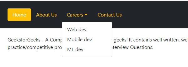
Pills navigation with dropdown menu
Creating a collapsible pills navigation menu: To create a collapsible pills navigation menu, use a button with class .navbar-toggler with attributes data-bs-toggle and data-bs-target. Within the button span an element with class .navbar-toggler-icon. Here, we have also used fontawesome to get the hamburger menu icon. Then, Wrap the .nav-links elements with class .navbar-collapse and .collapse and id of #navbar-collapse. Use the class .collapse as a value for the attribute data-bs-toggle and the id as a value for the data-bs-target attribute.
Example: This example illustrates the collapsible pills navigation menu.
HTML
<!DOCTYPE html>
<html lang="en">
<head>
<meta charset="UTF-8" />
<meta http-equiv="X-UA-Compatible"
content="IE=edge" />
<meta name="viewport"
content="width=device-width,
initial-scale=1.0" />
<title>Pills navigation menu</title>
<link href=
rel="stylesheet"
integrity=
"sha384-EVSTQN3/azprG1Anm3QDgpJLIm9Nao0Yz1ztcQTwFspd3yD65VohhpuuCOmLASjC"
crossorigin="anonymous"/>
<link rel="stylesheet"
href=
</head>
<body>
<nav class="nav nav-pills p-4 bg-dark">
<button
class="navbar-toggler"
type="button"
data-bs-toggle="collapse"
data-bs-target="#navbar-collapse">
<span class="navbar-toggler-icon">
<i class="fas fa-bars text-white fa-2x"></i>
</span>
</button>
<div class="collapse navbar-collapse text-white"
id="navbar-collapse">
<ul class="navbar-nav">
<li class="nav-item mt-4 pl-3">
<a class="nav-link active bg-warning"
aria-current="true"
href="#">Home
</a>
</li>
<li class="nav-item">
<a class="nav-link text-warning"
href="#">About Us </a>
</li>
<li class="nav-item">
<a class="nav-link text-warning"
href="#">Careers </a>
</li>
<li class="nav-item">
<a class="nav-link text-warning"
href="#">Contact Us </a>
</li>
</ul>
</div>
</nav>
<p class="p-4">
GeeksforGeeks - A Computer Science portal
for geeks. It contains well written, well
thought and well explained computer science
and programming articles, quizzes and
practice/competitive programming/company
interview Questions.
</p>
<script src=
integrity=
"sha384-MrcW6ZMFYlzcLA8Nl+NtUVF0sA7MsXsP1UyJoMp4YLEuNSfAP+JcXn/tWtIaxVXM"
crossorigin="anonymous">
</script>
</body>
</html>
|
Output:

Collapsible Pills Navigation
Share your thoughts in the comments
Please Login to comment...