How to Create a Multi-Column Footer in Bootstrap ?
Last Updated :
15 Mar, 2024
Bootstrap offers a range of classes that can be employed to design web pages and apply diverse styles. Footers are a crucial element of web design, as they provide users with valuable information and navigation options. With Bootstrap, creating a multi-column footer that is visually appealing and responsive across various devices is easy.
Approach:
- Utilize the grid system (
container, row, col-*) to structure footer content into multiple columns. - Divide footer content into separate sections, each within its own
col-* div. - Use appropriate Bootstrap utility classes (
list-unstyled, text-muted, etc.) for styling and organization within each column. - Ensure responsiveness by using responsive column classes (
col-md-*, col-lg-*, etc.) to adjust the layout based on screen size.
Example 1: Implementation to design a multi-column footer.
HTML
<!DOCTYPE html>
<html lang="en">

<head>
    <meta charset="UTF-8">
    <meta name="viewport"
          content="width=device-width, initial-scale=1.0">
    <title>Multi-Column Footer with Bootstrap</title>
    <!-- Bootstrap CSS -->
    <link rel="stylesheet" href=
"https://stackpath.bootstrapcdn.com/bootstrap/4.5.2/css/bootstrap.min.css">
</head>

<body>
    <footer class="footer bg-dark text-white py-5">
        <div class="container">
            <div class="row">
                <div class="col-lg-4 col-md-6">
                    <h4>About Us</h4>
                    <p>
                        GeeksforGeeks is a leading platform that provides
                          computer science resources and coding
                        challenges for programmers and technology enthusiasts,
                          along with interview and exam
                        preparations for upcoming aspirants.
                    </p>
                </div>
                <div class="col-lg-4 col-md-6">
                    <h4>Quick Links</h4>
                    <ul class="list-unstyled">
                        <li><a href="#" class="text-white">Home</a></li>
                        <li><a href="#" class="text-white">About</a></li>
                        <li><a href="#" class="text-white">Services</a></li>
                        <li><a href="#" class="text-white">Contact</a></li>
                    </ul>
                </div>
                <div class="col-lg-4 col-md-6">
                    <h4>Contact Us</h4>
                    <ul class="list-unstyled">
                        <li>123 Main Street</li>
                        <li>City, State, 12345</li>
                        <li>Email: info@example.com</li>
                        <li>Phone: +123-456-7890</li>
                    </ul>
                </div>
            </div>
        </div>
    </footer>

    <!-- Bootstrap JS -->
    <script src=
"https://code.jquery.com/jquery-3.5.1.slim.min.js">
      </script>
    <script src=
"https://cdn.jsdelivr.net/npm/@popperjs/core@2.5.4/dist/umd/popper.min.js">
      </script>
    <script src=
"https://stackpath.bootstrapcdn.com/bootstrap/4.5.2/js/bootstrap.min.js">
      </script>
</body>

</html>
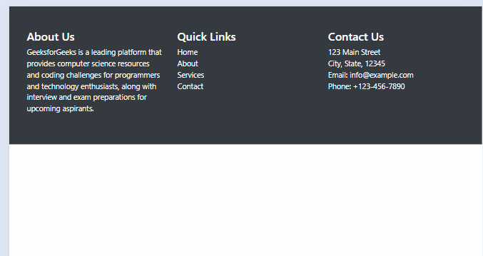
Output:
Example 2: Implementation to design a multi-column footer.
HTML
<!DOCTYPE html>
<html lang="en">
<head>
<meta charset="UTF-8">
<meta name="viewport"
content="width=device-width, initial-scale=1.0">
<title>Multi Column Footer</title>
<link href=
"https://stackpath.bootstrapcdn.com/bootstrap/4.5.2/css/bootstrap.min.css"
rel="stylesheet">
</head>
<body>
<div class="container">
<div class="row">
<div class="col-md-3">
<h4>About</h4>
<p class="text-muted">
Learn more about GeeksforGeeks News
</p>
</div>
<div class="col-md-3">
<h4>Sections</h4>
<ul class="list-unstyled">
<li><a href="#" class="text-muted">Home</a></li>
<li><a href="#" class="text-muted">World</a></li>
<li><a href="#" class="text-muted">Politics</a></li>
<li><a href="#" class="text-muted">Technology</a></li>
</ul>
</div>
<div class="col-md-3">
<h4>Services</h4>
<ul class="list-unstyled">
<li><a href="#" class="text-muted">Newsletters</a></li>
<li><a href="#" class="text-muted">Mobile</a></li>
<li><a href="#" class="text-muted">Apps</a></li>
<li><a href="#" class="text-muted">RSS</a></li>
</ul>
</div>
<div class="col-md-3">
<h4>Contact Us</h4>
<p class="text-muted">Get in touch with us</p>
</div>
</div>
</div>
<footer class="text-center bg-dark text-white py-3">
<div class="container">
<div class="row">
<div class="col-md-6">
<p class="text-muted">
© 2024 GeeksforGeeks. All Rights Reserved.
</p>
</div>
<div class="col-md-6">
<ul class="list-inline">
<li class="list-inline-item">
<a href="#" class="text-muted">Privacy Policy</a>
</li>
<li class="list-inline-item">
<a href="#" class="text-muted">Terms of Use</a>
</li>
<li class="list-inline-item">
<a href="#" class="text-muted">Contact Us</a>
</li>
</ul>
</div>
</div>
</div>
</footer>
<script src=
"https://code.jquery.com/jquery-3.5.1.slim.min.js">
</script>
<script src=
"https://cdn.jsdelivr.net/npm/@popperjs/core@2.5.4/dist/umd/popper.min.js">
</script>
<script src=
"https://stackpath.bootstrapcdn.com/bootstrap/4.5.2/js/bootstrap.min.js">
</script>
</body>
</html>
Output:

Share your thoughts in the comments
Please Login to comment...