How to add Borders and Shadows to Elements in CSS ?
Last Updated :
01 Feb, 2024
Apply box shadows to elements to create a 3D effect, whereas adding borders to containers or boxes can enhance the structural clarity of a layout. In this article, we will learn how to add borders and shadows to the elements in CSS. We will explore two different approaches to adding borders and shadows.
Using the border and box-shadow Properties
Set the CSS properties like a border for solid borders and box shadow for shadows. Element 1 has a solid border and a box shadow. Element 2 has a dashed border, rounded corners, and a box-shadow: 5px 5px 10px rgba(0, 0, 0, 0.3).
Example: Illustration of adding borders and shadows to elements using border and box-shadow properties.
HTML
<!DOCTYPE html>
<html>
<head>
<title>Borders and shadows</title>
<style>
.element1 {
width: 200px;
height: 100px;
background-color: rgb(201, 236, 185);
border: 5px solid rgb(43, 177, 19);
box-shadow: 5px 5px 10px rgba(0, 0, 0, 0.3);
margin: 20px;
text-align: center;
}
.element2 {
width: 200px;
height: 100px;
background-color: #e1cdcd;
border-radius: 10px;
border: 1px dashed #4CAF50;
box-shadow: -5px -5px 10px rgba(0, 0, 0, 0.3);
margin: 20px;
text-align: center;
}
</style>
</head>
<body>
<h1 style="color: green;">
GeeksforGeeks
</h1>
<h3>
Adding add borders
and shadows to elements
</h3>
<div class="element1">Element 1</div>
<div class="element2">Element 2</div>
</body>
</html>
|
Output:

Using the Outline and Box Shadows
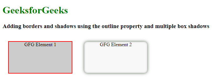
Set the outline property for the border-like effect and also using multiple box-shadow values for both outer and inner shadows. Element 1 has a solid border. The Element 2 has the rounded corners with the dual shadows.
Example: Illustration of adding borders and shadows to elements using outline and box-shadow properties.
HTML
<!DOCTYPE html>
<html lang="en">
<head>
<meta charset="UTF-8">
<meta name="viewport" content=
"width=device-width, initial-scale=1.0">
<title>
Border and Shadow
</title>
<style>
.elebox {
display: flex;
}
.element1 {
width: 200px;
height: 100px;
background-color: #ccc;
outline: 2px solid rgb(255, 0, 0);
margin: 20px;
text-align: center;
}
.element2 {
width: 200px;
height: 100px;
background-color: #f8f8f8;
border-radius: 10px;
box-shadow:
0 0 10px rgba(7, 32, 1, 0.7),
inset 0 0 5px rgba(15, 1, 29, 0.2);
margin: 20px;
text-align: center;
}
</style>
</head>
<body>
<h1 style="color: green;">
GeeksforGeeks
</h1>
<h3>
Adding borders and shadows
using the outline property
and multiple box shadows
</h3>
<div class="elebox">
<div class="element1">
GFG Element 1
</div>
<div class="element2">
GFG Element 2
</div>
</div>
</body>
</html>
|
Output:
Share your thoughts in the comments
Please Login to comment...